How to Understand the Color Spectrum

How to Understand the Color Spectrum

Samantha Remboldt
Understand the key differences in hue, luminosity, and saturation so that you can describe any color in just a few works.

How to Understand the Color Spectrum

The word ‘color’ doesn’t really get us far as designers. We need to be more specific about what elements of the color we’re describing.

If we were going to the doctor, we wouldn’t say: “My body hurts”. We’d say “My left arm hurts when I bend it this way”.

So. Today, we’re going to get more clear about some color terminology. We’re going to explore the differences between ‘hue’, ‘saturation’, and ‘luminosity’ so that we can accurately describe ANY color.


Terms to Understand: 

  • Hue = the actual, pure color.
    • Ways to describe Hue: by the base color, and/or it’s nearest neighbor
      • Example: green is fine. but blue green is better.
      • Example: pink is fine, but warm pink is better.
  • Saturation = the overall intensity or power of a hue. More bold = more saturated. More muted = less saturated.
  • Luminosity = the measure of how bright or dark a hue is. You can adjust colors to appear lighter or darker.


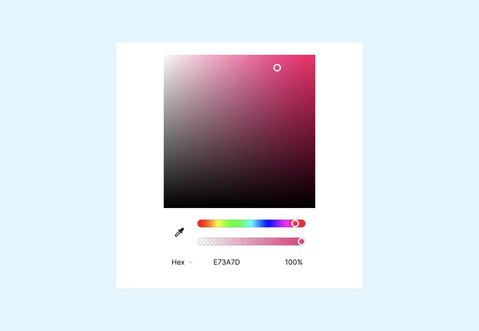
How to Properly Use the Color Spectrum


First, you choose a HUE (a base color, always going to show you the brightest version)

Then, you can explore the HUE SPECTRUM. 


The 4 Directions of the Hue Spectrum

  • Lighter (more Luminosity): going ‘up’ in the Hue Spectrum. This is adding more lightness to the color

  • Darker (less Luminosity): going ‘down’ in the Hue Spectrum. This is adding more darkness to the color

  • Brighter (more saturation): going ‘right’ in the Hue Spectrum. This is making the color more bold & bright

  • Muted (less saturation): going ‘left’ in the Hue Spectrum. This is desaturating the color and adding more grey.


To properly define ANY color, you can use those 3 parameters:

  • Hue: what’s the approximate color (red, pink, green, aqua, blue, etc.)
  • Luminosity: light, medium, dark
  • Saturation: muted, mid-tone, bright

Back to blog

★ ★ ★ ★ ★

Say hello to your new favorite color palette tool:

Color Palette PRO

Excellent 4.97 | Trusted by 1,000+ Designers

Create beautiful, brand-ready color palettes in 60 seconds.

Our all‐in‐one tool helps you select, test, and finalize your brand’s perfect palette—without the guesswork.

Get Color Palette PRO

Read the Reviews

"Wow, I love this! It's insanely useful!! From generating themed names to contrast compliance - this tool is so much fun to use and saved me a ton of time."

Customer Reviews

Based on 67 reviews
96%
(64)
3%
(2)
1%
(1)
0%
(0)
0%
(0)
K
Krista H.
new and improved color palette pro

I love the color palette pro! It is so easy to navigate and very intuitive, and it allows you to create a great palette in a few easy steps.

M
Megan D.
I'm Obsessed!

I've been a fan of their tools from the beginning, but I've got to say the new Color Palette Pro is the best yet! As a web designer this is the first place I go to take my clients' inspiration and create a palette that's uniquely them, but also meets contrast guidelines. It's so much fun to use I could spend hours just creating amazing palettes. There's so much here, I could go on and on, do yourself a favor and grab this tool!

K
Kelly D.
The Graphic Designer's Best Friend

WOW! This is the best tool and I love using it regularly for branding, graphic design, and web development projects. I highly recommend it to improve your creative process. Bonus: it's super fun to use, too!

A
Allison B.
Unique and original tool

The hard work and dedication that has been put into this project is outstanding. Truly an amazing tool! The features and hard work are shown through the Color Palette itself. User friendly and easy to navigate. The updates and dedication to improving and learning from the past is inspiring.

K
Kinga M.
The Most AMAZING tool

This tool is an absolute game-changer for designers. As the founder of Sprout Your Practice, I help natural health practitioners build beautiful, effective websites—but making colors WAGA-compliant used to be the bane of my existence. I relied on colorable.jxnblk.com and manually tested everything—an exhausting, time-consuming, and frankly ridiculous process that rarely gave me the results I needed.

Now? This tool gets me up and running in seconds. No more guesswork, no more wasted hours—just instant, reliable compliance so I can focus on what truly matters: creating stunning websites that help practitioners grow their businesses. THANK YOU for Sam & Chris for this tool xo