
Welcome to ‘Brand in a Box': a weekly drop where I create a fictional brand & give you….
-
custom color palette & font pairings
-
my reasons behind those choices
-
a website mockup so you can see HOW those elements come together (your most-requested feature!)
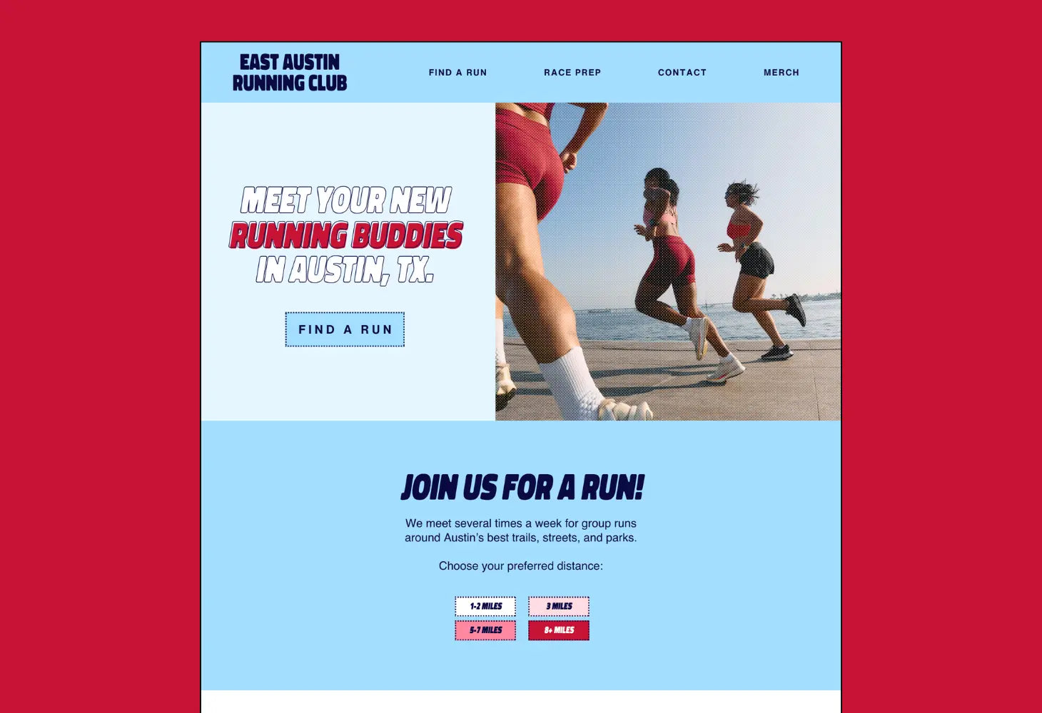
This week's brand is 'East Austin Running Club'. I imagine that this is a great resource for running enthusiasts (couldn't be me!) who want to find more running buddies to train with.
I did a bit of research on running clubs for this project and I noticed that a loooooot of them just use black/white branding. I thought it'd be fun to bring some fun COLOR to this space, and use some dynamic, forward-motion typefaces.
One of my favorite features of this brand is that the distance preferences (3 miles, 5-7 miles, etc.) coordinate with the saturation levels of the accent red color. So a shorter run will be a less saturated color, and a longer run will be a deeper red. That was just one of those things that made my designer heart happy!
I hope this brand inspires you! I had so much fun bringing everything together.
These fonts & colors are perfect for:
- brands that want to lean into a 'modern, playful Americana' vibe
- bold & classic brands
- brands that want a dynamic energy

The Fonts:
For this brand, I grabbed 'Spot Italic'- which I think works PERFECTLY with the 'forward motion' vibe of a running club. It's bold, easy-to-read, and has a casual energy that I was looking for.
Fonts:
- heading font: Spot Italic
- body font: Helvetica (note: most design programs have this pre-installed)
The Colors:
This was a FUN one. I love the Americana-esque vibes of blues + reds + whites together. If you look closely, you'll see that I've coordinated the 'preferred distance' buttons to have deeper saturation with longer distances. I just thought this was a fun visual way to understand the 'difficulty' of the runs.
The Graphics:
I wanted to have some yummy textures on these photos, so I got this Retroset Dry Transfer effects. These were super easy to use, I just added a filter over my photos and it gave the images a retro-tone feel. I also used dashed borders on my CTA buttons to match - leaning into the visual of 'stripes on the road'.
Graphics:
- Retroset Dry Transfer Effects- for the retrotone vibe overlays on photos
The Website Mockup:


