
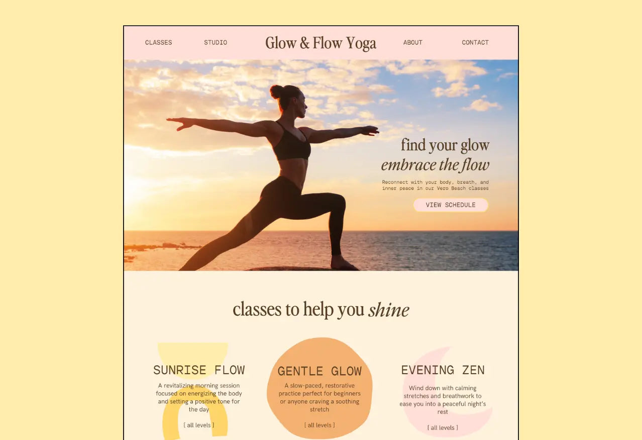
Color palette & font pairings for a warm, beachy, boho brand.
Welcome to ‘Brand in a Box': a weekly drop where I create a fictional brand & give you….
-
custom color palette & font pairings
-
my reasons behind those choices
-
a website mockup so you can see HOW those elements come together (your most-requested feature!)
This week's fictional brand is Glow & Flow Yoga: a beachside yoga studio based in Vero Beach, Florida. I imagine that they have in-studio and beach yoga classes, and that their vibe is warm, welcoming, and embraces the natural flow of the ocean, mood, and sun.
These fonts & colors are perfect for:
- brands that prioritize comfort, flow, coziness, and playfulness
- feminine / boho brands
- brands that want to feel approachable & friendly (especially to millennials!)

The Fonts:
I chose 'Perfectly Nineties' as the heading font because I think it's a strong, flow-y serif. There are other serifs that are thinner/sharper/sleeker, but I like the round-ness and strength of PN- perfect for a yoga studio that encourages strength and growth. This font just felt... strong to me.
Fonts:
- Perfectly Nineties (by one of my favorite type designers/friend: Jen Wagner!)
- Gopher Mono
- HK Grotesk (free Google font!)
The Colors:
This palette came about so naturally: I knew I wanted to lean into some bright, playful, warm boho colors. I was inspired by the sunset colors I saw at Vero Beach when I visited in January.
The Graphics:
This one was easy- I just used free Canva elements! I searched 'boho shapes' in Canva's graphics tab and found lots of options. I chose to go with abstract sun, moon, and 'blob' style graphics to lean into the flow-y vibes of this brand.
The Website Mockup:


