Brand in a Box: Cloud Nine Doula Services

Brand in a Box: Cloud Nine Doula Services

Samantha Remboldt

Color palette & font pairings for a gentle, soft, dreamy brand. 

Welcome to ‘Brand in a Box': a weekly drop where I create a fictional brand & give you….

  • custom color palette & font pairings 

  • my reasons behind those choices

  • a website mockup so you can see HOW those elements come together (your most-requested feature!)


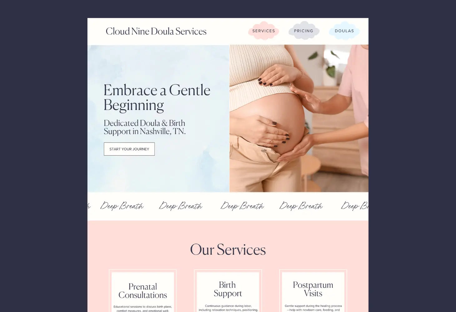
This week's fictional brand is 'Cloud Nine Doula Services': Nashville-based doula services for expectant parents seeking calm guidance through pregnancy, birth, and the early postpartum period.


I'm writing this as I'm 9 months pregnant, so that could have been part of the inspiration for this week's brief. 👶 I'm currently deep in babyland- shopping for the crib, changing tables, etc.


All that considered, it was SO much fun to create a fictional doula brand. I wanted the vibe to be soft, friendly, and encouraging. There's so much dang INFO in this industry, I wanted this brand to feel like a best friend who was going to be there for you in a major life moment.


I loved adding little encouraging messages to the website mockup (like 'deep breaths') to give it a more friendly feel. This is 100% a doula I would hire!


These fonts & colors are perfect for:

  • brands that prioritize soft, gentle, nurturing vibes
  • baby & childcare-facing brands (obvi!)
  • brands that want to feel high-end, but also approachable


The Fonts: 

For this brand, I got to use one of my FAVORITE fonts: Canela. I'll be honest- she's a splurge (she's my most expensive typeface). HOWEVER. I think she *immediately* gives a high-end feel to any brand. And I looooved combining her with that handwritten script for a friendly, approachable vibe. It feels elegant, but approachable (which was exactly the vibe I wanted!).

  • heading font: Canela
  • subheading font: Miss Confidential
  • body font: Proxima Nova (available on Adobe Fonts, but you can use any basic sans font)


The Colors: 

For these brand colors: I wanted to lean into a soft & dreamy vibe (I mean, 'cloud 9' already sounds so dreamy!). I pulled colors from the cloudy graphics and ended up with a gorgeous medley of soft & dreamy pastels. Since the graphics bring in so many pastel shades, I kept our base palette super simple: a warm light neutral, a cool dark neutral, and some pastel hero colors.


The Graphics: 

I didn't want to go too 'on the nose' with the cloud theme, so I searched for abstract cloud graphics. I stumbled on this pack and it was PERFECT. It actually included a lottttt more images than I was expecting, and these were so subtle that they made great backgrounds for text + background sections. I can totally see these being used for backgrounds on social media graphics, too. Highly recommend this graphics pack.


The Website Mockup: 

Back to blog

★ ★ ★ ★ ★

Say hello to your new favorite color palette tool:

Color Palette PRO

Excellent 4.97 | Trusted by 1,000+ Designers

Create beautiful, brand-ready color palettes in 60 seconds.

Our all‐in‐one tool helps you select, test, and finalize your brand’s perfect palette—without the guesswork.

Get Color Palette PRO

Read the Reviews

"Wow, I love this! It's insanely useful!! From generating themed names to contrast compliance - this tool is so much fun to use and saved me a ton of time."

Customer Reviews

Based on 72 reviews
93%
(67)
6%
(4)
1%
(1)
0%
(0)
0%
(0)
J
Julia B.
SO helpful

This tool has been an amazing addition to my design process. I'm so glad I got it! its such a time saver and it lays everything out really well. I highly recommend it!

Hi Julia,

Thank you for this wonderful review! I'm SO happy to hear that this tool is saving you time.

-Sam

M
Megan D.
I'm Obsessed!

I've been a fan of their tools from the beginning, but I've got to say the new Color Palette Pro is the best yet! As a web designer this is the first place I go to take my clients' inspiration and create a palette that's uniquely them, but also meets contrast guidelines. It's so much fun to use I could spend hours just creating amazing palettes. There's so much here, I could go on and on, do yourself a favor and grab this tool!

Hi Megan,

I'm so grateful for your review- thank you! I love your comment about spending hours just playing with the tool- I felt the exact same way when we were working on this new update. I'm glad this makes creating color palettes feel FUN. Thank you!

-Sam

K
Kelly D.
The Graphic Designer's Best Friend

WOW! This is the best tool and I love using it regularly for branding, graphic design, and web development projects. I highly recommend it to improve your creative process. Bonus: it's super fun to use, too!

Hi Kelly,

Your review means so much to us- thank you so much. I LOVE to hear that you're having fun using it, that was our whole goal with this update.

-Sam

H
Hailey F.
I LOVE Color Palette Pro!

I'm a brand and web designer and recently purchased Color Palette Pro. I just used it for two client projects and am loving that I can make my color palettes more accessible. I am really enjoying entering in my color palette and being able to see exactly which colors work best with eachother.

Hi Hailey,

Thanks so much for sharing your experience! THRILLED to hear that you love Color Palette PRO. It's a fun tool to use, and we love to hear that you're actually using it for client projects.
-Sam

I
Ingrid U.
Saves me SO much time and it's fun to use!

I love playing with color and going down the rabbit hole of color psychology and this is so helpful in letting me explore different combinations and good balanced palettes!!

Hi Ingrid,

Thank you SO much for getting Color Paletet PRO and writing this kind review. I love to hear that this is helping you have fun with color psychology and create more balanced palettes. Enjoy your tool!

-Sam