
Explore HEX, RGB, CMYK, and Pantone color codes, and how we use them in graphic design projects.

As a graphic designer, I’m obsessed with color. But today, I want to talk about something even more fascinating than just picking pretty colors: the magic of quantifying color. How do color codes actually work, and why do we even use them?
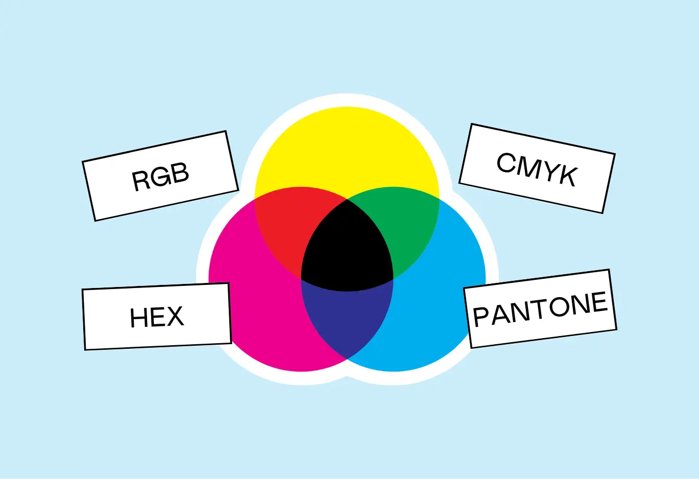
In this post, we’ll skim the surface of four common systems designers use to define color precisely: RGB, Hex, CMYK, and Pantone. Whether you’re just starting out in design or you’re curious about how your screen translates those vibrant hues, this will give you the scoop.
Before we dive into each type of color code, here's your cheat sheet:
-
RGB = Great for screen-based designs (computers, phones, TVs).
-
Hex Codes = A shorthand for RGB, perfect for web coding.
-
CMYK = Ideal for print, describing how much ink of each hue is used.
-
Pantone = The industry standard for precise color matching across different materials and regions.

Why Do We Quantify Color?
Ever wonder how you tell someone “use this exact green” without just pointing at a swatch on your screen? That’s where quantifying color comes in. All four systems—RGB, Hex, CMYK, and Pantone—let us describe colors so specifically that another designer (or a printer) can replicate the exact hue we want, anywhere in the world.
Let’s dive into each system, how it works, and when you might use it.

RGB (Red, Green, Blue)
Perfect for Screens & Digital Media
RGB stands for Red, Green, and Blue, the three colors of light that mix on most digital screens (like your phone, computer monitor, or TV). Each pixel on a screen has subpixels that light up at different intensities of red, green, and blue, creating the vast range of colors you see.

How RGB Works:
-
Each color—Red, Green, and Blue—ranges from 0 (no intensity) to 255 (full intensity).
-
Why 255? Because each color channel has 256 levels (from 0 to 255). If you see a color like rgb(255, 192, 203) (which is a variation of pink), that means 100% red, 75% green, and about 80% blue—yielding that soft, warm tone.
-
An RGB color is written as RGB(R, G, B). For instance:
-
Bright Red: RGB(255, 0, 0) (all red, no green or blue)

-
Shamrock Green: RGB(72, 177, 135) (plenty of green and a good amount of blue)

Hex Codes (Hexadecimal System)
A Shortcut for Digital & Web
If you’ve played with CSS or HTML, you’ve probably seen something like #FF0000. That’s a hex code, another way to represent an RGB color—just in a base-16 (hexadecimal) format.
Why Hex?
-
RGB can get long (e.g., rgb(255, 192, 203) is 17 characters if you count commas and spaces!).
-
Hex codes compress those numbers into six characters (after a #).
-
It’s more efficient for coding, and it loads faster on websites than a long numeric list.

In a hex code, the first two digits represent red, the next two represent green, and the last two represent blue. Each pair is a base-16 number—meaning we count from 0-9, then A-F.
-
0 = 0, 1 = 1, …, 9 = 9, 10 = A, …, 15 = F.
So #B834E0 breaks down into:
-
B8 for red,
-
34 for green,
-
E0 for blue.
The math behind it is a little mind-bending, but it’s essentially just a clever shorthand for those same 0 to 255 values you see in RGB.
Here's a preview of the math for a hex code:


So, in this example, the first 2 digits of the hex code are #B8.

CMYK (Cyan, Magenta, Yellow, Key/Black)
The Go-To for Print
When you’re designing something that will be physically printed—like business cards, posters, or packaging—CMYK is your friend. It stands for Cyan, Magenta, Yellow, and Key (Black), the four ink plates used in color printing.
How It Works:
-
You’ll often see it written as cmyk(c%, m%, y%, k%).
-
Each percentage tells you how much of that ink color is used.
-
Key (K) is black ink, which helps darken the color or add contrast without using all three of the other inks at once.

For instance, if you have a slightly darker green, you might see something like cmyk(59%, 0%, 24%, 31%). That means a decent chunk of cyan and some yellow, plus 31% black for depth.

Pantone
An Industry Standard for Color Consistency
Finally, Pantone is the big kahuna of color matching systems. It’s a proprietary system created to ensure color accuracy across different printers, materials, and even countries.
Why Pantone?
-
Screens differ. If I say “yellow,” your monitor might display it differently than mine.
-
Materials differ. The same ink on glossy paper vs. matte paper can look like two completely different colors.
-
Global consistency. Big brands (think Lays, Coca-Cola, etc.) need one universal reference so that every print run matches, no matter which factory or region prints it.
Pantone assigns a specific code (e.g., Pantone 109 C or Pantone 109 U, where “C” is coated paper and “U” is uncoated) so you get the exact color you intend—no surprises, no weird tints.
Final Thoughts & a Color Challenge
Quantifying color is so magical—it's like learning a new language that instantly helps you communicate more precisely as a designer. RGB and Hex are your jam for screens and digital design, CMYK is your bestie for print work, and Pantone is the ultimate pro-level system for absolute color accuracy on any surface.
Wanna geek out even more? Here’s a fun challenge:
-
Pick a random RGB color (something like RGB(184, 52, 224)).
-
Convert it to a hex code by hand, using the base-16 math we talked about.
-
Check your answer in a design program or with an online converter—just to see if your math lines up!
You’ll rarely have to do the conversion by hand in actual design work—but it’s pretty thrilling to know you can if you want.
Key Takeaways
-
RGB = Great for screen-based designs (computers, phones, TVs).
-
Hex Codes = A shorthand for RGB, perfect for web coding.
-
CMYK = Ideal for print, describing how much ink of each hue is used.
-
Pantone = The industry standard for precise color matching across different materials and regions.


