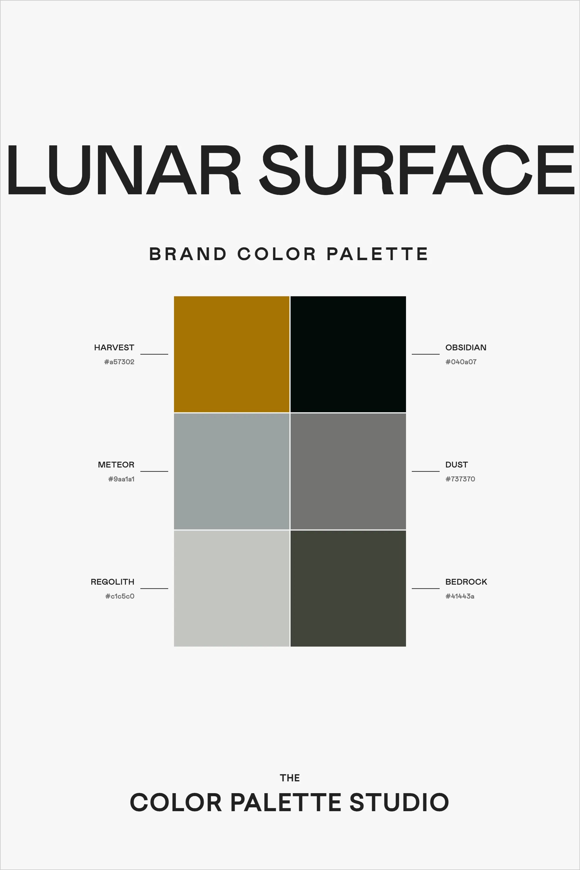
Drawing inspiration from the mysterious terrain of Earth's closest celestial neighbor, this "Lunar Surface" palette combines rich geological tones with sophisticated neutrals to create a color story that's both grounded and otherworldly.
Understanding the Palette
Each color in this six-shade collection has been carefully selected to reflect different aspects of lunar geology, creating a sophisticated and cohesive palette:
Harvest (#a57302), a rich golden brown, evokes the warm glow of Earthshine on lunar highlands. This commanding color serves as an excellent accent for prominent brand elements and calls-to-action.
Obsidian (#043a07), a deep, almost black green, mirrors the mysterious depths of lunar maria, providing gravitas and authority to any design it touches.
Meteor (#9aa1a1) and Dust (#737370) work in tandem as sophisticated mid-tones, reminiscent of different grades of lunar regolith. These versatile grays provide balance and professionalism to any application.
Regolith (#c5c5c0), the lightest shade, captures the sun-bleached surface of moon rocks, while Bedrock (#41443a) grounds the palette with its deep, earthy green-gray tone.
Strategic Applications
This palette excels particularly in:
- Technology and Innovation Sectors
- Scientific and Educational Materials
- Luxury Brand Applications
- Professional Services
- Architecture and Interior Design
- High-End Editorial Design
Design Implementation Strategies
When working with this sophisticated palette, consider these professional approaches:
1. Use Harvest sparingly as an accent color to draw attention to key elements while maintaining the palette's professional tone.
2. Layer the various gray tones (Meteor, Dust, and Regolith) to create subtle depth and hierarchy in your designs.
3. Employ Obsidian and Bedrock for text and important graphic elements, ensuring readability while maintaining the lunar aesthetic.
4. Consider using Regolith as a primary background color, with darker tones creating contrast for content areas.
Digital Applications
For web and digital projects, this palette offers several strategic advantages:
- The range of neutral tones provides excellent options for text and background combinations
- Harvest works effectively for clickable elements and highlights
- The darker shades can be used for footer areas and secondary navigation
- The lighter tones create perfect canvas areas for content
Brand Personality Expression
This palette communicates:
- Innovation grounded in expertise
- Sophisticated minimalism
- Technical excellence
- Professional authority
- Quiet confidence
Practical Usage Tips
When implementing this palette in your projects:
1. Establish a clear hierarchy using the contrast between light and dark tones
2. Use Harvest strategically to guide user attention without overwhelming the sophisticated nature of the palette
3. Layer the neutral tones to create depth and visual interest while maintaining professionalism
4. Consider the interplay between warm and cool tones when creating layouts
Final Thoughts
The "Lunar Surface" palette offers a sophisticated approach to color that balances professionalism with subtle intrigue. Its combination of warm and cool tones, along with its range of values, makes it a versatile choice for brands seeking to project authority while maintaining visual interest.
Ready to Create Your Own Perfect Palette?
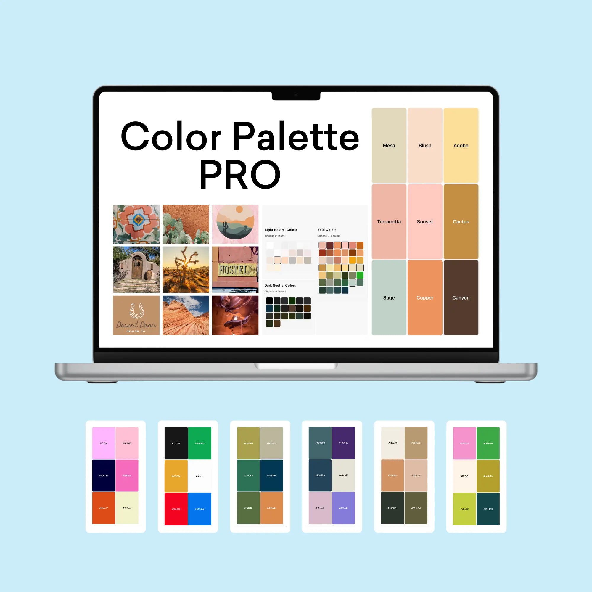
If you're inspired by this sophisticated lunar-inspired palette, you might be wondering how to create similarly effective color combinations for your own projects. That's exactly why I created the Color Palette Builder - a professional tool that helps designers create semi-custom, ready-to-use color palettes in minutes.
With the Color Palette Builder, you can:
- Choose from 12+ distinct design styles, each with its own carefully crafted color formula
- Create unique, professional color combinations that work harmoniously together
- Test your palette combinations instantly
- Export your palettes in multiple formats for client presentations
- Save and revisit your favorite palettes anytime using our free Color Buddy Chrome extension
Instead of spending hours perfecting your color combinations, you can use our proven formulas to create beautiful, functional palettes in 60 seconds or less. Join over 1,000 designers who have already transformed their color selection process.
Ready to revolutionize your color palette creation process? Check out our tools below and start creating professional-grade color palettes today.
Enjoyed this color palette breakdown? Share it with a fellow designer who might find it helpful!