
To fix a color palette, do not start over. Check it for balance, test contrast on the pairs you will actually use (you want 4.5 or higher), add tinted light and dark neutrals, then assign roles so you know which color is the hero, the accent, and the text.
These colors look so cute side by side. Then you drop them on a real website and nothing is readable, and you keep wanting to cheat on the palette.
I'm Sam Remboldt, a graphic designer in Nashville and the founder of The Color Palette Studio. This is the same fix I teach in my How to Fix a Color Palette workshop and in videos like this one. Palette health is not binary. It is a spectrum. Sometimes you just gotta sharpen things up.
You don't just need colors. You need a system.
If you are building a brand palette from scratch, use the ultimate guide. This post is how to fix a color palette you already have.
How to tell if your color palette is broken
A color palette needs a fix when:
- Something just feels off, even if you cannot name why
- The swatches look great, but the palette is confusing on a website, Instagram, or a logo
- You keep wanting to cheat on the palette
- One color is way more saturated or brighter than the rest
- You have no high-contrast pair for body text (nothing at 4.5)
- You are missing a real light neutral and a real dark neutral
- The colors have no roles (no hero, no accent, no neutrals)
The most common problems I see: too many random colors, no accessibility check, and no rules for how to use them. More of those live in the biggest color palette mistakes.
How to fix a color palette in 3 steps
This is the process I actually teach. In the workshop I call the stages cohesion, accessibility, and usage rules. In search language, that is balance, contrast, and roles.
- 1. Balance the palette (cohesion / harmony). Do the colors belong together?
- 2. Fix contrast and accessibility. Can people actually read them?
- 3. Assign color roles (usage rules). Which color does what?
Do them in that order. Lock the color you love first.
1. How to balance a color palette
Balance is cohesion. Harmony. Your colors feel like they belong together. No single shade feels like an outlier. The palette communicates one clear brand mood.
You do not need a lot of math. Line the colors up and look.
- Lightness. Do they share a similar brightness range? Too many extremes = chaos. All midtones = the danger zone. You will never hit 4.5.
- Saturation. Is one color wildly more saturated or "too vibrant"? That leftover feeling is usually this.
- Temperature. Warm + warm is cohesive. Cool + cool is cohesive. Mixing both is possible, but one usually dominates.
- Family. Do they share the same kind of rich, muted, or soft? Colors that could exist in the same universe.
Lock your anchor color. The one you cannot lose (the tote bags are printed, the client is insistent). Then repair the rest around it. If another color is the outlier, quiet it, deepen it, or let it go.
A harmony check is this step, sped up: it flags what is off and why.
2. How to fix color palette contrast (accessibility)
Accessibility, for a color palette, is contrast. Contrast is always two colors. A yellow is not inaccessible. Yellow on peach is.
Paste the pairs you would actually ship (body text on a background, a button on a band) into a free color contrast checker.
- 4.5:1 = WCAG AA for normal text. This is the number to remember.
- 3:1 = large text
- 7:1 = AAA for the main reading pair
You do not need every pair to pass. You need some high-contrast pairings for text + background. Zero pairs at 4.5 means the palette is not website-ready. If you are not putting a color on type, it does not need a pairing.
Most often, you fix contrast by adding neutrals.
Two kinds:
Muted brand colors (my favorite). A lighter or darker version of a color you already have. Honey becomes oat milk. Honey becomes chocolate. That is how neutrals stay on-brand instead of looking borrowed.
Universal neutrals. Cream, beige, grey, navy, charcoal. When in doubt, black and white go with everything. I still prefer tinted versions, not pure #000000 and #FFFFFF, so they do not feel disconnected and harsh.
Match the temperature. Warm palette, warm neutrals. Cool palette, cool neutrals. Why they matter: neutrals. How light + dark get you out of the midtone trap: balanced palettes.
3. How to assign color roles
Colors are the ingredients. Usage rules are the recipe. A pretty palette is useless if you do not know which color goes where.
- Hero: the color people immediately associate with the brand. Logo, key headers. Yes, you can have more than one.
- Accent: on-brand, less iconic. The pop. Buttons, links, a highlight.
- Light neutral: page backgrounds, breathing room. At least one.
- Dark neutral: body text, dark sections, footer. At least one.
If two colors fight to be the hero, keep the anchor from step 1 and demote the other. Then export HEX (web), RGB (social), and CMYK (print) so the recipe actually gets used.

How to fix a color palette: before and after example
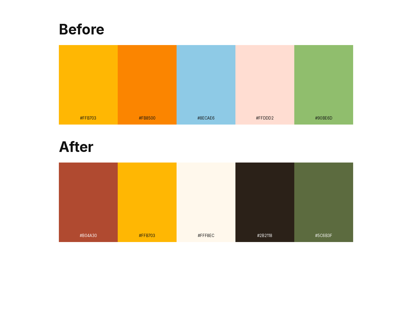
A made-up stationery brand, Marigold Press. The owner fell in love with a Pinterest row:
-
#FFB703marigold -
#FB8500bright orange -
#8ECAE6icy blue -
#FFDDD2peach -
#90BE6Dgrass green

Cute as swatches. Not a usable color palette.
Balance. Warm set with one icy blue outlier. Orange is fighting marigold for the same job. Saturation is all over the place. Anchor: #FFB703 marigold. The blue goes. The orange drops.
Contrast. Peach on white is about 1.3:1. Marigold on peach is about 1.4:1. Orange on peach is about 2.0:1. Grass on white is about 2.1:1. Zero pairs at 4.5. That is why it fails on a website.

Neutrals from the existing colors. Not random grey. Cream #FFF8EC (the oat-milk version). Espresso #2B2118 (the chocolate version). Olive #5C6B3F can hold type.
Roles. Marigold stays the accent (the color they already love). Clay #B04A30 becomes the hero. Cream and espresso are the neutrals.
| Role | Name | Hex |
|---|---|---|
| Hero | Clay | #B04A30 |
| Accent (locked) | Marigold | #FFB703 |
| Light neutral | Cream | #FFF8EC |
| Dark neutral | Espresso | #2B2118 |
| Supporting | Olive | #5C6B3F |

Accessible pairs after the fix
- Espresso on cream (
#2B2118on#FFF8EC): about 14.9:1 (AAA body text) - Marigold on espresso (
#FFB703on#2B2118): about 9.0:1 (yellow on a dark band) - Olive on cream (
#5C6B3Fon#FFF8EC): about 5.5:1 (AA) - Clay on cream (
#B04A30on#FFF8EC): about 5.1:1 (AA)
Marigold on cream is still about 1.7:1. That is fine. The yellow is the accent, not body text. Fixing a color palette includes knowing which pairs are allowed to fail.
Same sunny vibe. Now it works on a website.
How to fix a color palette in Color Palette Fixer
Marigold Press is the hand example. This is the same 3 steps, on a palette that looked electric and scored 20% health.
Starting five:
#D8FF7A#B3E7FF#CB8AFF#FF9BDC#4E61F5
Cute as a row of candy. Then you try to put type on them.

Health was 20%. Five colors: pass. Light neutral: fail. Dark neutral: fail. Contrast coverage: 0% of pairs at AA. Pairings selected: 0. That is the “looks great, unusable on a website” pattern from earlier in this post.

Balance. Harmony Check flagged one outlier: #B3E7FF was too muted next to the rest. Suggested #50F1FF. Apply. The loud colors get to stay. The one that did not belong in the same saturation family moves.

Contrast. Smart Suggestion asked for light and dark neutrals, for backgrounds and text. Not random grey. A light #E7F1F2 and a dark #05060A. That is how you get out of all-midtone, all-neon, zero pairs at 4.5.

Roles, after the fix
| Role | Hex |
|---|---|
| Hero | #D8FF7A |
| Accent | #50F1FF |
| Accent | #CB8AFF |
| Accent | #FF9BDC |
| Accent | #4E61F5 |
| Light neutral | #E7F1F2 |
| Dark neutral | #05060A |
Accessible pairs after the fix (dark type on light grounds, AA is 4.5):
-
#05060Aon#D8FF7A: 17.8 -
#05060Aon#E7F1F2: 17.6 -
#05060Aon#50F1FF: 14.8 -
#05060Aon#FF9BDC: 10.6 -
#05060Aon#CB8AFF: 8.3
The brights are still the personality. They are just not pretending to be body text. #4E61F5 still is not a reading pair with the light neutral (about 4.2). That is fine. It is an accent.
Same candy vibe. Now it works on a website.
If you already have a palette like this, Color Palette Fixer runs this same pass: harmony, contrast, neutrals, roles. About 60 seconds. The method in this post still works if you never buy it.
Color palette fixer vs a color palette generator
Coolors and other generators are good at inventing a new palette. They are a poor tool for "how to fix a color palette," because they will happily replace the color you cannot lose.
A color palette fixer evaluates the hexes you already have, flags balance, contrast, missing neutrals, and role problems, and suggests repairs that keep a locked signature color.
I built Color Palette Fixer to run this same 3-step fix: harmony / balance check, contrast scores, suggested light and dark neutrals, then roles. You can lock the color you love so the rest moves around it. Most people finish a pass in about 60 seconds.
The method above still works if you never buy it. For a single pair, use the free color contrast checker.
FAQ: how to fix a color palette
How do I know if my color palette is bad?
A color palette is unfinished if it fails a balance check, has no light and dark neutrals, has no text pairs at 4.5, or has no roles. If the swatches look great and the website falls apart, it needs a fix.
How do I fix a color palette that doesn't work?
Do not regenerate it. Balance it around the color you love, test contrast, add tinted light and dark neutrals, then assign hero, accent, and neutrals. Keep the vibe. Improve the accessibility.
How do I make a color palette accessible?
Accessible color palettes are about pairs. Add a tinted light background and a tinted dark ink, then confirm those pairs hit 4.5:1 in a contrast checker. Not every pair must pass. The pairs that must pass are the ones you put type on.
What contrast ratio do I need for brand colors?
WCAG 2 AA for body text is 4.5:1. Large text is 3:1. AAA body text is 7:1. Not every brand color has to pass.
What is the difference between a color palette fixer and a generator?
A generator invents a new palette. A fixer diagnoses the palette you already have and suggests repairs that can keep a locked signature color.
Can I keep a signature brand color when I fix my palette?
Yes. That is the correct constraint. Lock it. Move the supporting colors and the neutrals around it. If it fails as body text, stop using it as body text and let a dark neutral do the reading.
Why does my color palette look good on a mood board but not on my website?
Mood boards show equal rectangles. Websites ask colors to read, click, recede, and brand. All-midtone palettes look rich as swatches and fail as type. The fix is balance, neutrals, roles, and a contrast check, not a new aesthetic.
How long does it take to fix a color palette?
By hand, a focused repair takes about 20 to 45 minutes if you know which color is sacred. With a diagnosis tool, a first pass can take about 60 seconds.
GET THE BEST-SELLING TOOL

FREEBIES
Free Color Contrast Checker
Test your brand colors for website accessibility in 10 seconds 🎨