
My step-by-step process for creating brand color palettes that feel intentional and look amazing.
What is a Color Palette?
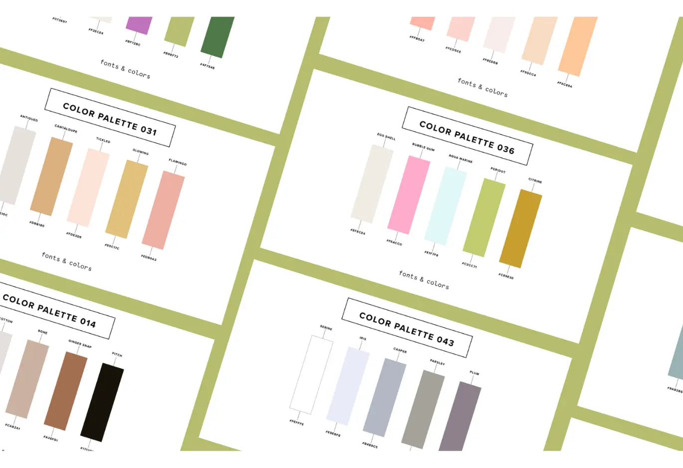
A brand color palette is a pre-determined series of colors that you consistently use across your marketing. Typically, you'll assign 5-8 colors to your brand color palette (although, truly, this number can vary). There’s no hard-and-fast rule about how many brand colors you’re allowed to use.
Your brand is never just ONE color. If Starbucks only used 1 color for their brand, their website would look like a giant green box.
In reality, your brand is the result of how the colors compliment and interact with each other. It’s typically a balance of light neutrals, dark neutrals, and bold/bright colors that help identify your brand.
Ingredients for a Successful Brand Color Palette:
To create a successful brand color palette, you’ll want to keep these things in mind:
- Be consistent with your brand identity: The colors should align with the brand's personality, values, and ethos
- Differentiate yourself: Be sure to use colors that help you stand apart from your competitors
- Evoke the right emotions: your brand colors should evoke the right psychological response from your audience
- Test for accessibility: be sure that there’s sufficient contrast between the text & background colors you want to use for your brand

3-Step Framework for Creating Color Palettes
-
Craft a Brand Personality
-
Choose a Design Style
-
Build & Balance Your Color Palette
Step #1: Craft a Brand Personality
It might be helpful to start with a definition!
Brand Personality: a set of human characteristics or traits attributed to a brand, giving it a unique character in the minds of consumers. Essentially, this answers the question: “if my brand was a person, what kind of person would it be?”.
Brand Personality vs. Personality Traits
Personality traits are the individual characteristics of a brand. For example, some personality traits might be….
-
Funny
-
Witty
-
Charming
-
Clever
-
Modern
Each of those individual traits is a personality trait.
Brand personality is the SUM of these traits. So, what happens when we bring all those traits TOGETHER and form a unique personality?
I have a fun example that might make it easier to understand why it’s important to focus on the holistic nature of a brand personality:
If you’re a Harry Potter fan (like me!), you’ll be familiar with Ron Weasley. Some of his personality traits are:
-
Loyal to Harry Potter and Hermione Granger.
-
He's brave, often uses humor as a defense mechanism
-
Values his family deeply
Now, let’s think about a totally different character: Bellatrix LeStrange. Some of her personality traits are:
-
Loyal to Voldemort
-
She’s deeply committed to the Dark Arts and pure-blood supremacy
-
Cruel, manipulative, prideful, and a bit sadistic.
If we boiled their entire personalities down to ‘loyal’, then they would seem similar, right? But they’re NOT. These two characters are VERY different from one another. This is why it’s important to focus on the Brand Personality (the sum of the traits), rather than each individual personality trait.
To craft a brand personality, you’ll want to form a holistic list of personality traits that describe your brand. I have a great list of 500 personality trait words if you need to jump-start your creativity.
Here’s an example of a brand personality for ‘Sweets by Maribel’, a fictional vegan cupcake shoppe in San Diego, CA:

Step #2: Choose a Design Style
Here’s the thing: we don’t translate brand colors directly from ‘personality traits’ to ‘colors’.
Instead, after we build the brand personality, we want to choose a design style. A design style is the intentional aesthetic approaches, visual languages, and design techniques that designers can use to convey a brand identity. Essentially, it’s the *vibe*.
Things that can be part of a design style:
-
Fonts
-
Colors
-
Textures & Patterns
-
Imagery
-
Shapes & Elements
-
Filters & Effects
There are SO many different design styles. There’s not a finite list, you can create infinite mood boards/design styles. Here are a few of the most common design styles I’ve seen in recent years:

You can use a pre-made design style (like the ones we make) or create your own mood boards. It’s also worth noting that some brand personalities can use more than 1 design style (there’s not always a ‘perfect fit’, it’s more up to your judgement and the project’s best fit).
For example, let’s envision a fictional brand: Crema Coffee. Their brand personality is chic, romantic, modern, polished, trendy.
Now- what design style can we use for this fictional brand?

Neutral & Minimal
We could totally lean into a neutral and minimal design style, highlighting soft warm hues and dashes of chic neutrals.
Botanical
We could also lean into a more botanical style- utilizing soft pinks, polished copper, lush plants, etc.
Either style would be acceptable to use. You might even be able to think of a whole NEW style that you’d like to try for this brand.
The important thing for this step is that you choose a design style or craft a mood board for your brand’s personality.
Step #3: Build & Balance Your Color Palette
Now we can get to the FUN PART ☺ Let’s build a brand color palette!
Here’s my handy checklist that I keep nearby when I’m building my palettes:
-
Have a range of light & dark colors
-
Make sure the palette matches the brand personality & design style
-
Make sure it attracts the brand’s ideal clients
There are 2 main ways that we can go from ‘design styles’ to ‘color palettes’:
Option #1: Freestyle
Option #2: Formulas
The Freestyle Method
In this method, you’ll build a custom mood board and use the eyedropper tool to pull a range of colors. Typically, this process takes 1-2 hours.

As you’re following the ‘freestyle method’, be sure to keep that checklist nearby: include light & dark neutrals, and make sure that your colors match the brand personality.
The Formula Method (my preference)
In this method, you’ll use a curated recipe of colors that allow you to create palettes that match the design style and have guaranteed accessibility.
Some of the most popular design styles (like ‘neutral and minimal’) have built-in color palette formulas. These are based on the thousands of designs that we’ve seen in this style. As long as you follow these color palette formulas, you’ll have a palette that matches your design style and ensures accessibility.

At the end of the day, you make a successful palette using the freestyle method or the formula method. Personally, I use formulas because they save me SO MUCH TIME and give me perfect results.
My favorite tools & resources
There are some GREAT resources out there that can help you build your brand color palettes. Here are a few that we’ve created to help you:
-
Color Palette Template: a totally free Canva template that you can use to craft your personality, add your design styles, and use the eyedropper tool to build your color palettes
-
Color Contrast Checker: a totally free contrast checker tool that you can use to test your brand colors for contrast OR generate new, accessible color pairings. Remember: you want your text + background color combinations to have contrast scores of 4.5+ to ensure AA accessibility.
-
500 Brand Personality Traits: Use this list to spark inspiration for your brand personalities. I like to send this to my clients and ask them to write down 10-20 words that catch their attention, then I narrow it down to 5-10 words.
-
Color Palette PRO: Our all‐in‐one tool helps you select, test, and finalize your brand’s perfect palette—without the guesswork. Includes Smart Color Formulas™, a color name generator, built-in accessibility tester, and more!
Summary
Creating brand color palettes doesn’t take a formal design degree. You just need to keep a few things in mind:
-
Follow this 3 step process: create a brand personality, choose a design style, then build your palette
-
Ensure accessibility by adding a range of light/dark neutral colors
-
Test your palettes for contrast (always!)
-
Keep your ideal customer in mind
-
Most importantly: choose a color palette that you’ll actually stick with. Consistency is the #1 most important part of a color palette.


