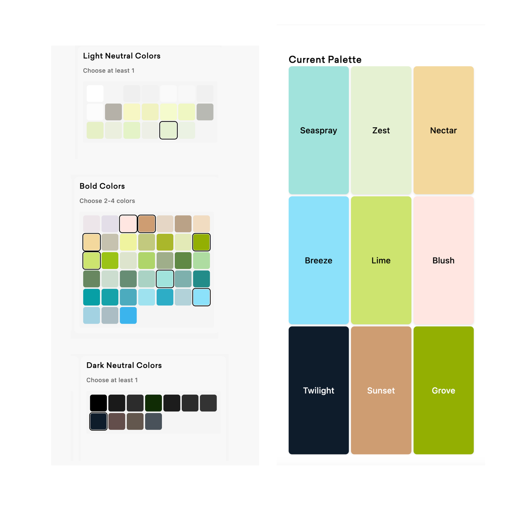
As a designer, I see LOTS of color palettes. There are some reallllllly common mistakes that I see over & over again, but don’t worry- they’re super easy to fix.
Mistake #1 - Forgetting Contrast 101
-
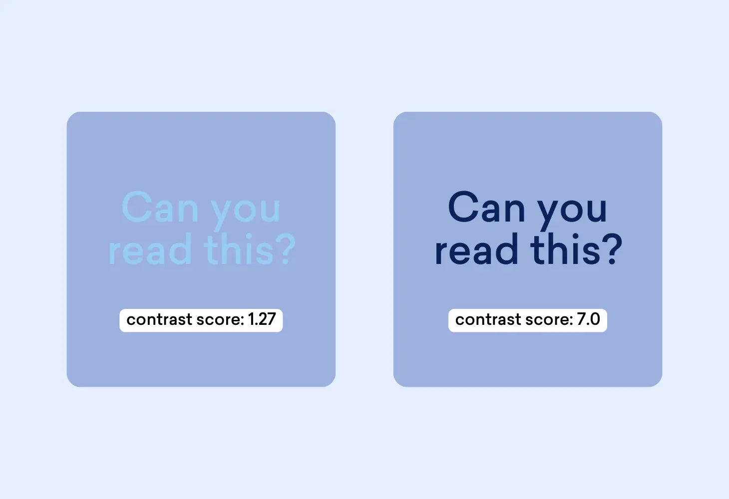
- Light pink text on a white background might look sleek, but your readers will need a magnifying glass to actually read your copy.
-
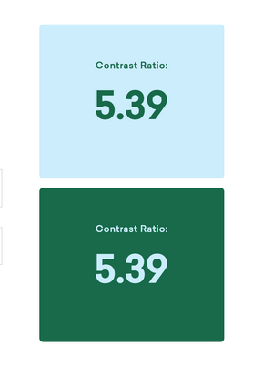
🛠️ How to Fix: test your brand colors using the Color Contrast Checker or Color Palette PRO to ensure your text + background pairs have 4.5+ contrast scores.
- Light pink text on a white background might look sleek, but your readers will need a magnifying glass to actually read your copy.
Mistake #2 - Ignoring Brand Personality
-
- If your colors don’t match your brand vibe (and voice!), you’re missing a prime opportunity to stand out in a busy inbox.
-
🛠️ How to Fix: Take some time to define your brand personality (you can use this list of 500+ personality traits to find words that fit your vibe). Then, choose a design style that matches your personality and only then can you properly choose your brand colors to match your vibe.
- If your colors don’t match your brand vibe (and voice!), you’re missing a prime opportunity to stand out in a busy inbox.
Mistake #3 - Forgetting Your Target Audience
-
- Sure, lavender is adorable, but does it actually help you attract your target audience?
-
🛠️ How to Fix: Consider your target audience/customer/persona:
- are they a Millennial parent?
- Are they construction workers?
-
Are they a Gen Z college student?
All of these factors are suuuuuper important when choosing your brand colors. Make sure that the palette you create attracts (not repels!) your target audience.
- Sure, lavender is adorable, but does it actually help you attract your target audience?
Mistake #4 - Copying Your Competitors
-
- Taking color cues straight from your competitors’ playbook can leave your brand blending into the background.
- 🛠️ How to Fix: Be aware of your competitor’s brand colors, but don’t try to copy them just because you think those colors ‘work’ in your industry. Instead- craft a color story that’s distinctly you.
- Taking color cues straight from your competitors’ playbook can leave your brand blending into the background.

