
Ever tried designing a brand palette and felt like something was…off? Even if you nailed the style or “vibe,” you still need solid contrast and variety to make your palette functional. In this post, we’ll explore how to balance colors in your palette with an easy four-step process—because great design is a little bit art, a little bit science.
Aesthetics vs. Balance
Aesthetic = The Brand “Vibe”
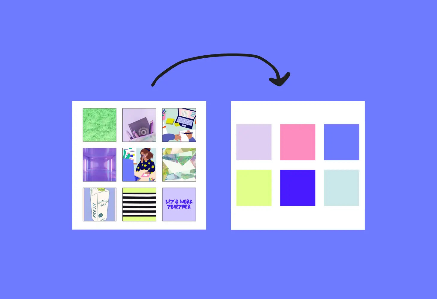
Think retro seventies, warm boho, cool minimalist, or even eclectic grandpa (yes, it’s a thing!). The aesthetic is the emotional feel of the brand. You’ll typically create a mood board or inspiration collage to hone in on this vibe.
Balance = How Well the Palette Works
A palette can look amazing in a static mood board, but if you can’t read text on a background or get consistent contrast across channels, the brand won’t translate well in real life. That’s where balance comes in—ensuring you have enough variety in hue and luminance (light/dark) so your palette is usable everywhere.

Step 1: Pick Your Aesthetic
This is the fun, free-flowing part where you:
-
Collect inspiration images or build a mood board.
-
Note any must-have brand colors (like a legacy color or client favorite).
-
Focus on how you want people to feel—cheerful, nostalgic, elegant?

Step 2: Add the Colors You Want (No Judgment Yet)
Go ahead—throw in five, eight, or even ten colors. At this stage, we’re not filtering anything out. If it fits the vibe, add it. Don’t worry if your palette looks huge or chaotic.
Remember: Even one accent color can make a brand pop. There’s no strict limit on how many colors you can have, but typically 5–8 is a sweet spot for brand identity.

Step 3: Ensure at Least One Light & One Dark Color
This is non-negotiable for balance. You need a light color (something near white) and a dark color (something near black or deep in hue). Why? Because if all your colors are mid-tone, it’s almost impossible to get that 4.5+ contrast score we talked about.
Avoid the Danger Zone
-
The “danger zone” is when all your colors cluster in the middle of the spectrum—none are truly light, none are truly dark. That leaves you with minimal contrast and a potential accessibility nightmare.

Step 4: Test Your Contrast Scores
Now science kicks in. Plug your colors into Color Palette PRO and check for:
-
Which pairs have a contrast ratio ≥ 4.5?
-
Are there enough high-contrast pairs to cover all your design use cases? (e.g., text on background, buttons, accents, etc.)
If you find some pairs don’t meet the 4.5 threshold, that’s okay! Not every single pairing has to be high-contrast.
But if you have ZERO high-contrast pairs, tweak one color to be slightly darker or lighter until you get into the safe zone. A single shift in brightness can make a huge difference.

Bonus Tips for a Perfectly Balanced Palette
-
Saturations & Shades
-
Vary not just your light/dark but also your saturation—some can be bold, others more muted. This creates visual interest and ensures your brand doesn’t feel flat.
-
The Hue Spectrum
-
Refer to the sections of the color spectrum (above) and note where each of your brand colors falls inside the spectrum. Spreading your colors across that grid helps you avoid the dreaded “all-midtone” scenario.
-
Use Tools to Speed It Up
-
Color Palette Tester: Test all your palette combos at once.
-
Color Contrast Checker: Quick 1:1 checks for text/background combos.
-
Color Palette PRO: My personal favorite for crafting palettes that already come with high-contrast color pairs. No guesswork required.
Conclusion
Balancing a brand color palette is part art (your aesthetic choices) and part science (ensuring contrast & usability). By making sure you have at least one light and one dark color—and then verifying your combos with contrast tools—you’ll end up with a palette that not only looks gorgeous but also works seamlessly in the real world.
Remember: If you’re stuck or just want to save time, check out Color Palette PRO. It has built-in formulas and an accessibility tester to help you craft a balanced palette in minutes. Because there’s nothing worse than falling in love with a color scheme, only to realize you can’t actually read your website text.


