In an era where magic meets modern design, this palette captures the essence of contemporary wizardry with a playful yet sophisticated edge. Drawing inspiration from magical manuscripts and mystical energies, these colors create a perfect blend of whimsy and wonder.
The Palette Story
This enchanting collection features five magical tones that bring modern sorcery to life:
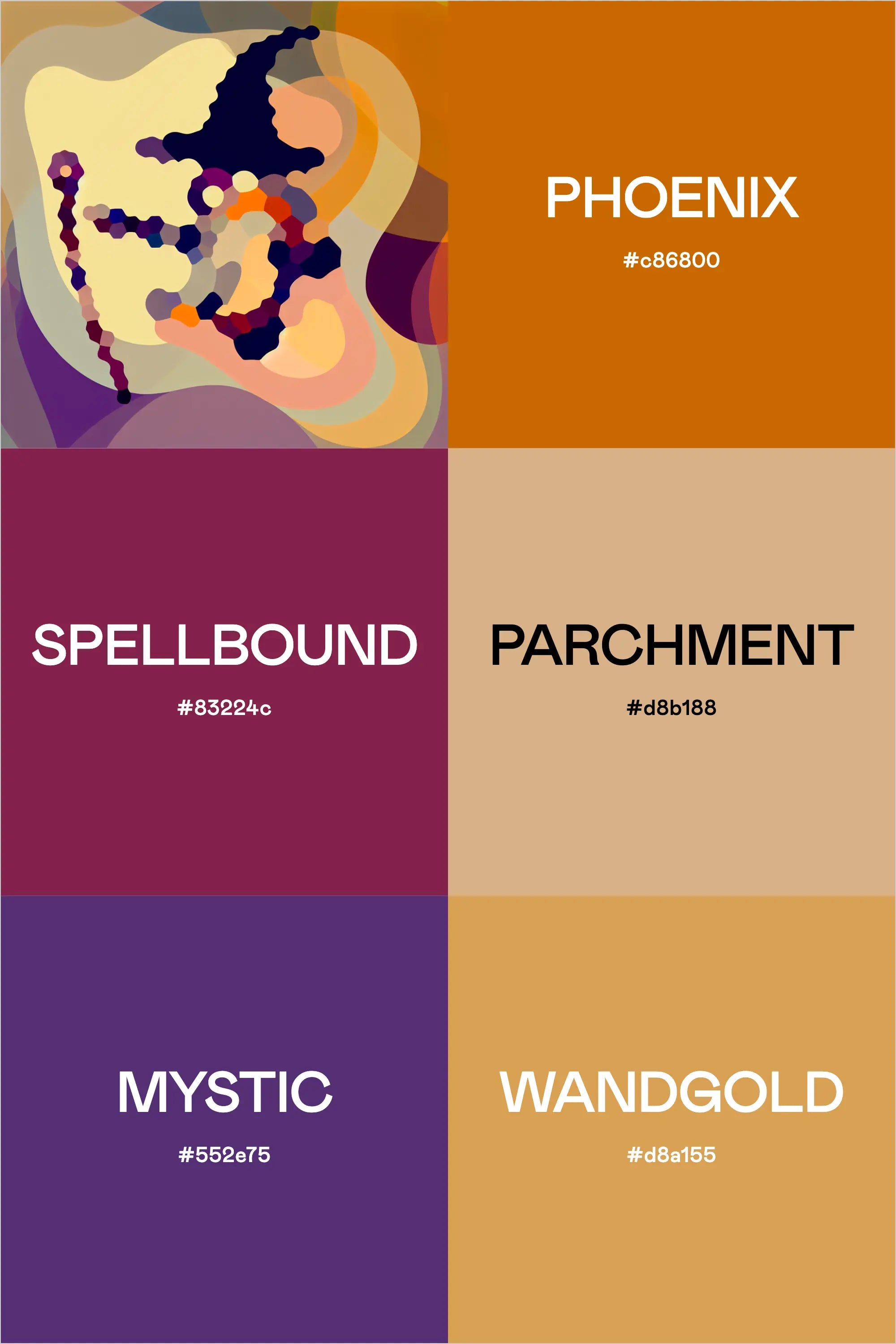
Phoenix (#e86800) blazes brilliantly as a vibrant orange, capturing the fierce energy of magical flames. Like its namesake, it represents transformation and rebirth, adding warmth and vitality to the palette.
Spellbound (#83224c) enchants with a deep magenta that speaks of ancient potions and powerful enchantments. This rich tone adds depth and mystery to any magical brand.
Parchment (#d8b188) provides an aged warmth reminiscent of ancient scrolls and spell books. This neutral tone grounds the more vibrant colors while maintaining the magical atmosphere.
Mystic (#552e75) deepens the palette with a royal purple that speaks of cosmic energy and arcane wisdom. It brings gravity and mystery to the magical mix.
Wandgold (#d8a155) illuminates with a warm, metallic glow that suggests magical artifacts and enchanted implements. It adds a touch of whimsical luxury to the palette.
Strategic Applications
This palette shines in contexts where magic meets modern life:
- Gaming and Entertainment Brands
- Children's Educational Products
- Fantasy Literature Marketing
- Theme Park Attractions
- Magical Retail Experiences
- Interactive Entertainment
- Fantasy Art Galleries
Implementation Strategy
For maximum enchantment:
- Use Phoenix for primary calls-to-action and energy points
- Deploy Spellbound for mysterious accents and depth
- Incorporate Parchment for readable backgrounds and texture
- Apply Mystic for magical emphasis and focus areas
- Reserve Wandgold for special highlights and magical touches
Industry Focus
This palette resonates particularly well with:
- Fantasy Game Developers
- Children's Book Publishers
- Themed Entertainment Venues
- Toy Manufacturers
- Pop Culture Retailers
- Interactive Experience Designers
- Fantasy Art Creators
Building Your Visual System
For Digital Applications:
- Use Parchment for primary backgrounds
- Implement Phoenix for primary buttons and highlights
- Apply Spellbound for important headers
- Utilize Mystic for navigation elements
- Add Wandgold for magical interactions and hover states
For Physical Products:
- Lead with Phoenix for packaging highlights
- Use Spellbound for premium details
- Apply Parchment for base materials
- Incorporate Mystic for deluxe editions
- Feature Wandgold for special edition elements
Design Elements That Complement
This palette pairs magically with:
- Whimsical typography
- Star and crystal motifs
- Magical particle effects
- Geometric spell circles
- Ethereal gradients
- Mystical symbols
- Glowing elements
The Broader Context
This palette communicates essential magical qualities:
- Wonder through its vibrant orange
- Mystery through its deep purple
- History through its parchment tone
- Magic through its metallic gold
- Power through its rich magenta
Crafting Brand Color Palettes with Professional Tools
The process of creating professional color palettes benefits from specialized tools that ensure both aesthetic appeal and functional performance. Using our Color Palette Builder and complementary tools, designers can craft semi-custom color palettes that maintain perfect balance while meeting crucial web accessibility standards.
Strategic Color Development
The Color Palette Builder serves as your foundation for creating professional color palettes, offering built-in formulas that ensure harmony and accessibility. The tool guides you through a systematic process:
- Selection of design style that aligns with brand personality
- Built-in color recipes for foolproof combinations
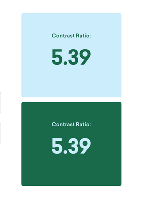
- Automatic contrast checking for WCAG compliance
- High-contrast pairing identification for accessibility
- Color validation across different applications
Each palette created includes strategically selected colors for:
- Primary brand colors that establish core identity
- Secondary accent colors for visual interest
- Supporting neutral tones for balance
- Accessible combinations for digital applications
Visualization and Application
The Brand Visualizer brings your palette to life by showing how colors interact in real-world applications. This step helps identify any potential adjustments before implementation and demonstrates how your palette performs across various design elements:
- Website components and UI elements
- Marketing materials and collateral
- Social media assets
- Brand documentation
Documentation and Guidelines
Use the Brand Guideline Builder to document your color palette with professional precision. This tool helps create comprehensive style guides that include:
- Color codes in multiple formats (HEX, RGB, CMYK)
- Usage guidelines and hierarchy
- Approved color combinations
- Application examples and restrictions
By following this systematic approach with our professional tools, designers can create color palettes that are not only visually striking but also practical and accessible. The integration between tools ensures a smooth workflow from initial concept to final implementation, saving valuable time while maintaining professional standards.
Final Insights
The magic of this palette lies in its ability to bridge the gap between traditional mystical elements and contemporary design sensibilities. It provides a versatile foundation for brands that want to capture the essence of magic while maintaining modern appeal.
For designers and brand strategists, these colors offer an enchanting platform for creating experiences that delight and inspire. Whether crafting digital interfaces or physical products, the palette maintains its charm across all applications, making it perfect for brands that want to add a touch of magic to the modern world.
When building magical brand experiences, these colors work together to create an atmosphere of wonder and possibility, ensuring your brand stands out in a world hungry for enchantment.


