Drawing inspiration from the earth's most precious stones and minerals, this palette combines rich jewel tones with sophisticated neutrals to create a color story that feels both luxurious and grounded in nature. Each color captures the depth and character of its namesake mineral.
The Palette Breakdown
This six-color collection mirrors the diversity of natural stone and mineral formations:
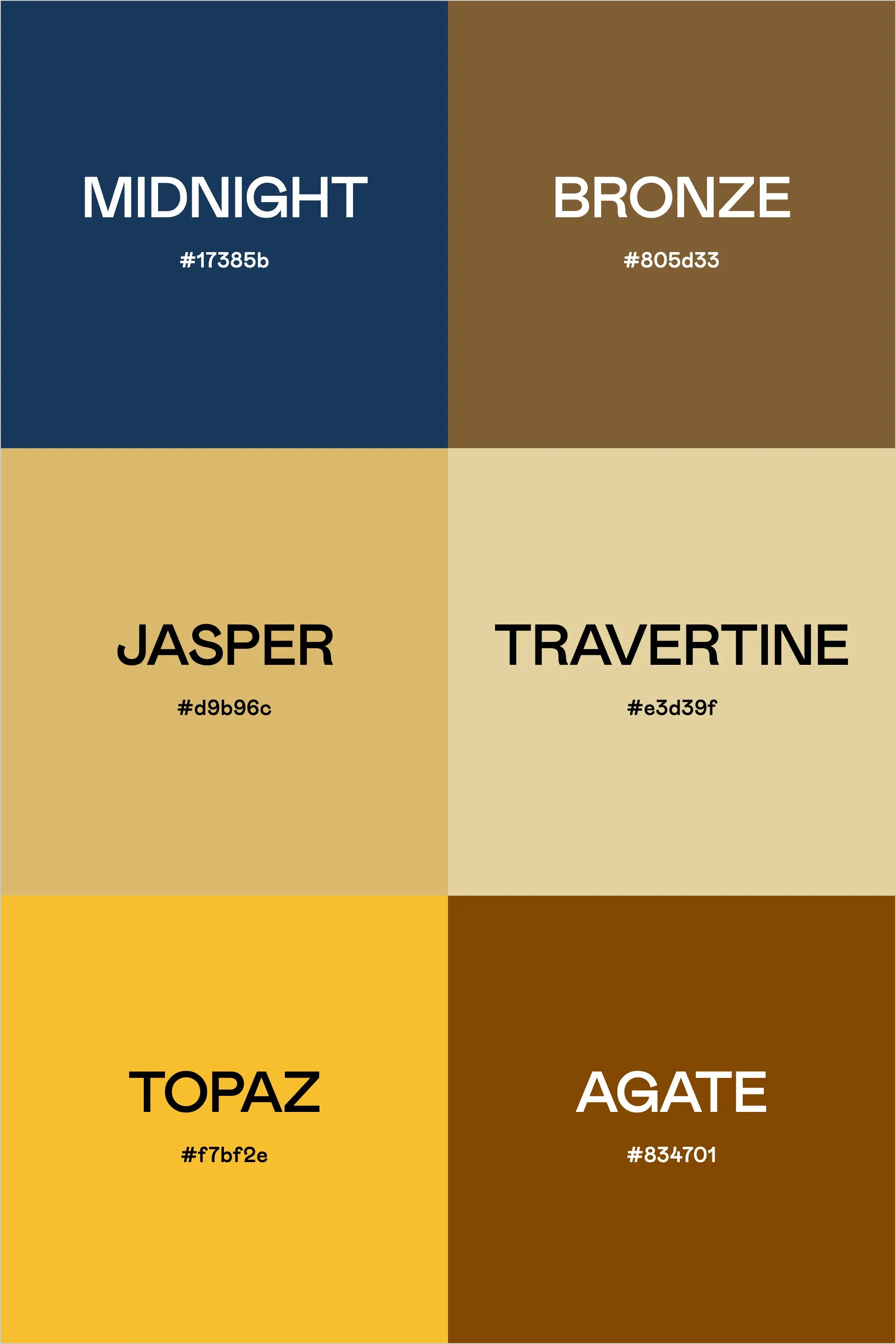
Midnight (#17385b) provides a deep navy foundation, reminiscent of midnight lapis lazuli, while Bronze (#805d33) offers a rich, warm metallic tone. Jasper (#d9b96c) and Travertine (#e3d39f) work together to create a sophisticated neutral base inspired by natural stone formations.
The palette is enriched by Topaz (#f7bf2e), bringing a vibrant golden yellow that recalls the finest Brazilian gemstones, and Agate (#834701), offering a deep amber brown that grounds the collection with its earthy warmth.
Perfect Applications
This palette excels in:
- Luxury Real Estate
- Fine Jewelry Design
- High-End Interior Design
- Architectural Firms
- Premium Retail Brands
- Museum and Gallery Spaces
- Heritage Luxury Brands
Design Strategy Tips
1. Use Midnight for primary brand elements and sophisticated accents
2. Apply Travertine and Jasper as refined neutral backgrounds
3. Employ Topaz sparingly for impactful highlights
4. Layer Bronze and Agate to create rich depth in design elements
Digital Implementation
For digital applications, consider these approaches:
- Use Travertine as a primary background color
- Apply Midnight for navigation and key interactive elements
- Reserve Topaz for important calls-to-action
- Implement Bronze and Agate for sophisticated accent elements
Brand Expression
This palette communicates:
- Natural luxury
- Timeless elegance
- Earthen sophistication
- Premium quality
- Heritage value
- Refined taste
Final Thoughts
The "Stone and Mineral" palette demonstrates how earth's natural elements can inspire sophisticated design. Its combination of deep jewel tones and natural neutrals creates a versatile foundation for brands that want to convey luxury while maintaining a connection to natural beauty.
Ready to Create Your Own Perfect Palette?
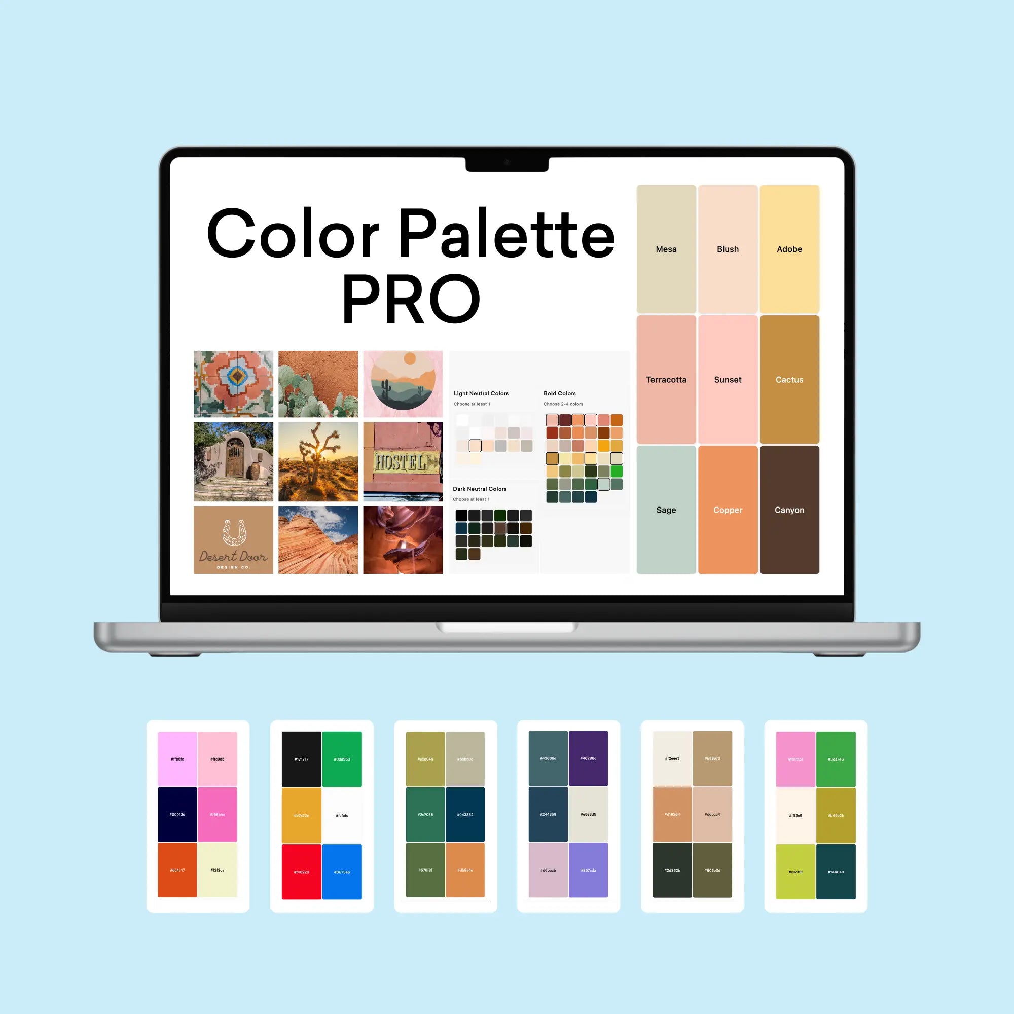
If you're inspired by this mineral-rich palette, you might be wondering how to create similarly effective color combinations for your own projects. That's exactly why I created the Color Palette Builder - a professional tool that helps designers create semi-custom, ready-to-use color palettes in minutes.
With the Color Palette Builder, you can:
- Choose your color palette using distinct design styles, each with its own carefully crafted color formula
- Create unique, professional color combinations that work harmoniously together
- Test your palette combinations instantly
- Export your palettes in multiple formats for client presentations
- Save and revisit your favorite palettes anytime
Ready to revolutionize your color palette creation process? See below to learn more about the Color Palette Builder and start creating professional-grade color palettes today.
Enjoyed this color palette breakdown? Share it with a fellow designer who might find it helpful!

