In a world of vibrant color trends, there's something undeniably powerful about a well-crafted monochromatic palette. This "Steel Grey" collection demonstrates how varying shades of grey can create a sophisticated, versatile brand experience that commands attention through subtlety rather than saturation.
The Palette Composition
This carefully curated collection features six distinct grey tones, each named after metallic elements and finishes:
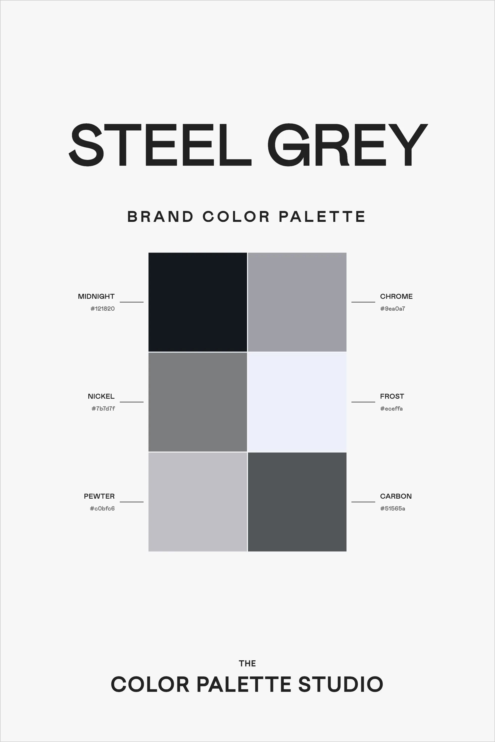
Midnight (#121920) anchors the palette with a deep, almost-black tone that provides dramatic depth. Chrome (#9ea0a7) offers a bright, polished grey that brings a modern, technological feel. Nickel (#7b7d7f) serves as a perfect middle-tone, while Frost (#eceff9) provides an almost-white highlight that adds brightness and contrast.
Rounding out the collection are Pewter (#c0bfc6), offering a softer grey option, and Carbon (#51565e), providing a rich, deep tone that sits between Midnight and Nickel in intensity.
Professional Applications
This palette excels in:
- Architecture and Interior Design
- Technology and Software Interfaces
- Financial Services
- Legal and Professional Services
- Automotive and Industrial Design
- High-End Product Packaging
- Editorial and Publishing Projects
Implementation Strategies
1. Create dynamic layouts by using the full range of tones, from Midnight to Frost, to establish clear visual hierarchies.
2. Use Chrome and Pewter as primary background colors, with darker tones for text and important elements.
3. Employ Frost strategically to highlight key information or create breathing room in dense layouts.
4. Layer multiple tones to create subtle depth and sophistication in digital interfaces.
Digital Design Applications
In digital environments, this palette offers exceptional versatility:
- Use Midnight for primary navigation and footer areas
- Apply Chrome and Nickel for secondary elements and borders
- Utilize Frost for hover states and highlights
- Implement Carbon for secondary text and icons
Brand Expression
This monochromatic palette communicates:
- Unwavering professionalism
- Technical excellence
- Timeless sophistication
- Attention to detail
- Industrial strength
- Modern reliability
Final Thoughts
The "Steel Grey" palette proves that monochromatic doesn't mean monotonous. Through careful selection of tones and thoughtful application, this palette can create designs that are both sophisticated and engaging, perfect for brands that want to project stability, professionalism, and technical excellence.
Ready to Create Your Own Perfect Palette?
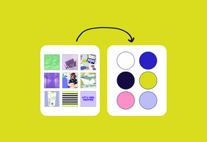
If you're inspired by this sophisticated monochromatic palette, you might be wondering how to create similarly effective color combinations for your own projects. That's exactly why I created the Color Palette Builder - a professional tool that helps designers create semi-custom, ready-to-use color palettes in minutes.
With the Color Palette Builder, you can:
- Choose from 12+ distinct design styles, each with its own carefully crafted color formula
- Create unique, professional color combinations that work harmoniously together
- Test your palette combinations instantly
- Export your palettes in multiple formats for client presentations
- Save and revisit your favorite palettes anytime
Ready to revolutionize your color palette creation process? Check out our tools below and start creating professional-grade color palettes today.
Enjoyed this color palette breakdown? Share it with a fellow designer who might find it helpful!

