
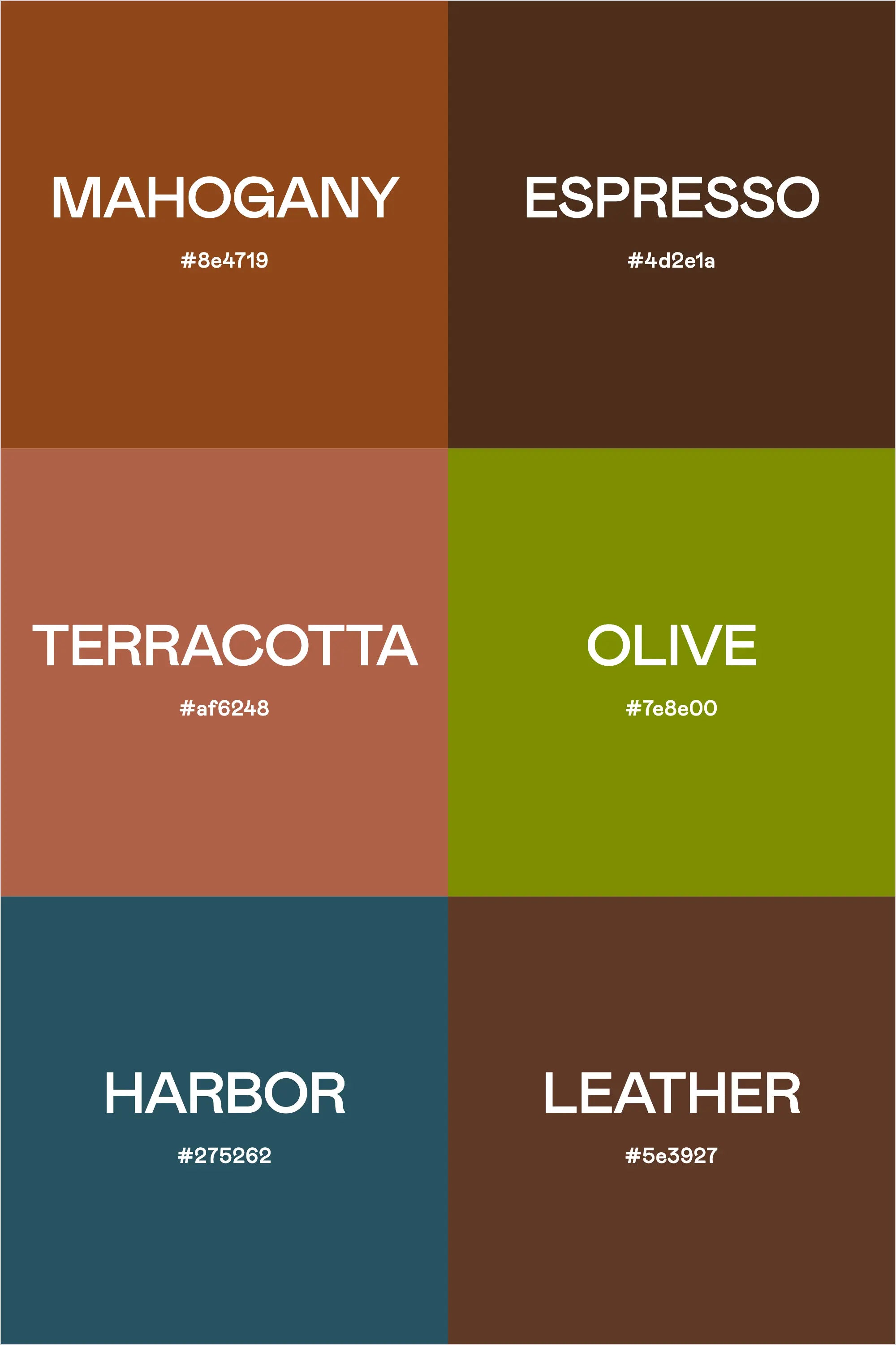
Executive Sophistication: A Professional Palette for Modern Workspaces
3 minute read


FREEBIES
-

Color Buddy Chrome Extension
get the freebieFREE CHROME EXTENSION
A free Google Chrome extension to help keep your color palettes handy at all times.
-

Color Contrast Checker
test your colorsFREE ACCESSIBILITY TOOL
We created a totally free way for you to check the contrast levels of your color combos.
-

Color Palette Cheat Sheet
get the checklistFREE DESIGN CHECKLIST
A graphic designer's 10 simple tips for creating the perfect color palette for your brand.


BEST SELLERS


trusted by 1,000+
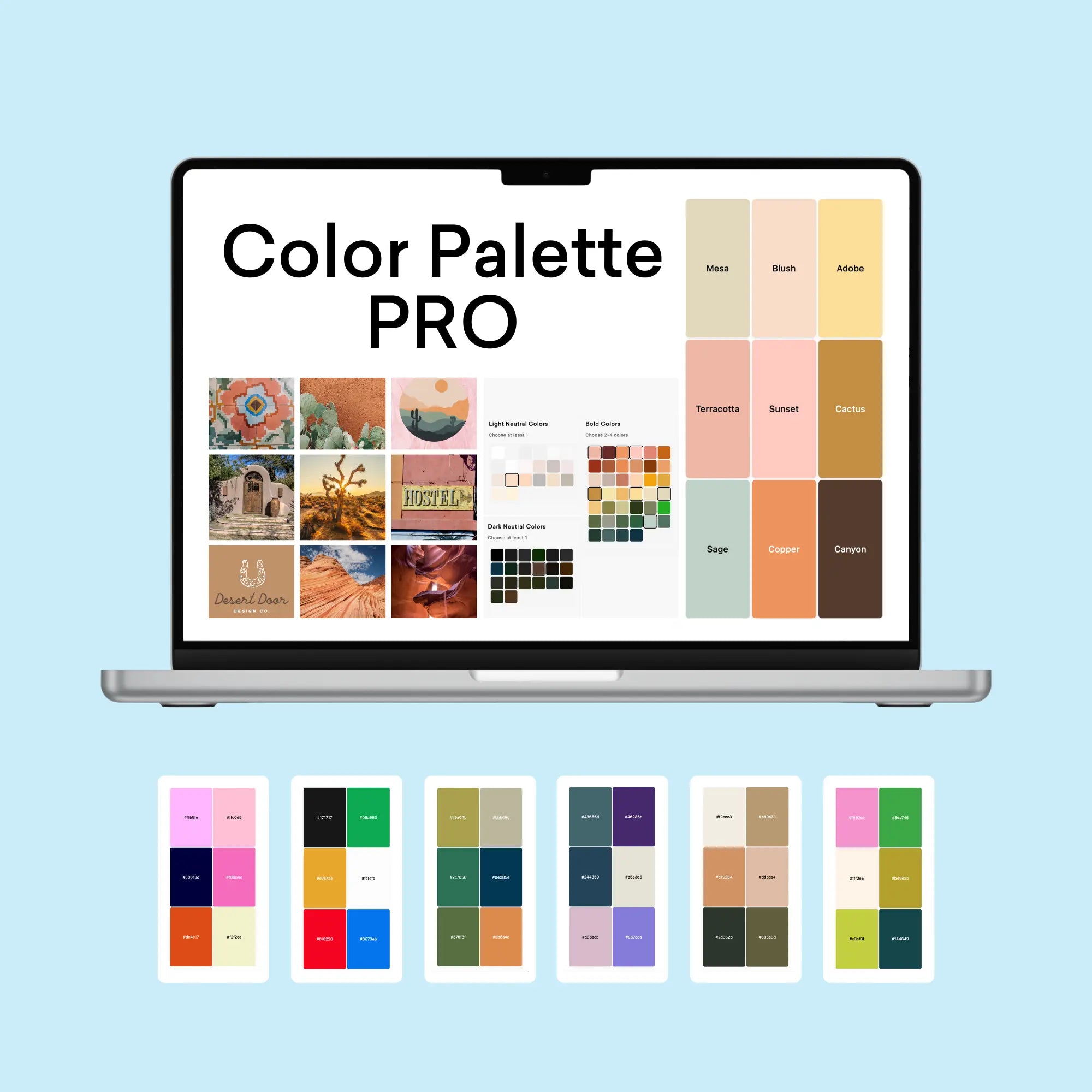
The Color Palette Builder
$97.00
An easy, interactive online tool that helps you create semi-custom, ready-to-use color palettes.