This "Cosmic Ethereal" palette is a quiet, otherworldly mix of pale violet, dusty lilac, misty blue, and deep indigo, inspired by star fog, thin aurora, and the hush of deep space. It feels weightless and a little nocturnal, making it a natural fit for spiritual wellness brands, ritual beauty, jewelry, and editorial work that wants mystery without going neon. The mix stays muted on purpose: Starlight and Opaline do the airy lifting, while Nocturne and Eclipse hold the night.

Who this palette is for
This palette is for designers building brands that should feel mystical, soft, and a little nocturnal: meditation and wellness, crystal or fine jewelry, dreamy beauty, and fashion or editorial with a night-sky mood. It fits quiet luxury and spiritual work. Skip it if the project needs electric energy or bright pastel play.
If you want electric sci-fi space instead of muted night fog, use Color Palette: Nebula.
How to Use This Palette:
- Starlight (#f3eef8) is a pale, cool violet-white—perfect for backgrounds and negative space.
- Opaline (#cdc4dc) is a pearly dusty lilac, ideal for cards, secondary surfaces, and soft UI.
- Aurora (#8ea4c4) is a misty periwinkle-blue that keeps the palette feeling ethereal instead of purely purple—great for links, highlights, and airy type.
- Wisteria (#6e5a88) is a muted plum that carries the cosmic body of the palette—use it for accents, illustrations, and medium contrast.
- Nocturne (#2a2550) is a deep indigo that gives structure—headings, dark panels, and brand marks.
- Eclipse (#0c0a16) is the near-black night sky, perfect for dark mode grounds, bold type, and high-contrast moments.
This palette feels hushed, mystical, and nocturnal, which makes it ideal for brands that want cosmic atmosphere without the electric glow.
Hex Codes:
- Starlight: #f3eef8
- Opaline: #cdc4dc
- Aurora: #8ea4c4
- Wisteria: #6e5a88
- Nocturne: #2a2550
- Eclipse: #0c0a16
Accessibility
These Cosmic Ethereal pairings pass AA (4.5:1) for body text, listed lightest background first.
Eclipse (#0c0a16) on Starlight (#f3eef8) — 17.2
Nocturne (#2a2550) on Starlight (#f3eef8) — 12.4
Wisteria (#6e5a88) on Starlight (#f3eef8) — 5.3
Eclipse (#0c0a16) on Opaline (#cdc4dc) — 11.7
Nocturne (#2a2550) on Opaline (#cdc4dc) — 8.5
Eclipse (#0c0a16) on Aurora (#8ea4c4) — 7.7
Nocturne (#2a2550) on Aurora (#8ea4c4) — 5.6
Wisteria against Opaline, Aurora, or Nocturne is for accents, not small text.
To check another pair, use the Color Contrast Checker.
If you want a palette like this built from a client’s inspiration instead of copied, Color Palette Builder turns that into a brand-ready palette.
GET THE BEST-SELLING TOOL

FREEBIES
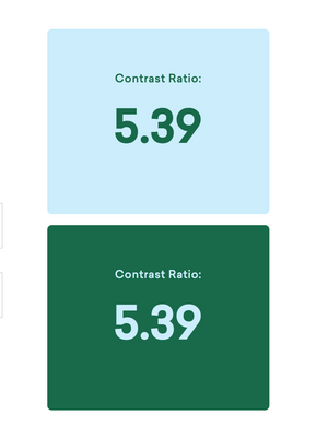
Free Color Contrast Checker
Test your brand colors for website accessibility in 10 seconds 🎨