Color Palette: Nebula

Color Palette: Nebula

Samantha Remboldt

Step into the galactic glow with this "Nebula" color palette! A mix of soft misty whites, electric blues, and deep purples, this palette is perfect for brands that want to feel mystical, futuristic, and bold. Whether you're designing for sci-fi aesthetics, tech startups, or dreamy celestial brands, these colors bring a sense of wonder and cosmic energy.

How to Use This Palette:

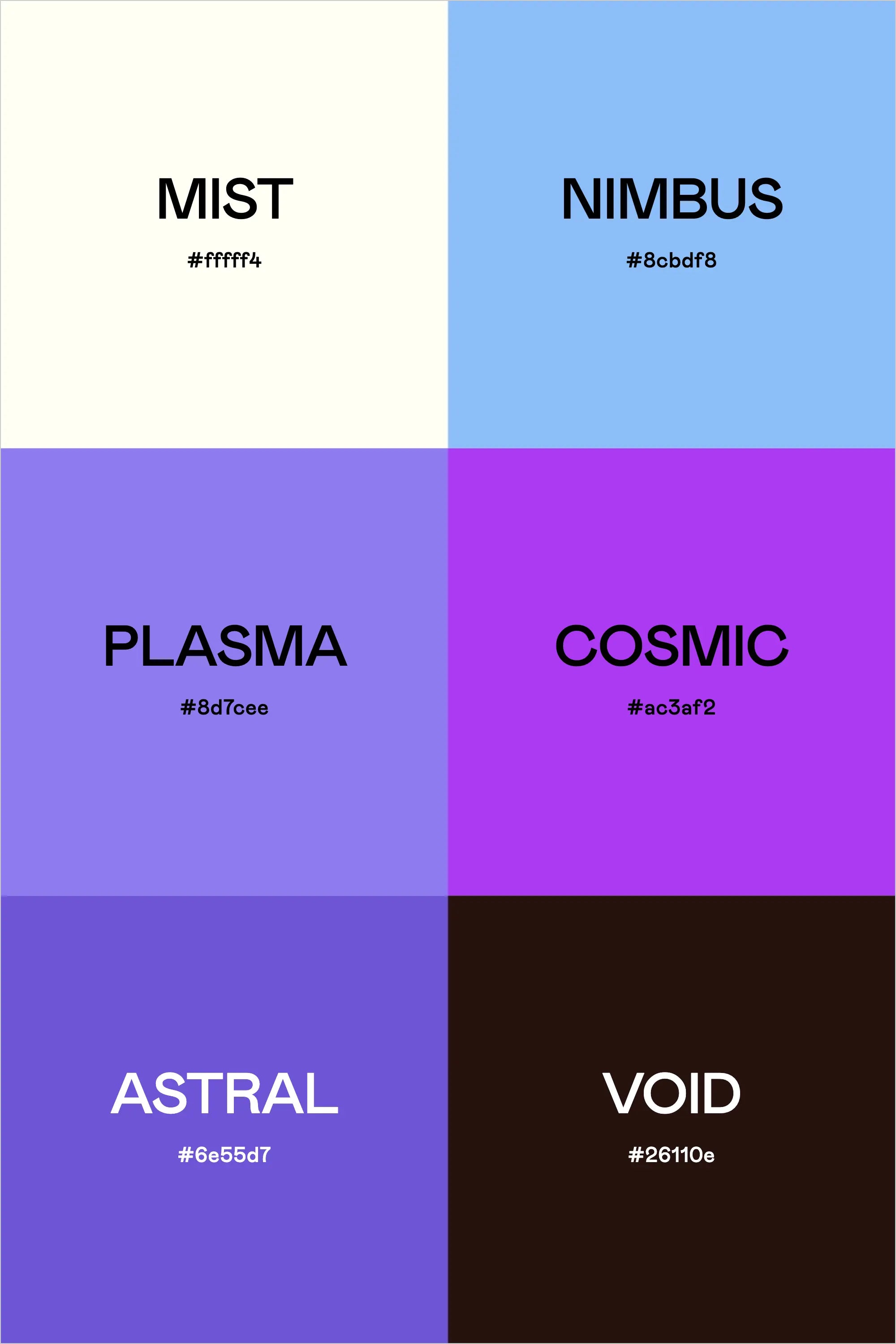
  • Mist (#fffff4) is a soft, ethereal white—great for backgrounds and negative space.
  • Nimbus (#8cbdf8) is a cool sky blue, perfect for UI highlights or branding elements.
  • Plasma (#8d7cee) and Cosmic (#ac3af2) bring an electric glow—use them for accents, buttons, or social media designs.
  • Astral (#6e55d7) is a deep, rich purple that works well for typography and contrast.
  • Void (#26110e) grounds the palette, adding depth and mystery—ideal for dark backgrounds or dramatic design elements.

This palette captures the awe of space and the energy of the unknown, making it perfect for brands that want to feel bold, innovative, and otherworldly.

Hex Codes:

  • Mist: #fffff4
  • Nimbus: #8cbdf8
  • Plasma: #8d7cee
  • Cosmic: #ac3af2
  • Astral: #6e55d7
  • Void: #26110e


Back to blog

★ ★ ★ ★ ★

Say hello to your new favorite color palette tool:

Color Palette PRO

Excellent 4.97 | Trusted by 1,000+ Designers

Create beautiful, brand-ready color palettes in 60 seconds.

Our all‐in‐one tool helps you select, test, and finalize your brand’s perfect palette—without the guesswork.

Get Color Palette PRO

Read the Reviews

"Wow, I love this! It's insanely useful!! From generating themed names to contrast compliance - this tool is so much fun to use and saved me a ton of time."

Customer Reviews

Based on 70 reviews
94%
(66)
4%
(3)
1%
(1)
0%
(0)
0%
(0)
J
Julia B.
SO helpful

This tool has been an amazing addition to my design process. I'm so glad I got it! its such a time saver and it lays everything out really well. I highly recommend it!

M
Megan D.
I'm Obsessed!

I've been a fan of their tools from the beginning, but I've got to say the new Color Palette Pro is the best yet! As a web designer this is the first place I go to take my clients' inspiration and create a palette that's uniquely them, but also meets contrast guidelines. It's so much fun to use I could spend hours just creating amazing palettes. There's so much here, I could go on and on, do yourself a favor and grab this tool!

K
Kelly D.
The Graphic Designer's Best Friend

WOW! This is the best tool and I love using it regularly for branding, graphic design, and web development projects. I highly recommend it to improve your creative process. Bonus: it's super fun to use, too!

I
Ingrid U.
Saves me SO much time and it's fun to use!

I love playing with color and going down the rabbit hole of color psychology and this is so helpful in letting me explore different combinations and good balanced palettes!!

K
Krista H.
new and improved color palette pro

I love the color palette pro! It is so easy to navigate and very intuitive, and it allows you to create a great palette in a few easy steps.