Drawing inspiration from seaside sunsets and coastal landscapes, this expansive twelve-color palette creates a sophisticated journey from deep oceanic blues to warm, golden horizons. Each color has been carefully selected to work both independently and as part of a cohesive whole.
Understanding the Palette
The palette divides naturally into several complementary color stories:
Core Anchors: Midnight (#00000D) provides a true black foundation, while Crystal (#F5FAD2) offers a soft, warm highlight that's gentler than pure white. Nectar (#F49C21) brings a vibrant orange that captures the warmth of golden hour.
Coastal Waters: A beautiful progression of blues tells the story of water's depth - from bright Lagoon (#0EB8D6) to rich Azure (#0D80A5) to deep Ocean (#094A71), finally descending to mysterious Abyss (#0C2043).
Natural Accents: Coral (#E15142) provides vibrant energy, while Honey (#F8CE7C) adds warmth. Sage (#89CEA6) brings a touch of coastal vegetation, complemented by soft Mauve (#826A73) and deep Wine (#792F42) for sophisticated depth.
Strategic Applications
This versatile palette excels in:
- Luxury Travel and Hospitality
- High-End Real Estate
- Resort and Leisure Brands
- Wellness and Spa Services
- Marine and Environmental Organizations
- Upscale Coastal Retail
- Premium Lifestyle Brands
Design Implementation Strategies
1. Use the blues (Lagoon, Azure, Ocean, Abyss) to create depth and hierarchy
2. Employ Nectar and Coral as attention-grabbing accents
3. Utilize Crystal and Honey for light, airy spaces
4. Layer Sage, Mauve, and Wine for sophisticated secondary elements
Digital Applications
For digital environments, consider these approaches:
- Use the blue spectrum for primary navigation and key interfaces
- Apply warmer tones (Nectar, Honey, Coral) for calls-to-action
- Employ Crystal and lighter tones for content areas
- Reserve Midnight and Abyss for areas requiring maximum contrast
Brand Expression
This palette communicates:
- Natural luxury
- Sophisticated escape
- Environmental consciousness
- Premium experience
- Balanced energy
- Coastal refinement
Final Thoughts
This expanded palette offers exceptional versatility while maintaining a cohesive coastal narrative. Its range from deep oceanic blues to warm sunset tones provides designers with a complete toolkit for creating sophisticated, nature-inspired brand experiences.
Ready to Create Your Own Perfect Palette?
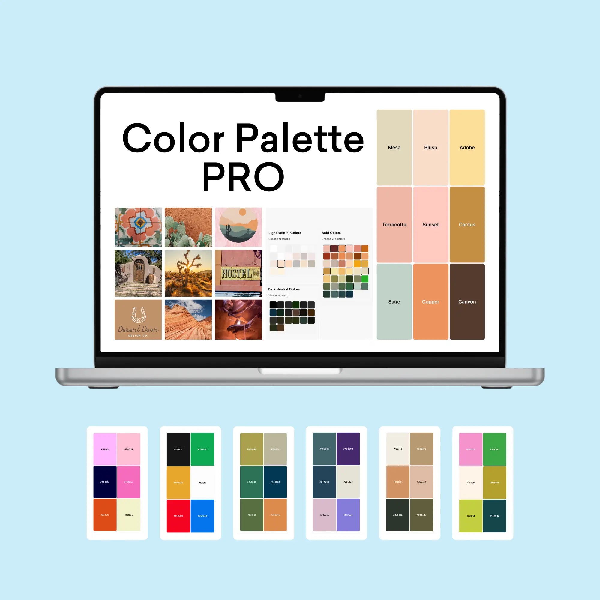
If you're inspired by this expansive coastal palette, you might be wondering how to create similarly effective color combinations for your own projects. That's exactly why I created the Color Palette Builder - a professional tool that helps designers create semi-custom, ready-to-use color palettes in minutes.
With the Color Palette Builder, you can:
- Choose your color palette using distinct design styles, each with its own carefully crafted color formula
- Create unique, professional color combinations that work harmoniously together
- Test your palette combinations instantly
- Export your palettes in multiple formats for client presentations
- Save and revisit your favorite palettes anytime
Ready to revolutionize your color palette creation process? See below to learn more about the Color Palette Builder and start creating professional-grade color palettes today.
Enjoyed this color palette breakdown? Share it with a fellow designer who might find it helpful!


