Discover why going overboard with bright colors in your design palette could be a visual party foul. Learn how to strike the perfect balance to keep your designs eye-catching yet easy on the eyes.
Today, we're diving into a topic that's super relevant for anyone in the realms of design, branding, or even just personal projects that involve choosing colors: Why overly bright colors could be doing more harm than good.
The Magnetic Pull of Bright Colors 🌟
Let's face it, we're all naturally drawn to bright colors. They're like the life of the party in the design world—fun, vibrant, and impossible to ignore. Whether it’s a catchy ad, an eye-popping website, or an Instagrammable mural, bright colors just scream, "Look at me!" And honestly, they do a great job at grabbing our attention.
Brands often leverage this appeal, using bright colors to convey a sense of youthfulness, modernity, or excitement. It's sort of like walking into a room and immediately noticing the person wearing a neon shirt—you can't not look.
The Party Pooper: Over-Brightness 😵💫
However, have you ever been to a party where everyone is loud, and there's no room for a softer conversation? After a while, it can get a bit exhausting, right? The same principle applies to using bright colors, especially in digital design. Staring at a brightly colored screen for too long is the visual equivalent of being at that loud party. Your eyes get tired, you start to feel a bit overwhelmed, and you might even get a headache.
The risk runs higher for people staring at screens all day (yes, I'm talking about you and me both). Overexposure to bright colors can make it more difficult to focus and might even lead to digital eye strain. Not fun.
The Sweet Spot: Balance and Moderation 🎨
So, should we banish bright colors from our designs forever? Absolutely not! Bright colors have a time and a place, and they can be magical when used thoughtfully. The trick is balance. Pair that electric blue with a soothing gray, or that fiery red with a calming cream. It’s all about making sure your brights pop without shouting.
In essence, consider using bright colors for accentuating—think call-to-action buttons, headings, or key messages you want to stand out. Just avoid making your entire interface a rainbow explosion, unless you’re intentionally designing a 24/7 rave (which also sounds exhausting).
Quick Task: Check Your Palette ✅
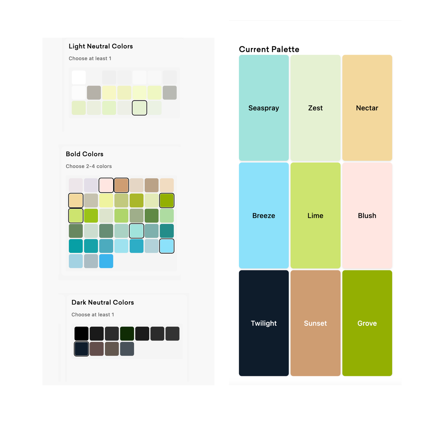
Ready for some practical advice? Open up your current project and take a good look at your color palette. If you find your design is heavily leaning into brights, consider dialing it back a notch. Opt for shades that are easier on the eyes, yet still provide that pop of color you're going for.
You don’t need to be an expert to make these tweaks—most design software has easy-to-use color picker tools. Just move slightly away from the super-saturated end of the spectrum, and you'll find a sweet spot that offers the best of both worlds.
Wrap-Up 🌈
Bright colors are like spices. A little can add a lot of flavor, but dump in the entire jar, and you might just ruin the dish. Use them to garnish, not to overwhelm.
So go ahead, sprinkle in those bright colors, but remember: moderation is key.
Happy designing! 🎨✨

