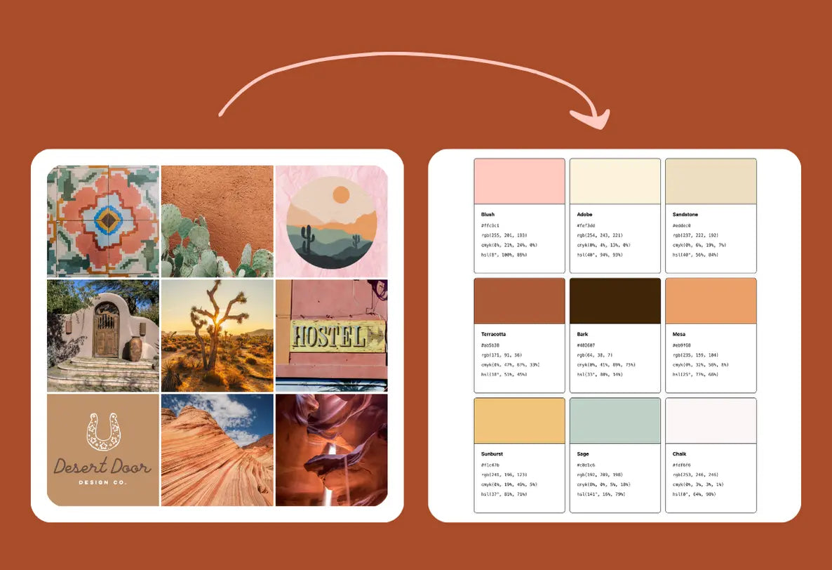
Hey there! I’m Sam, a graphic designer who loves dreaming up fresh color palettes. Today, I’m going to walk you through exactly how I turned a Southwestern-Chic mood board into a fully functional brand color palette—using my favorite tool, Color Palette PRO. Today, I’m channeling all those desert daydreams—rich terracottas, dusty pinks, warm greens, and a dash of sunshine.

1. Gather Your Inspiration
First things first: inspiration hunting. Pinterest is my BFF here (peep my southwestern board for ideas). Look for:
- Desert & Canyon Landscapes: Joshua Tree, Red Rocks, or anything that screams “dry heat but make it chic.”
- Earthy Textures & Patterns: Terracotta pots, crocheted blankets, cacti sketches.
- Dusty Warm Tones: Sandy neutrals, salmon pinks, and subtle mustard notes.
Want access to my Pinterest board? Check out all the inspo pics I saved here.
2. Build a Mood Board
Once you’ve found those images, it’s mood board time! Just drag and drop into your favorite mood board tool. Think about:
- Hero Images: The ones that set the tone—maybe a canyon sunrise or a boho living room.
- Accent Photos: Cactus illustrations, styled shoots with southwestern flair, anything that complements your hero images.
Having it all in one place helps you see the bigger picture and ensures your final palette feels cohesive.

3. Upload Your Mood Board into Color Palette PRO
Here’s where the magic happens. I hopped into Color Palette PRO—our new tool that makes building and refining color palettes a breeze.
Here’s my method:
- Open “Design Styles” (there’s a pre-loaded Southwest Chic option!).
- Generate a Palette and set your palette size (I usually do 6 colors, but you do you).
This step always feels like discovering hidden gems in your photos—so exciting!
4. Lock in Your Favorites & Tweak
Color Palette PRO gives you a shuffle of options, but you can:
- Lock Your Faves: That perfect terracotta? Lock it in.
- Hit “Generate” Again: Let the tool keep surprising you until you find that chef’s kiss combo.
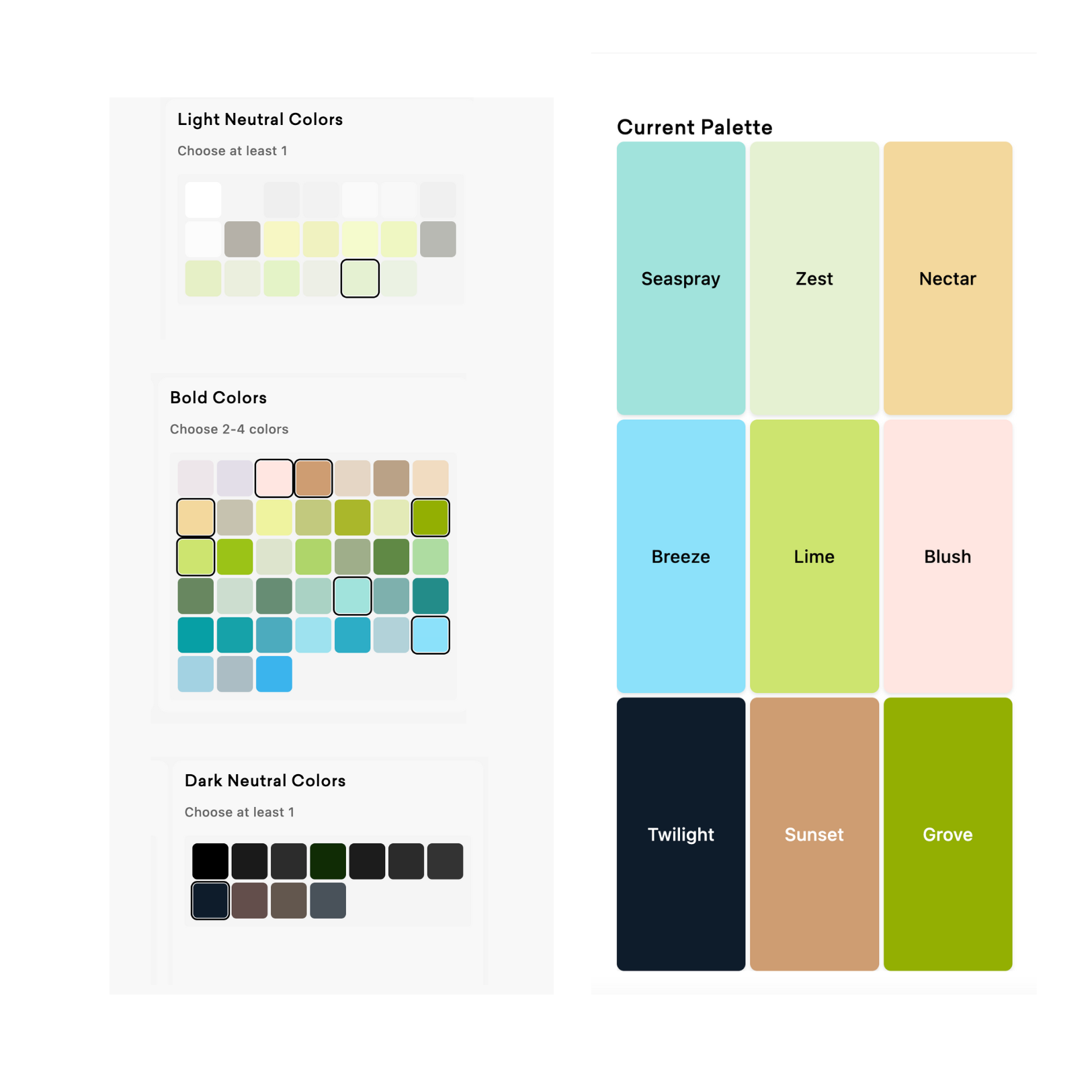
For this design style, I always make sure I have a mix of:
- Warm Neutrals (like sandy beige)
- Bold Pops (a deep rust, maybe a muted sage)
- At Least One Dark Neutral (for text)
Tweak the sliders if you want something slightly more pink, orange, or golden. It’s so easy to customize.

5. Naming Your Colors
Once everything’s locked in, name your colors. Color Palette PRO can auto-generate them, and sometimes it spits out spot-on southwestern references (how cute is “Sunburst” or “Sandstone”?). Or rename them to fit your brand’s personality—whatever sparks your creative joy!

6. Check Your Contrast
Even if your palette looks gorgeous, you’ll want to check accessibility. Color Palette PRO makes that super easy:
- Go to the Contrast Tester tool.
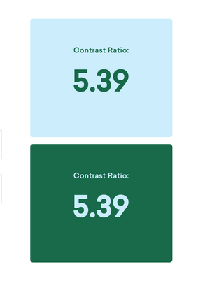
- It shows you text/background pairings and rates them based on contrast scores.
- If you see your palette is mostly low contrast (which can happen with softer, pastel hues), try adding a dark neutral (like charcoal) and light neutral (like a cream or off-white).
- Name those new neutrals (just to keep things cohesive).
This step ensures your brand palette is actually usable for text, headlines, backgrounds, buttons—basically anywhere you need clear readability.

7. Export Your Final Palette
Once you’re satisfied with the colors (and you’ve locked in some high-contrast pairings), save your palette in Color Palette PRO. Then:
- Click Export.
- Select the color code formats you want (I usually go with hex codes and RGB).
- If you like, export the approved color pairings for easy reference in your brand guidelines.
And voilà—you now have a fully fleshed out, accessible brand color palette rooted in that Southwestern Chic vibe!
8. Let Me Know What You Think!
I’m in love with how these warm, desert-y shades came together—makes me want to design a boho café or a yoga retreat brand ASAP.
Your turn:
- What would you create with this Southwestern Chic palette?
- Which color combos are calling your name?
Drop your thoughts below, check out my Pinterest board for more inspo, or give Color Palette PRO a whirl. Can’t wait to see what you come up with, and thanks for stopping by!
Happy designing!

