
Want an ever-evolving color palette? Learn how to create custom color palettes based on seasons, collections, products, holidays, and collaborations.
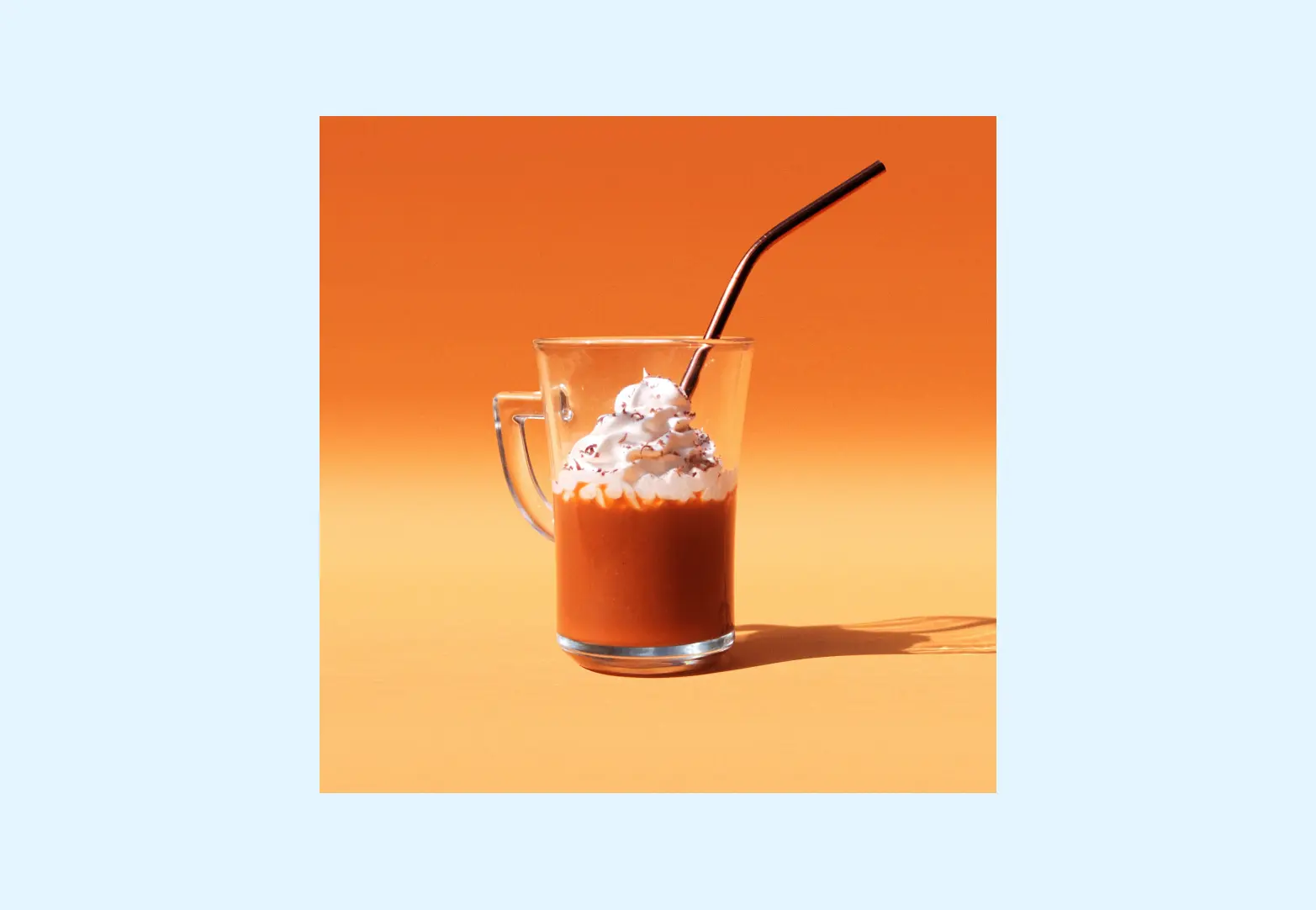
This post was inspired by a recent visit to Starbucks to pick up a Pumpkin Cream Cold Brew.
While I was in Starbucks, I noticed all the subtle ways that they had updated their color palette for the fall season.
- 🤎 The drink menu had a creamy caramel background color.
- 🍁 The cups had a muted, fall palette (think: dusty greens, maroons, terracottas).
- 🎃 The gift cards had pumpkins and rust-colored leaves.
When I got home, I pulled up their brand guidelines (an admittedly creepy move, but I LOVE to creep on big brands’ guidelines). It confirmed something that I knew to be true which is:
Starbucks updates their color palette every single season.

Image Source: https://creative.starbucks.com/color/
And (lucky for you!) it’s a totally repeatable strategy.
If you want to have a color palette that you can update throughout the year, here’s a step-by-step guide:
-
Create a base color palette
-
Choose a structure for your bonus palettes
-
Create your bonus color palettes
1. Create a base color palette
If you want to be able to ‘play’ with your color palette throughout the years/seasons/collections, you’ll want to have a strong base color palette. This should be 5-8 colors that uniquely identify your brand.
Starbucks is a great example to follow: their base color palette has 8 colors: 4 variations of their iconic ‘Starbucks green’, and 4 neutrals (1 black color, 2 beige colors, and 1 white color). These colors work for Starbucks year round.
Here’s a good formula for a base color palette:
- 1 hero color
- 3 variations of that hero color (maybe some lighter tints or darker shades)
- 2-3 simple neutrals (think: black, white, beige, grey, etc.)
2. Choose a structure for your bonus palettes
Now that you’ve created a base color palette, you can have some FUN and start to create some bonus color palettes.
Your first step? Choose a structure for your bonus palettes. Here are some options:
- Seasonal: for brands that want to update their color palettes each season (Examples: Spring, Summer, Fall, Winter)
- Holiday: for brands that want to update their color palettes for each major holiday (Examples: Valentine’s Day, Christmas, Diwali, New Years Eve)
- Product: for brands that want to update their color palettes for each product or collection that they offer (Example: Taylor Swift updating her website color palette based on each album that she’s promoting)
- Events: for brands that want to update their color palette based on specific events or monuments (Examples: Olympics, World Cup, 4th Business Anniversary, etc.)
- Collaboration: for brands that want to update their color palette based on collaborations with other brands, celebrities, or influential figures (Example: Parade creating a red product line based on a collaboration with Coca Cola)
3. Create your bonus color palettes
Now that you’ve created a base color palette and selected a structure for your palettes, you can start to create your first bonus color palette!
Here are some things to keep in mind when you create your bonus color palettes:
- You will still use colors from your base palette, no matter the bonus palette. This helps to ‘anchor’ your brand’s identity.
- Your bonus color palettes can have 1-10 colors.
- Because your base color palette has built-in contrast (with those light + dark neutrals), you don’t really need to worry about contrast with your bonus color palette. Your bonus color palette can be all fun colors! 🙂
This is your graphic-designer approved permission slip to create bonus color palettes. It’s OKAY! You just gotta create your palettes the right (and strategic) way.


