
Color psychology is helpful—but as a brand designer, I care way more about how colors work together to create a vibe (aka: color palette psychology).
Maybe this will get my ‘graphic designer’ card revoked, but I have a hot take when it comes to color psychology.
My hot take? I don’t really spend too much time focused on color psychology (AHHHH why is that so scary to type?).
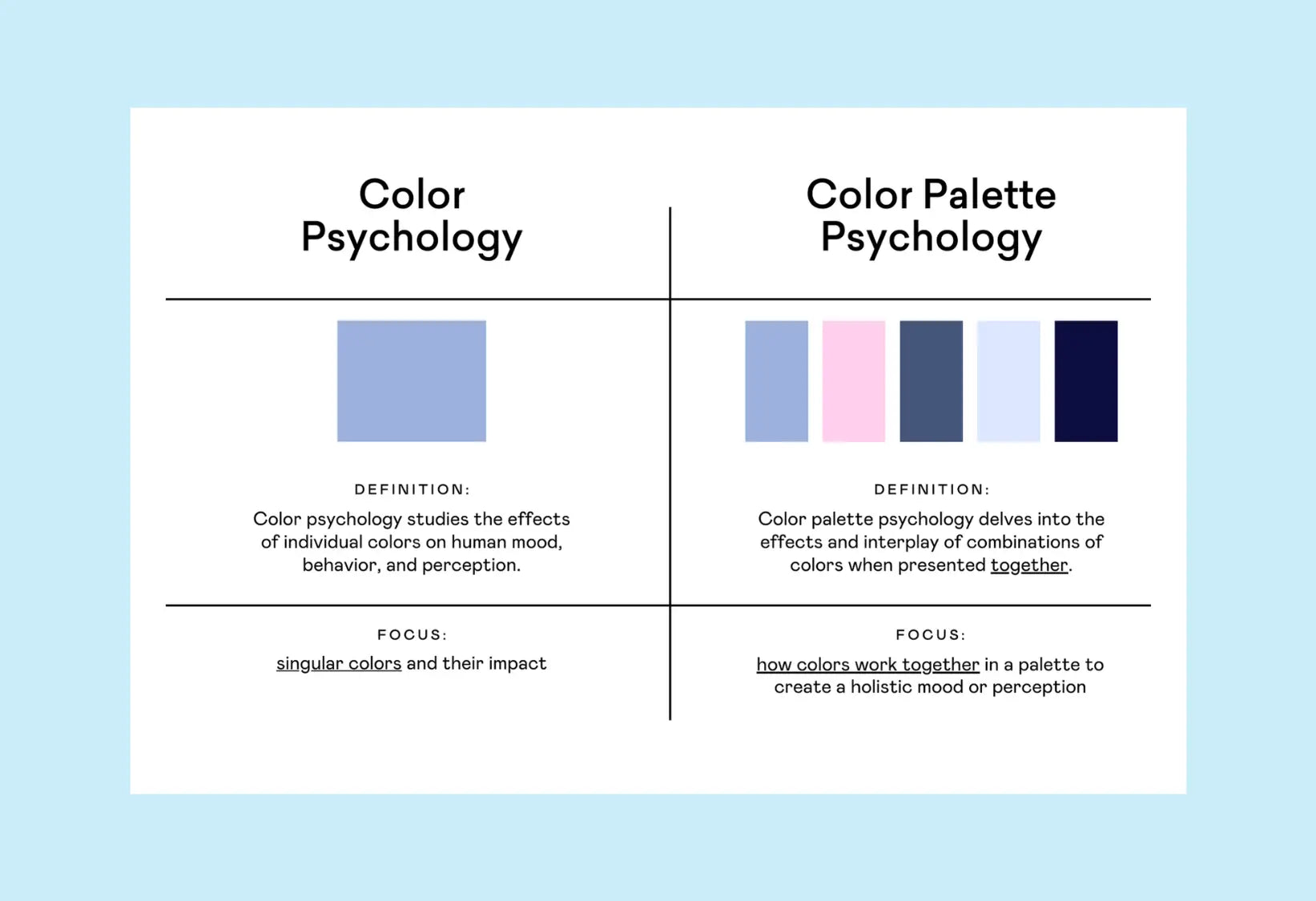
Color Psychology = how individual colors make us feel
Color Palette Psychology = how colors work together in a palette to create a holistic mood or perception
I’m going to show you why I care WAY more about Color Palette Psychology for my branding projects.
The Psychology of Colors
At the beginning of every year, I sent out a survey to my audience to discover which topics they want to learn more about. And the MOST commonly requested topic is color psychology.
This is really interesting to me as a brand designer, because I have a *spicy* take when it comes to color psychology. It matters, but it also doesn’t (hear me out!).
I just don’t think it’s as simple as red = angry or blue = trustworthy. There are complex nuances to color psychology in branding, and I’m going to show you the things that I pay attention to when creating brand palettes (while still absolutely respecting color psychology & all its implications).
These color associations do exist—and they’re super helpful to know—but they’re not the whole story. Context, shade, contrast, and pairing all matter. So instead of memorizing a color cheat sheet, I like to think of this as a starting point.
Color Psychology
Colors make us feel things.
The colors you choose for your brand can, whether you mean to or not, influence how your clients feel. There are overarching psychological implications with colors that extend beyond branding projects.
Here are 3 examples. When you look at each example, take note of how you FEEL (like, your initial gut reaction):


I show these images during my live workshop, and here are the most common responses:
-
Yellow: happy, excited, creative, joyful
-
Red: scared, sexy, alert
-
Blue: calm, peaceful, tranquil, clean
I’ve taught this workshop to thousands of attendees, but the answers are pretty much the same. So there is *absolutely* truth to the fact that individual colors make us feel things, whether we want them to or not.

The Psychology of Common Colors
Let’s break down some of the most widely used colors and their general psychological vibes. These aren’t hard rules—but they are helpful to keep in mind when you’re building out your brand identity.
Take what works. Leave what doesn’t. Your brand gets to break the rules if it does so with intention.
🔴 Red
Big emotions. Red is intense—it’s passion, power, urgency, heat. It can make your heart beat faster (literally). Depending on the context, it can feel dangerous, romantic, or fiery. Too much of it can be overwhelming, but when used right? Red demands attention.
🟠 Orange
Orange is like your fun, extroverted friend who’s always down for an adventure. It’s energetic, playful, and inviting—without the “in your face” intensity of red. It’s great for brands that want to feel warm, confident, and approachable.
🟡 Yellow
You cannot not feel something when you see yellow. It’s bright, bold, happy, and high-energy. Yellow grabs attention and brings sunshine-y vibes—but if you overdo it, it can veer into chaotic real fast. Use intentionally for max impact.
🟢 Green
Nature, balance, health, and calm. Green is grounding. It’s often tied to growth, money, or wellness—but it can also bring a sense of stability and harmony. Different shades of green tell totally different stories (lime green ≠ forest green, and we know it).
🔵 Blue
The trust color. Blue is calm, cool, and collected. It’s one of the most universally liked colors, which is why you’ll see it used in a lot of industries (especially finance, tech, and healthcare). Lighter blues = airy and relaxing. Darker blues = stable and serious.
🟣 Purple
Purple gives luxury meets magic. It’s creative, a little nostalgic, and historically linked to royalty. It can feel elevated or playful depending on the shade, but either way—it’s got personality. A great color to reach for if you want to feel a little extra.
🩷 Pink
Pink can be soft and romantic or bold and rebellious—it totally depends on how you use it. Light pinks often feel gentle and feminine. Hot pinks? Full of energy and fun. There’s a lot of range here, and that’s what makes pink so powerful.
🤎 Brown
Earthy and grounded. Brown feels warm, honest, and natural. It’s a solid choice for brands that want to feel organic, rustic, or down-to-earth. It’s also super underrated when it comes to adding softness or richness to a palette.
⚪ White
Clean, minimal, pure. White is technically the absence of color, but it still says something—it creates space, simplicity, and clarity. It’s often used as a background or neutral, but when used intentionally, it can be incredibly powerful.
⚫ Black
Black is timeless. It’s confident, bold, elevated, and dramatic. It adds weight and contrast to any palette—and is especially good for luxury, editorial, or edgy brands. Use it to create contrast, sophistication, or that “don’t mess with me” energy.
⚫ Grey
Quiet power. Grey is neutral, conservative, and professional. It doesn’t ask for attention, but it brings a sense of maturity and balance. It can feel moody or minimalist, depending on the other colors it’s paired with.
Keep in mind: color psychology is a piece of the puzzle—not the whole picture. It’s not about finding the “right” color… It's about finding the right vibe for your brand story. And that’s where color palette psychology really starts to shine. (More on that in the next section 👀)
Color Psychology Hot Takes
Hot take #1: Colors are complicated
Let’s be real—“green” isn’t just one color. Lime green is full of energy. Emerald green feels regal & elegant. Throw mint, olive, and seafoam into the mix, and suddenly you realize: labeling green as simply “natural” is way too basic.

Context, shade, pairing, contrast—all these little details can flip your color’s mood entirely. That’s why it’s more productive to think about how colors interact together rather than relying on a one-size-fits-all label like “green equals natural.” If color psychology were as simple as picking a single color and calling it a day, my job would be a whole lot easier (but honestly, a lot less fun).
Hot take #2: For brands, we use palettes (not individual colors)
Color psychology focuses on singular colors and their impact.
But, as a brand designer, I know this isn’t how we use colors in real life.
For brands, we build brand color palettes, which is a collection of colors that work together.
So, color psychology is important. Don’t get me wrong. BUT I think there’s another type of psychology that matters even more….
Color Palette Psychology
Where color psychology focuses on individual hues, color palette psychology delves into the effects and interplay of combinations of colors when presented together.
The focus of Color Palette Psychology is how colors work together in a palette to create a holistic mood or perception.

Let’s look at a few examples of color palettes. Just like before- think about how each palette makes you FEEL:


I show these images during my live workshop, and here are the most common responses:
-
Palette #1: clean, relaxed, zen, calm
-
Palette #2: creative, playful, fun, youthful
Thousands of workshop attendees, and the responses are pretty universal.
My favorite *big reveal* moment? The shade of light blue in the palettes is the EXACT same. And it’s the same light blue from the ‘color psychology’ slide earlier. So this shade of blue can make people feel calm, relaxed, tranquil- but it can also make people feel fun, youthful, and playful if it’s combined with OTHER colors that invoke that energy.
This! This is why it’s more important (in my opinion) to focus on Color Palette Psychology.
When we work with brands, we’re focusing on how all the colors work together. So, the psychological impacts of the colors should be treated with the same holistic energy.
Which Matters More in Branding: Color Psychology or Color Palette Psychology?
We should focus on the psychological effects of the WHOLE palette, not just individual colors. This means focusing on Color Palette Psychology and analyzing the vibes of the *entire* palette (not just individual colors).
The great news is that you can use Color Psychology to research the implications of individual colors, but you should also keep in mind that color combos = more important for brand projects.
Conclusion
Color psychology is a helpful starting point, but context matters.
Color palette psychology emphasizes the synergy of multiple colors.
Brand designers should keep the overall vibe in mind, not just isolated hues.
My favorite tools & resources
There are some GREAT resources out there that can help you build your brand color palettes. Here are a few that we’ve created to help you:
-
Color Psychology Cheat Sheet: download this cheat sheet to keep handy!
-
Color Contrast Checker: a totally free contrast checker tool that you can use to test your brand colors for contrast OR generate new, accessible color pairings. Remember: you want your text + background color combinations to have contrast scores of 4.5+ to ensure AA accessibility.
-
Color Palette PRO: Our all‐in‐one tool helps you select, test, and finalize your brand’s perfect palette—without the guesswork. Includes Smart Color Formulas™, a color name generator, built-in accessibility tester, and more!


