Are you looking to make your brand stand out and connect emotionally with your audience? Bright color palettes for branding are a powerful way to grab attention and convey energy, warmth, and positivity. When thoughtfully applied, warm tones like reds, oranges, and yellows can create a dynamic and welcoming brand identity that resonates deeply with customers. This complete guide will help you understand how to use bright and warm color palettes effectively in brand design, ensuring your brand colors tell the right story and leave a lasting impression.
Understanding Bright Color Palettes for Branding
What Makes a Color Palette Bright and Warm?
Bright color palettes for branding focus on vivid, high-energy shades that evoke feelings of excitement and friendliness. Warm tones typically include colors such as red, orange, yellow, and sometimes coral or gold, which are associated with warmth, enthusiasm, and optimism. These colors naturally draw the eye and create a feeling of approachability and passion.
Why Warm Tones Work for Brand Design
Warm tones have a unique role in brand design because they can evoke emotions like comfort, happiness, and motivation. Brands that incorporate warm and bright color palettes often appear more vibrant and engaging, making them perfect for industries centered around creativity, food, health, lifestyle, and entertainment. Using these colors strategically helps you build a personality-packed brand that attracts the right audience.
Choosing the Right Warm Color Palette for Your Brand
Consider Your Brand’s Personality and Audience
Before settling on a bright and warm color palette, ask yourself what emotions you want your brand to evoke. Is your brand bold and adventurous, or friendly and approachable? Are you targeting a youthful audience or professionals? Your color choices should support your brand’s core message and appeal to your ideal customers.
Mixing and Matching Brand Color Palettes
Warm tones can be combined in various ways to create a balanced color palette. Consider using one dominant bright warm color coupled with complementary neutrals or accent colors to avoid overwhelming your audience. For example, pairing a fiery red with soft beige or warm gray can soften the overall look while maintaining vibrancy.
Key Elements to Build a Vibrant Brand Color Palette
Core Colors and Supporting Shades
- Primary Color: The main brand color that conveys your brand’s personality.
- Secondary Colors: Complementary or analogous warm tones that enhance the primary color.
- Accent Colors: Bright pops of color used sparingly for emphasis or call-to-actions.
- Neutral Colors: Balanced shades like cream, tan, or soft gray to ground the palette.
Applying the 60-30-10 Rule
A popular design guideline, the 60-30-10 rule, is helpful for structuring your brand color palette. Use 60% of a dominant warm color, 30% secondary colors, and 10% accent colors to create harmony that feels natural but exciting. This approach keeps your branding consistent and visually appealing across various platforms.
Practical Tips for Using Bright and Warm Tones in Brand Design
Keep Legibility and Accessibility in Mind
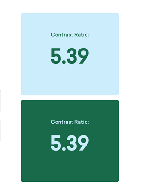
While warm tones are eye-catching, it is vital to maintain text readability and accessibility. Use dark or neutral colors for text on bright backgrounds, and ensure sufficient contrast so your message is clear to all viewers, including those with visual impairments.
Integrate Warm Color Palettes Across Brand Touchpoints
Consistency is key to effective brand recognition. Apply your warm color palette to logos, websites, packaging, social media graphics, and marketing materials. This cohesive use of color creates a memorable experience that reinforces your brand’s identity every time.
For an easy start, consider exploring thoughtfully curated color palette kits designed specifically for vibrant and warm brand design to avoid guesswork and ensure your brand colors harmonize well.
Common Mistakes to Avoid When Using Bright and Warm Brand Color Palettes
Overusing Bold Colors
Too much brightness can overwhelm your audience and dilute your brand message. Avoid saturating every design element with warm hues; instead, strategically place accents to highlight the most important features.
Neglecting Color Meaning and Cultural Context
Colors carry different meanings worldwide. When targeting a global audience, research how warm tones are perceived to prevent miscommunication or cultural insensitivity. Context matters for creating authentic connections with your audience.
Inspiring Examples of Warm Color Palettes in Brand Design
Vibrant and Playful Brands
Brands in the food and entertainment industries often use bold reds, oranges, and yellows to spark appetite and excitement. Think of how fast-food chains harness these colors to boost energy and immediate recognition.
Elegant and Energetic Brands
Luxury and lifestyle brands sometimes blend warm tones with refined neutrals to balance energy with sophistication. This can create a sense of warmth while maintaining a premium feel.
How to Find and Create Your Perfect Warm Color Palette
Use Inspiration from Nature and Art
Warm tones can be inspired by sunsets, autumn leaves, and vibrant flowers. These natural palettes offer harmonious color groupings that feel inherently balanced and inviting.
Explore Professional Tools and Kits
Leveraging expert-curated resources like the bright and warm color palette collection can speed up your design process, providing ready-to-use harmonized options that fit warm branding perfectly.
Bright color palettes for branding are a dynamic tool to help your brand stand out with energy, warmth, and personality. By understanding how to select, balance, and apply warm tones effectively, you can craft a brand identity that captivates and connects. Whether you’re starting fresh or refreshing your current palette, explore vibrant combinations and leverage professional resources to create a cohesive and compelling brand design that truly sings.