
Color palette & font pairings for a warm, nostalgic, cozy brand.
Welcome to ‘Brand in a Box': a weekly drop where I create a fictional brand & give you….
-
custom color palette & font pairings
-
my reasons behind those choices
-
a website mockup so you can see HOW those elements come together (your most-requested feature!)
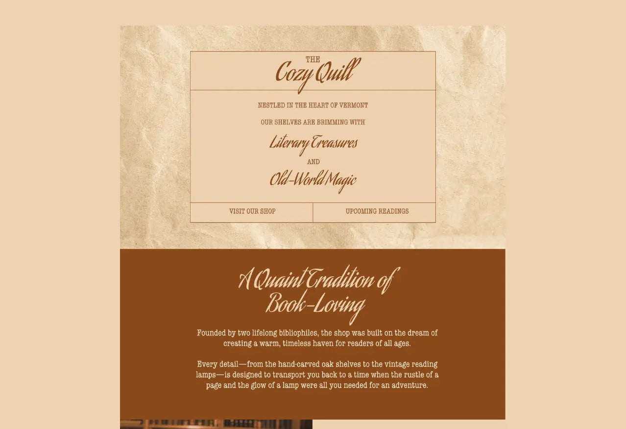
This week's fictional brand is The Cozy Quill: an antique bookshop based in Foxglove Hills, Vermont. I wanted this brand to feel full of old-world magic and quant traditions.
This was a really interesting brand for a few reasons:
1- The heading font is a FREE Google font
2- I didn't purchase any graphics or illustrations
3- I only used 2 colors in the brand palette
Let this be a reminder that simple, clean branding can still send a strong message. Instead of including a bunch of imagery or premium graphics, I leaned on clean, thin lines and free paper textures.
These fonts and colors are perfect for brands that...
- lean into a warm, old-world vibe
- want to embrace the 'dark academia' aesthetic
- prioritize coziness, nostalgia, and community

The Fonts:
The heading font for this brand is a FREE Google font (love that)- Aguafina. I love how it feels like it's actually written with ink + quill, perfect for the name of this brand!
- heading font: Aguafina (free Google font!)
- body font: ITC American Typewriter (available on Canva Pro!)
The Colors:
For the first time, I only used 2 brand colors: a light neutral and a dark neutral. I made sure I had high contrast, and kept it super simple. Remember- your palettes don't have to be huge to be beautiful!
The Graphics:
I searched 'paper textures' and found these free ones on Canva. Not only were they a great, warm color match to my brand colors, but they also gave a bit of texture & grit to this website mockup.
The Website Mockup:


