Like a city park at dawn, this palette captures the interplay between natural elements and urban sophistication. The combination of varied greens with misty neutrals creates a color story that feels both organic and refined, perfect for designs that bridge the natural and constructed world.
The Palette Breakdown
This six-color collection tells the story of an urban green space through carefully selected tones:
Grove (#63733d) and Meadow (#81915c) provide two distinct green tones that mirror the varied foliage of cultivated parkland. Moss (#3f4130) adds a deeper, earthier green, while Asphalt (#161a14) offers a nearly-black green that grounds the palette.
The collection is balanced by two sophisticated neutrals: Mist (#eef0f4) brings an airy lightness, while Stone (#a8acb9) provides a cool, structural gray that references urban architecture.
Perfect Applications
This palette excels in:
- Architecture and Urban Planning
- Sustainable Design Projects
- Landscape Architecture
- Environmental Consulting
- Modern Home and Garden
- Eco-Friendly Products
Design Strategy Tips
1. Use Asphalt for primary text and key design elements
2. Layer Grove and Meadow to create natural depth in primary brand elements
3. Apply Mist and Stone for backgrounds and supporting elements
4. Employ Moss as a sophisticated alternative to black
Digital Implementation
For digital applications, consider these approaches:
- Use Mist as your primary background color
- Apply Grove and Meadow for primary navigation and important sections
- Implement Stone for secondary elements and borders
- Reserve Asphalt for key text and calls-to-action
Brand Expression
This palette communicates:
- Urban sophistication
- Environmental consciousness
- Refined naturalism
- Modern sustainability
- Structural elegance
- Organic luxury
Final Thoughts
The "Urban Park" palette masterfully balances natural elements with contemporary sophistication. It's perfect for brands that want to convey environmental consciousness while maintaining a modern, urban edge.
Ready to Create Your Own Perfect Palette?
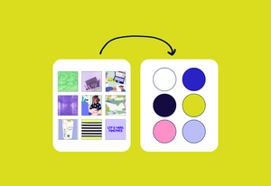
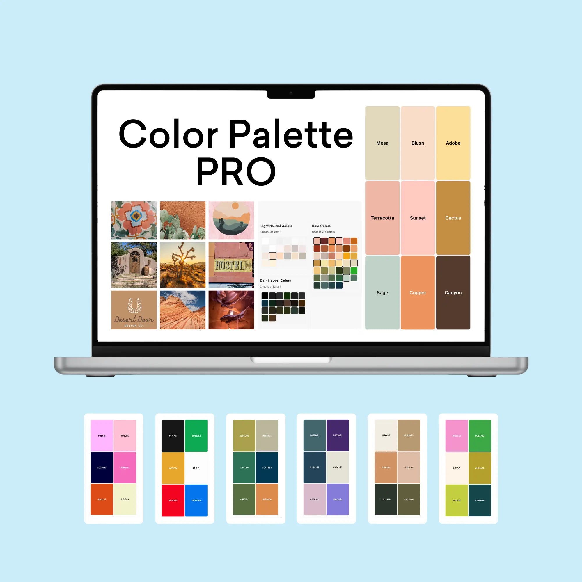
If you're inspired by this sophisticated nature-meets-city palette, you might be wondering how to create similarly effective color combinations for your own projects. That's exactly why I created the Color Palette Builder - a professional tool that helps designers create semi-custom, ready-to-use color palettes in minutes.
With the Color Palette Builder, you can:
- Choose your color palette using distinct design styles, each with its own carefully crafted color formula
- Create unique, professional color combinations that work harmoniously together
- Test your palette combinations instantly
- Export your palettes in multiple formats for client presentations
- Save and revisit your favorite palettes anytime
Ready to revolutionize your color palette creation process? See below to learn more about the Color Palette Builder and start creating professional-grade color palettes today.
Enjoyed this color palette breakdown? Share it with a fellow designer who might find it helpful!


