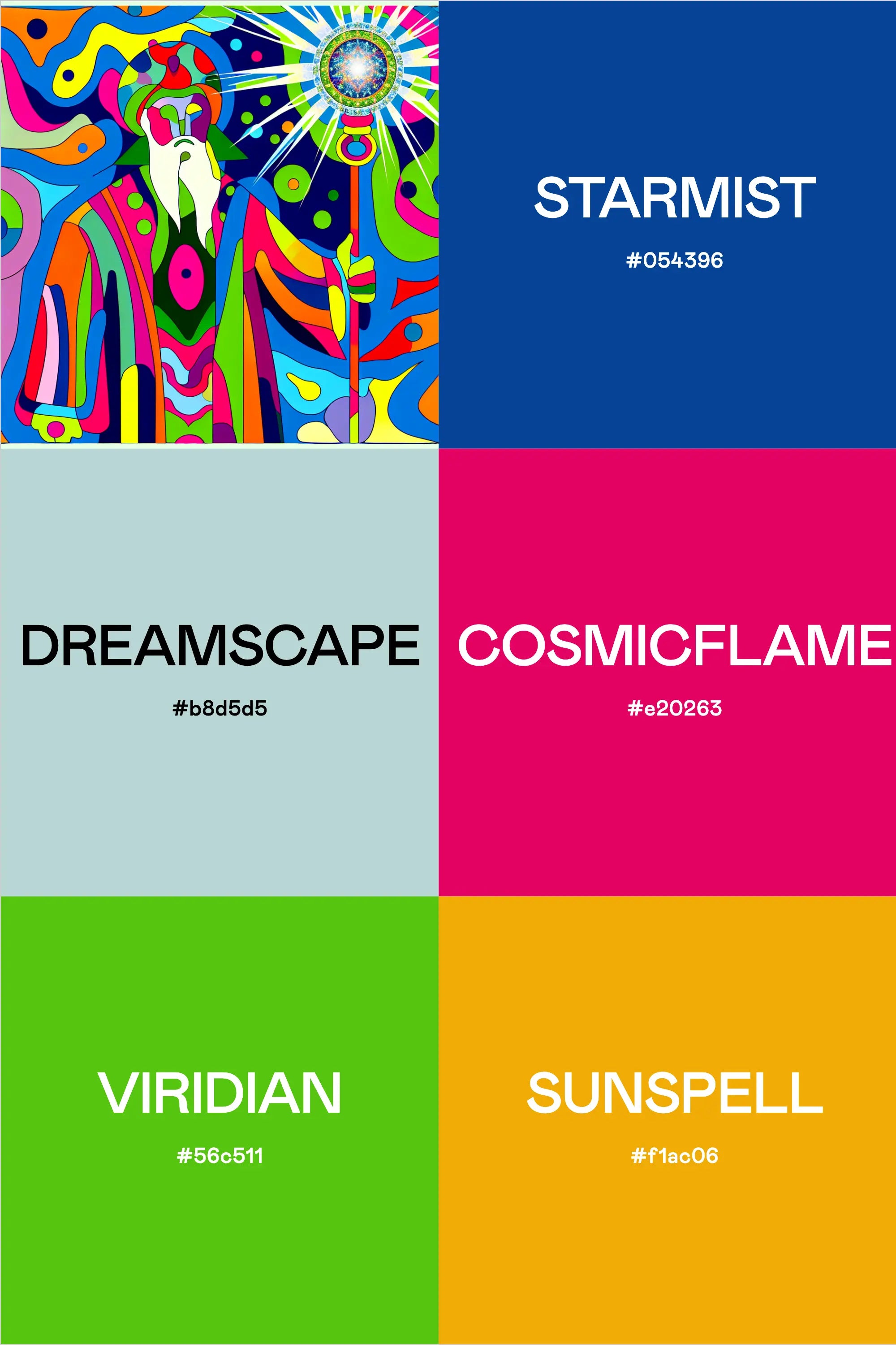
Step into a world where 1960s psychedelia meets mystical wisdom through this mind-bending color palette. Inspired by the era of acid rock posters and magical grimoires, this combination creates an otherworldly experience that's perfect for brands looking to tap into both ancient wisdom and modern counter-culture.
The Colors of Consciousness
Like a wizard's most potent potion, this palette mixes together colors that create visual alchemy:
- Starmist (#054396) - A deep, cosmic blue reminiscent of starlit wizard robes and midnight rituals
- Dreamscape (#b8d5d5) - A misty, ethereal tone that captures the space between reality and dreams
- Cosmicflame (#e20263) - A pulsing magenta that channels the electric energy of 60s rock posters
- Viridian (#56c511) - An electric green that speaks to both natural magic and psychedelic visions
- Sunspell (#f1ac06) - A golden orange that radiates the warmth of ancient magical knowledge
Where Mysticism Meets Movement
This palette draws direct inspiration from the visual language of both the psychedelic movement and mystical traditions. Think concert posters from the Summer of Love meets illuminated manuscripts, but reimagined for the digital age. The combination creates an intense visual experience that's perfect for brands looking to tap into alternative spirituality, counter-culture authenticity, or mind-expanding experiences.
Perfect Applications
This psychedelic wizard palette finds its power in:
- Modern mystical brands and tarot apps
- Music festival branding and merchandise
- Alternative healing and spiritual practices
- Immersive digital experiences and VR environments
- Independent music labels and artists
- Modern occult bookstores and supplies
- Psychedelic research and wellness centers
Design Principles for Psychedelic Magic
When working with such a powerful palette, consider these guiding principles:
- Embrace fluid, organic shapes that allow colors to flow into each other
- Consider optical effects and color vibration between adjacent hues
- Use pattern and repetition to create mesmerizing effects
- Don't fear unusual color combinations - that's where the magic happens
- Balance intense colors with moments of visual rest
Implementation Strategies
For designers ready to harness these mystical hues:
- Create dynamic gradients between colors for spell-binding effects
- Layer colors with varying opacity to create new magical combinations
- Use black or white detail work to define and contain the psychedelic energy
- Consider how colors will shift and move in digital animations
The Renaissance of Psychedelic Design
As society embraces alternative wellness and spiritual practices, we're seeing a resurgence of psychedelic design principles. This palette sits at the intersection of ancient wisdom and modern exploration, making it particularly relevant for brands looking to push boundaries while maintaining a connection to spiritual traditions.
Practical Magic
While this palette might seem intense for traditional applications, its true power lies in its ability to create memorable brand experiences. The key is understanding how to harness its energy while maintaining clear communication and purpose.
Final Incantation
This isn't just a color palette – it's a portal to another dimension of design possibility. Whether you're creating digital experiences, brand identities, or physical spaces, these colors work together to cast a spell that's both timeless and thoroughly modern.
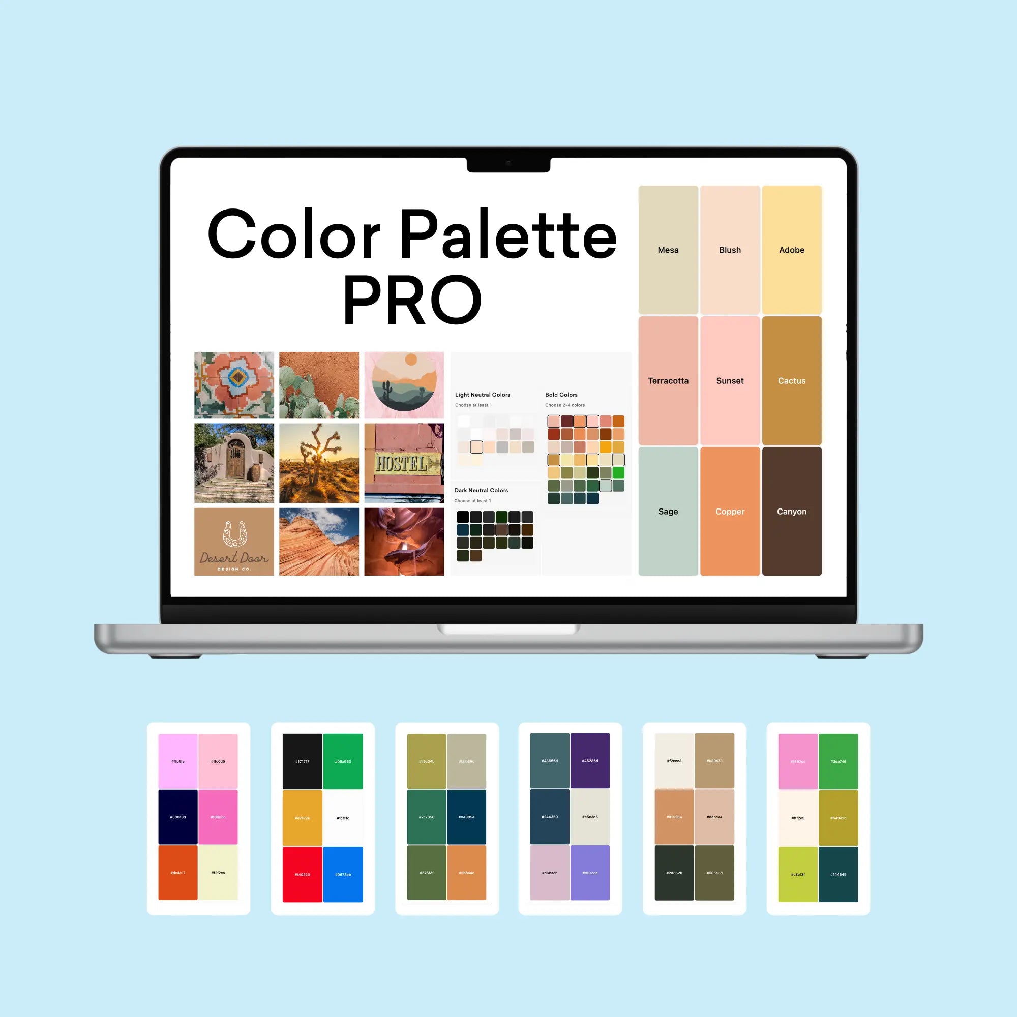
Professional Color Palette Development Tools
Building on this distinctive combination of colors, our suite of professional development tools enables precise implementation and documentation for brand success. Let's explore how to effectively manage unique palettes within professional parameters.
Strategic Color Management
The Color Palette Builder serves as a comprehensive platform for developing and validating professional color selections, offering structured approaches that ensure both creative vision and practical application:
- Strategic alignment with brand positioning and market objectives
- Systematic color relationship validation
- Comprehensive accessibility assessment
- Cross-platform color verification
- Implementation pathway planning
Application Testing
Our Brand Visualizer provides essential testing capabilities for color implementation across all relevant touchpoints, ensuring consistency and effectiveness:
- Digital interface elements
- Print collateral specifications
- Marketing asset guidelines
- Documentation standards
Documentation Standards
The Brand Guideline Builder enables thorough documentation of all color specifications and usage parameters, including:
- Complete color specifications (HEX, RGB, CMYK)
- Implementation hierarchies
- Approved usage scenarios
- Application restrictions
This systematic approach ensures that even distinctive color palettes can be effectively implemented within professional parameters. Our integrated toolkit provides comprehensive support from initial development through final implementation, maintaining high professional standards while preserving creative integrity.