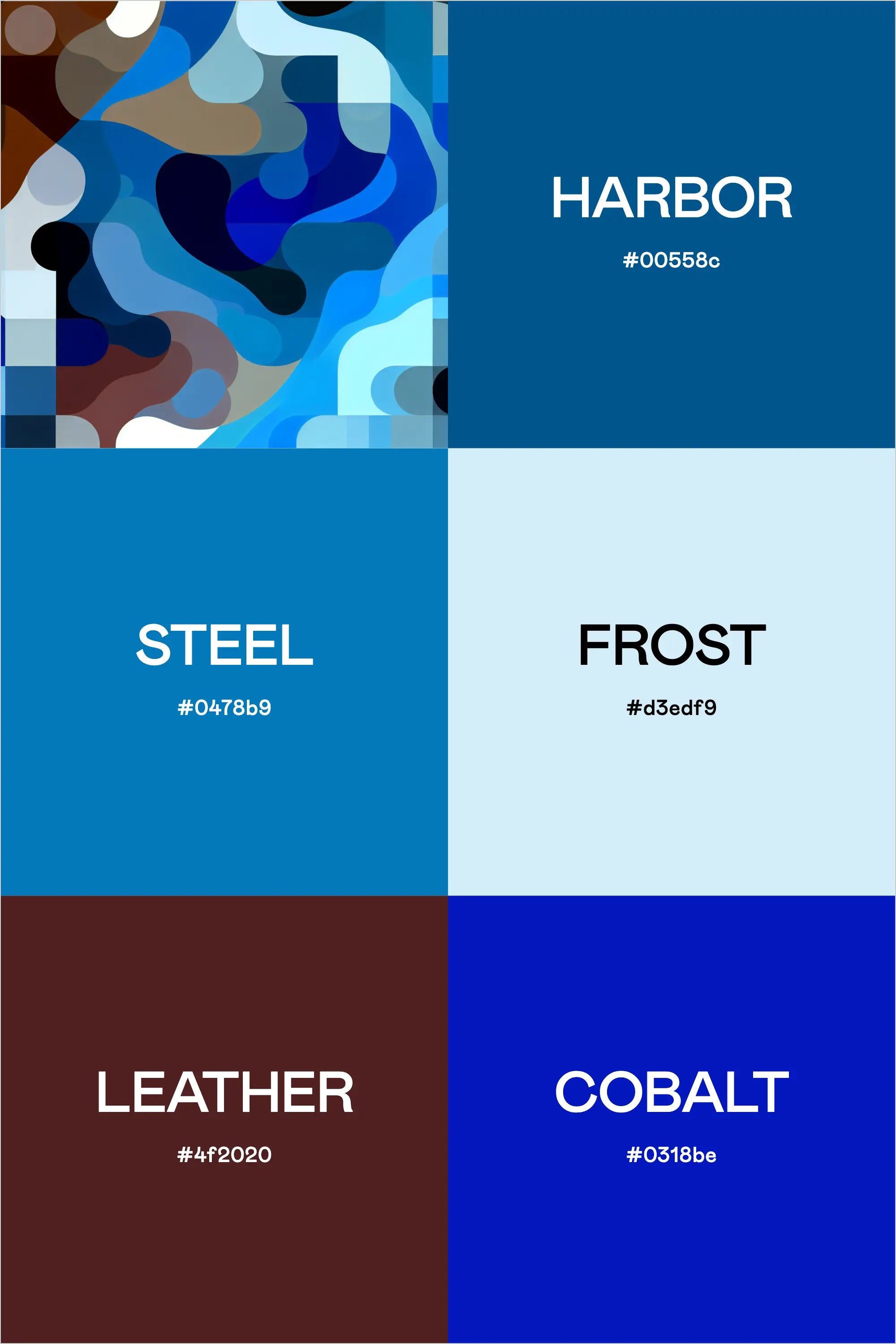
The intersection of professionalism and personality can be challenging to navigate in brand design. Today, we're exploring a sophisticated color palette that brings together the depth of the ocean with the precision of modern design - a combination we're calling "Nautical Nights."
Breaking Down the Palette
This carefully curated collection features five distinct colors that work in harmony:
Harbor (#00558c) serves as our anchor color - a deep, maritime blue that carries both authority and depth. This shade brings to mind the protected waters of a well-designed port, offering a perfect foundation for any professional brand seeking to convey trust and stability.
Steel (#0478b9) introduces a more energetic blue, reminiscent of clear skies reflected on polished metal. It's this palette's bridge between deep contemplation and bright optimism.
Frost (#d3edf9) provides the necessary breathing room - a pale, icy blue that acts as our neutral. It's essential for creating balance and preventing visual fatigue in digital applications.
Leather (#4f2020) adds a unexpected twist - a rich brown that grounds our nautical theme with earthy sophistication. Think of well-worn leather boat seats or vintage navigation tools.
Cobalt (#0318be) rounds out our palette with intense energy - a vibrant blue that can serve as either an accent or a statement piece, depending on your brand's personality.
Strategic Applications
For designers and brand strategists working with professional service clients, this palette offers versatility while maintaining a distinct point of view. The combination of cool tones with the warm leather creates opportunities for:
- Corporate communications that feel both trustworthy and approachable
- Digital interfaces that balance professionalism with engagement
- Print materials that command attention while maintaining sophistication
- Brand systems that can scale from conservative to contemporary applications
Design Philosophy
This palette's strength lies in its ability to be both masculine and refined without falling into typical corporate clichés. The varying depths of blue create a sense of dimension, while the leather tone prevents the palette from feeling cold or impersonal.
Tips for Implementation
When working with this palette, consider these approaches:
- Use Harbor as your primary brand color for main touchpoints
- Deploy Steel for interactive elements and secondary branding
- Leverage Frost for backgrounds and negative space
- Incorporate Leather strategically for warmth and grounding
- Save Cobalt for moments of impact and calls-to-action
Industry Applications
This palette particularly shines in:
- Maritime and nautical businesses
- Financial services and consulting
- Legal and professional services
- Technology and software companies
- Executive coaching and business development
- Luxury real estate and high-end services
Building Your Brand System
When incorporating this palette into your brand system, start with the core colors (Harbor and Steel) for your primary brand elements. Use Frost liberally in your digital applications to create clean, professional layouts. Leather can be introduced through photography filters or textural elements, while Cobalt should be used sparingly for maximum impact.
Remember that color is just one element of your brand's visual language. This palette works exceptionally well when paired with:
- Clean, sans-serif typography
- Minimal, geometric patterns
- Professional photography with cool undertones
- Structured layouts with clear hierarchy
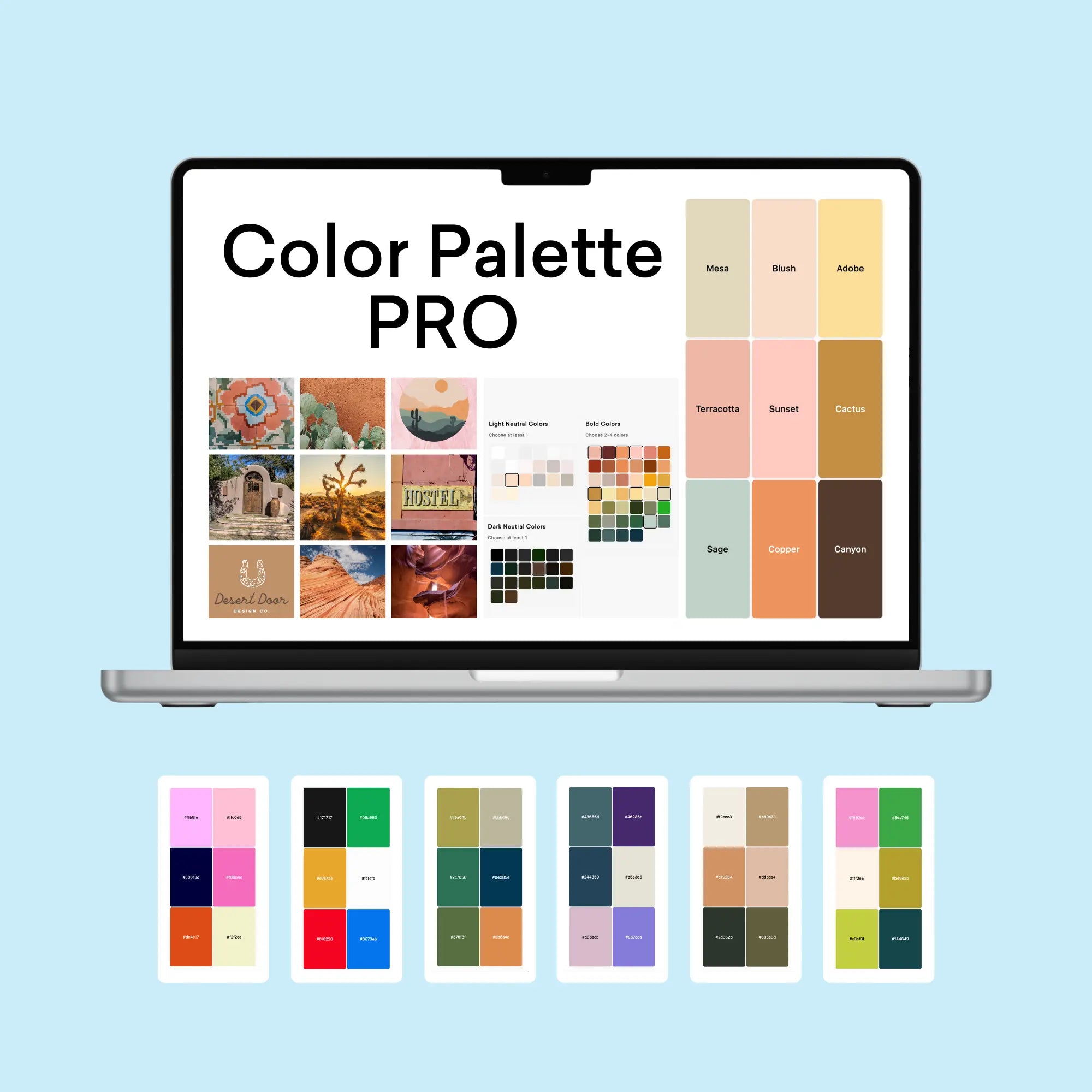
Crafting Brand Color Palettes with Professional Tools
The process of creating professional color palettes benefits from specialized tools that ensure both aesthetic appeal and functional performance. Using our Color Palette Builder and complementary tools, designers can craft semi-custom color palettes that maintain perfect balance while meeting crucial web accessibility standards.
Strategic Color Development: The Color Palette Builder serves as your foundation for creating professional color palettes, offering built-in formulas that ensure harmony and accessibility. The tool guides you through a systematic process:
- Selection of design style that aligns with brand personality
- Built-in color recipes for foolproof combinations
- Automatic contrast checking for WCAG compliance
- High-contrast pairing identification for accessibility
- Color validation across different applications
Each palette created includes strategically selected colors for:
- Primary brand colors that establish core identity
- Secondary accent colors for visual interest
- Supporting neutral tones for balance
- Accessible combinations for digital applications
Visualization and Application: The Brand Visualizer brings your palette to life by showing how colors interact in real-world applications. This step helps identify any potential adjustments before implementation and demonstrates how your palette performs across various design elements:
- Website components and UI elements
- Marketing materials and collateral
- Social media assets
- Brand documentation
Documentation and Guidelines: Use the Brand Guideline Builder to document your color palette with professional precision. This tool helps create comprehensive style guides that include:
- Color codes in multiple formats (HEX, RGB, CMYK)
- Usage guidelines and hierarchy
- Approved color combinations
- Application examples and restrictions
By following this systematic approach with our professional tools, designers can create color palettes that are not only visually striking but also practical and accessible. The integration between tools ensures a smooth workflow from initial concept to final implementation, saving valuable time while maintaining professional standards.
Final Thoughts
The strength of this palette lies in its versatility within professional contexts while maintaining a distinct personality. It's proof that professional doesn't have to mean boring, and masculine doesn't have to mean aggressive. By thoughtfully applying these colors, you can create a brand experience that feels both trustworthy and contemporary, capable of standing out in today's competitive market while maintaining timeless appeal.
For designers and brand strategists, this palette offers a sophisticated starting point for creating memorable brand experiences that resonate with discerning professional audiences. Whether you're developing a new brand or refreshing an existing one, these colors provide the foundation for a system that can grow and adapt while maintaining its core identity.