In an era where sustainable design and natural aesthetics are increasingly valued, we're exploring a sophisticated palette that draws inspiration from the verdant world around us. This collection of twelve thoughtfully curated colors captures the essence of a thriving ecosystem, from morning mist to deep forest understory.
Palette Overview
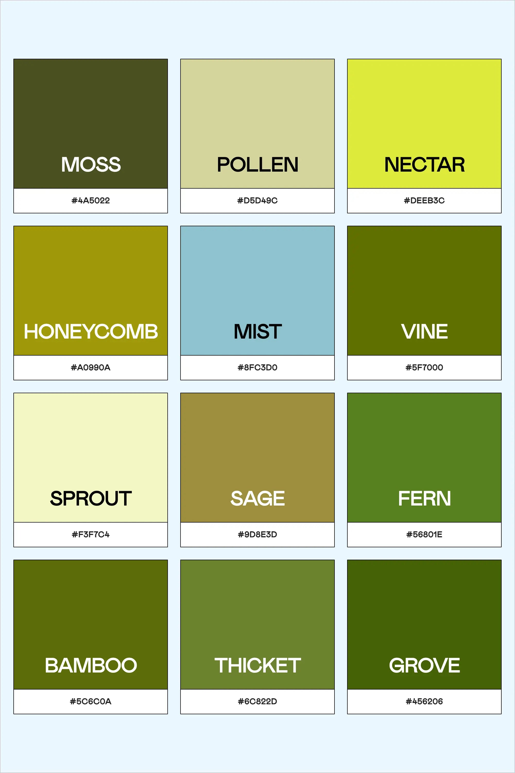
This nature-inspired collection features:
Light Tones
- Sprout (#F3F7C4): The first peek of seedlings emerging
- Pollen (#D5D49C): Soft, natural neutrals
- Nectar (#DEEB3C): Vibrant spring energy
Mid Tones
- Mist (#8FC3D0): Morning dew on leaves
- Honeycomb (#A0990A): Rich, golden warmth
- Sage (#9D8E3D): Classic herbal gray-green
Deep Greens
- Moss (#4A5022): Forest floor richness
- Vine (#5F7000): Climbing tendrils
- Fern (#56801E): Woodland shade
Forest Depths
- Bamboo (#5C6C0A): Structural green
- Thicket (#6C822D): Dense foliage
- Grove (#456206): Deep forest shadow
Professional Applications
Sustainable Branding
- Perfect for eco-conscious brands
- Ideal for organic products
- Excellent for environmental services
- Suitable for wellness industries
Digital Design
-
Website Implementation
- Use lighter tones for primary backgrounds
- Apply mid-tones for interactive elements
- Reserve deep greens for emphasis
- Implement forest depths for footer elements
-
App Development
- Light tones for main interfaces
- Mid-tones for navigation
- Deep greens for calls-to-action
- Forest depths for key information
Industry-Specific Applications
This palette excels in:
-
Environmental Sectors
- Conservation organizations
- Sustainable products
- Agricultural businesses
- Eco-tourism
-
Wellness & Health
- Natural medicine
- Organic skincare
- Holistic practices
- Health food brands
-
Education & Research
- Environmental studies
- Botanical research
- Nature education
- Scientific publications
Technical Implementation
For developers, here's the CSS variable set:
:root {
--color-sprout: #F3F7C4;
--color-pollen: #D5D49C;
--color-nectar: #DEEB3C;
--color-mist: #8FC3D0;
--color-honeycomb: #A0990A;
--color-sage: #9D8E3D;
--color-moss: #4A5022;
--color-vine: #5F7000;
--color-fern: #56801E;
--color-bamboo: #5C6C0A;
--color-thicket: #6C822D;
--color-grove: #456206;
}
Design System Implementation
Primary Elements
- Use deeper greens for primary brand elements
- Implement lighter tones for backgrounds
- Apply mid-tones for secondary elements
Supporting Elements
- Use sage and mist for neutral backgrounds
- Apply honeycomb for warm accents
- Reserve nectar for highlight elements
Best Practices for Implementation
-
Maintain Visual Hierarchy
- Use contrast effectively between light and dark tones
- Create depth through thoughtful color layering
- Ensure clear differentiation between interactive and static elements
-
Consider Context
- Adapt color usage based on application
- Account for different viewing environments
- Consider seasonal applications
Professional Tools for Color Management
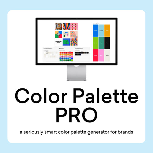
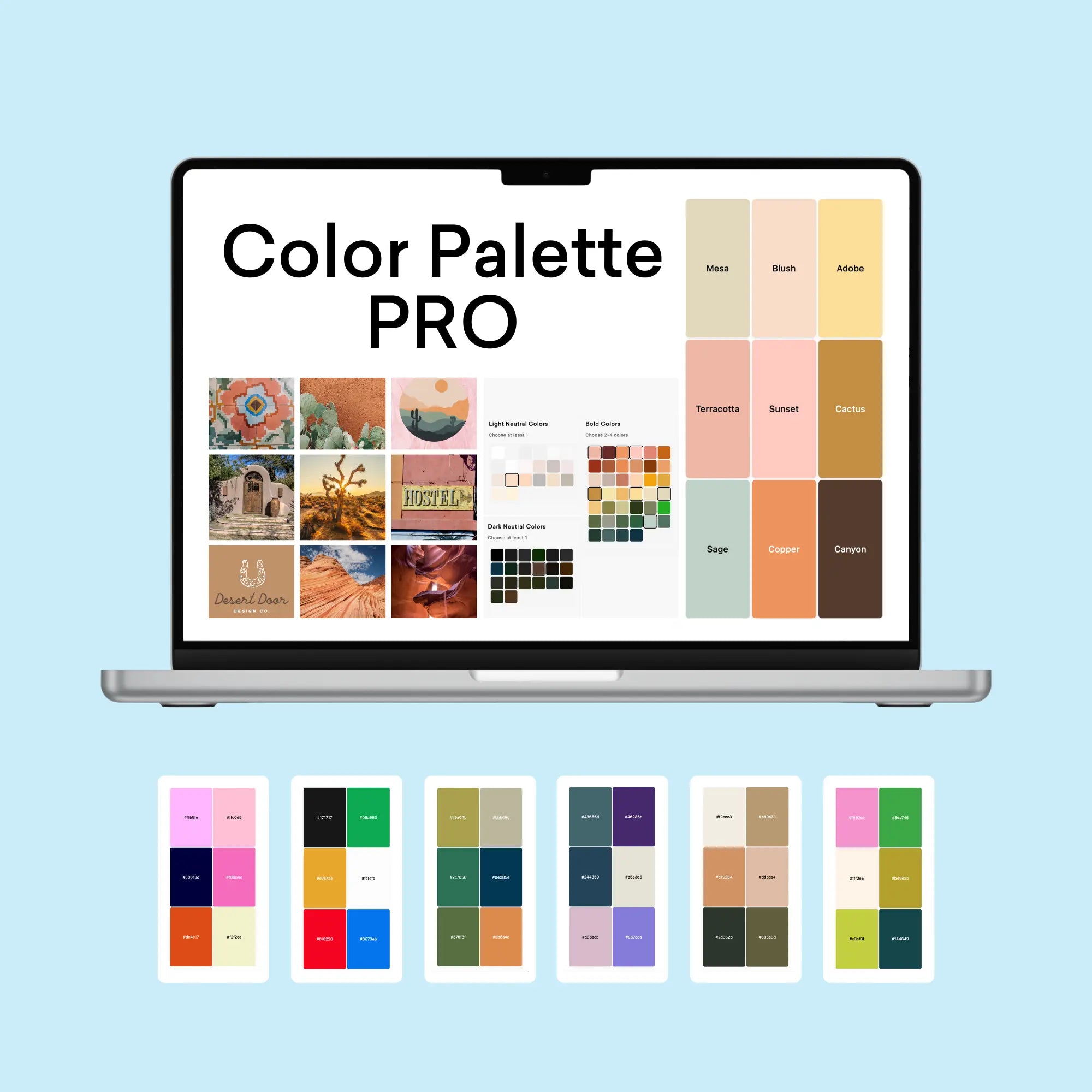
For fellow design enthusiasts looking to elevate their color workflow, The Color Palette Studio offers several powerful tools specifically designed for creating and testing color combinations:
- Color Palette Builder: This interactive tool helps you create semi-custom, ready-to-use color palettes following proven design formulas. With built-in accessibility features and over 35 billion possible combinations, it takes the guesswork out of palette creation while ensuring WCAG compliance.
- Color Palette Tester: Perfect for validating your color choices, this tool helps you check brand colors for usability, contrast, and harmony in just 60 seconds. It's especially valuable for ensuring your color combinations meet accessibility standards and provide strong visual contrast.
- Brand Visualizer: This comprehensive tool allows you to see how your colors will actually look in real-world applications, helping you visualize fonts, colors, logos, and images together in just a few minutes. It's an invaluable resource for previewing how your color palette will function across different design elements.
- Brand Guideline Builder: Once you've perfected your color palette, this tool helps you create professional brand guidelines that document your color usage rules, ensuring consistency across all applications. The mix-and-match template system makes it easy to create comprehensive guidelines in under an hour.
These tools work together seamlessly, taking you from initial color selection through testing, visualization, and final documentation. For any freelance web designer or small business designer looking to streamline their color workflow while maintaining professional standards, this suite of tools offers a complete solution for color palette development and implementation.
Conclusion: A Foundation for Sustainable Design
This botanical palette offers a sophisticated foundation for brands and projects aligned with natural and sustainable values. Its versatility allows for both subtle and bold applications while maintaining a connection to the natural world.
Whether developing a new brand identity or refreshing an existing design system, these colors provide a robust framework for creating meaningful and impactful visual experiences that resonate with environmentally conscious audiences.