Mountain Clouds

Mountain Clouds

Samantha Remboldt

This "Mountain Clouds" palette is a serene mix of soft grays, deep blues, and moody shadows, perfect for brands that want a calm, sophisticated, and atmospheric feel. Inspired by misty mountain landscapes, this palette is ideal for luxury brands, minimalist designs, and professional aesthetics that embrace depth and tranquility.

How to Use This Palette:

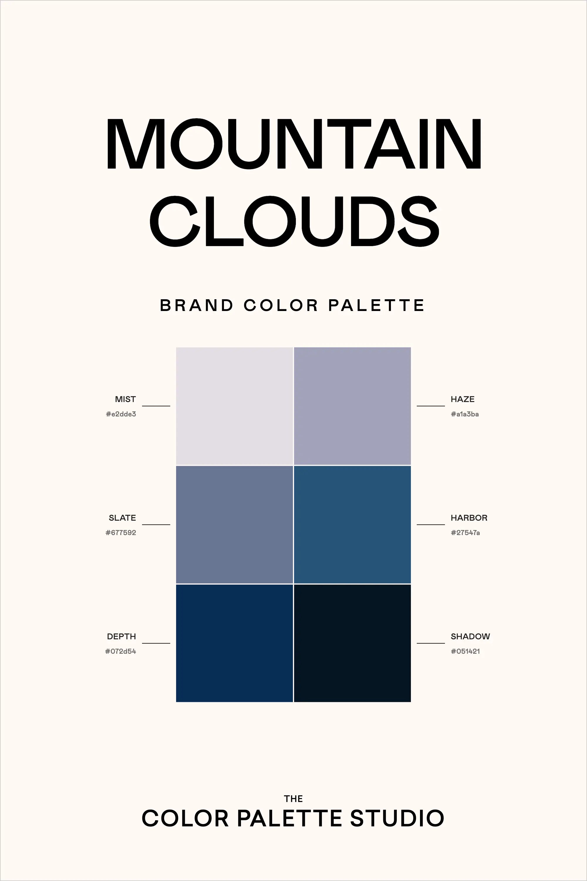
  • Mist (#e2dde3) is a soft, airy neutral—perfect for backgrounds and subtle branding.
  • Haze (#afa3ba) adds a muted, misty lilac-gray tone, great for secondary elements and soft text.
  • Slate (#677592) and Harbor (#2f547a) create a refined mid-tone balance, working well for typography, accents, and buttons.
  • Depth (#072d54) provides a strong contrast, perfect for bold branding, headings, and UI elements.
  • Shadow (#051421) is the deepest shade, anchoring the palette with richness—ideal for dark backgrounds and text.

This palette feels like a cool, misty morning in the mountains, offering elegance, calmness, and a touch of mystery—perfect for modern brands looking for a sophisticated edge.

Hex Codes:

  • Mist: #e2dde3
  • Haze: #afa3ba
  • Slate: #677592
  • Harbor: #2f547a
  • Depth: #072d54
  • Shadow: #051421
Back to blog

★ ★ ★ ★ ★

Say hello to your new favorite color palette tool:

Color Palette PRO

Excellent 4.97 | Trusted by 1,000+ Designers

Create beautiful, brand-ready color palettes in 60 seconds.

Our all‐in‐one tool helps you select, test, and finalize your brand’s perfect palette—without the guesswork.

Get Color Palette PRO

Read the Reviews

"Wow, I love this! It's insanely useful!! From generating themed names to contrast compliance - this tool is so much fun to use and saved me a ton of time."

Customer Reviews

Based on 70 reviews
94%
(66)
4%
(3)
1%
(1)
0%
(0)
0%
(0)
J
Julia B.
SO helpful

This tool has been an amazing addition to my design process. I'm so glad I got it! its such a time saver and it lays everything out really well. I highly recommend it!

M
Megan D.
I'm Obsessed!

I've been a fan of their tools from the beginning, but I've got to say the new Color Palette Pro is the best yet! As a web designer this is the first place I go to take my clients' inspiration and create a palette that's uniquely them, but also meets contrast guidelines. It's so much fun to use I could spend hours just creating amazing palettes. There's so much here, I could go on and on, do yourself a favor and grab this tool!

K
Kelly D.
The Graphic Designer's Best Friend

WOW! This is the best tool and I love using it regularly for branding, graphic design, and web development projects. I highly recommend it to improve your creative process. Bonus: it's super fun to use, too!

I
Ingrid U.
Saves me SO much time and it's fun to use!

I love playing with color and going down the rabbit hole of color psychology and this is so helpful in letting me explore different combinations and good balanced palettes!!

K
Krista H.
new and improved color palette pro

I love the color palette pro! It is so easy to navigate and very intuitive, and it allows you to create a great palette in a few easy steps.