If you’re looking to infuse your designs with bold, sophisticated energy, look no further than this Jewel Tones palette. Inspired by precious stones, these colors range from shimmering aquas to rich reds and plums—perfect for brands that want to exude confidence and luxury. Jewel tones effortlessly catch the eye, making them ideal for striking logos, dramatic social media graphics, and vibrant product packaging. They also pair beautifully with metallic accents or subtle neutrals for a balanced, polished look.
When working with such saturated hues, it’s important to keep accessibility in mind. Consider using lighter tones like Frost and Topaz in combination with deeper colors like Garnet or Merlot to ensure enough contrast for text and other design elements. Whether you’re refreshing a brand identity or planning a show-stopping campaign, these jewel-like shades offer the versatility and impact you need to create a visual statement that’s both memorable and inclusive.
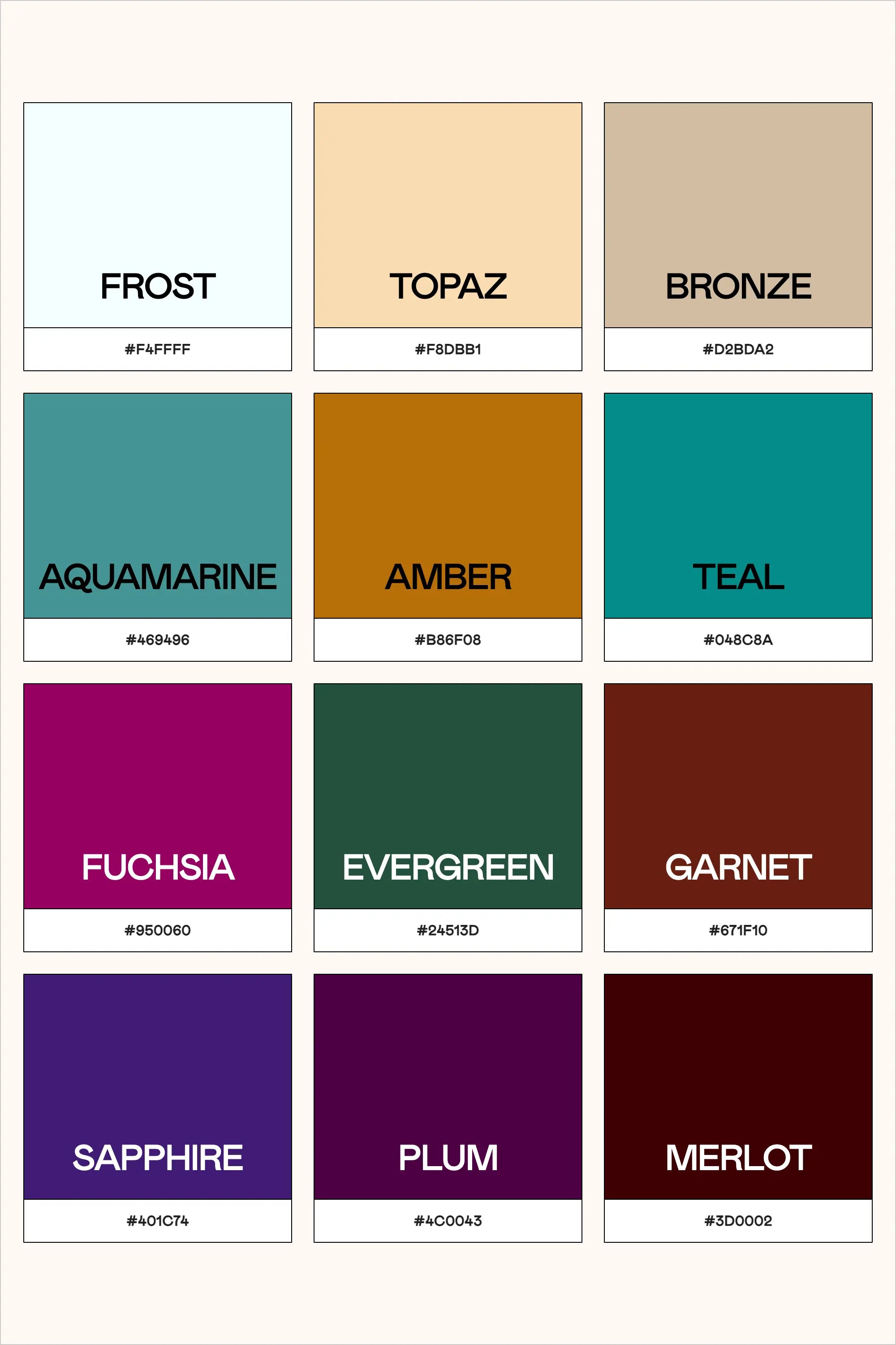
Colors & Hex Codes
- Frost – #f4ffff
- Topaz – #f8dbb1
- Bronze – #d2bda2
- Aquamarine – #469496
- Amber – #b86f08
- Teal – #0a8c8a
- Fuchsia – #950060
- Evergreen – #24513d
- Garnet – #671f10
- Sapphire – #401c74
- Plum – #4c0043
- Merlot – #3d0002