As a self-taught graphic designer and visual brand specialist, I've learned that creating the perfect color palette is both an art and a science. Today, I'm excited to share a vibrant, versatile color system that exemplifies key color harmony principles while maintaining strong accessibility standards – essential knowledge for any freelance web designer working with small businesses.
The Palette Breakdown
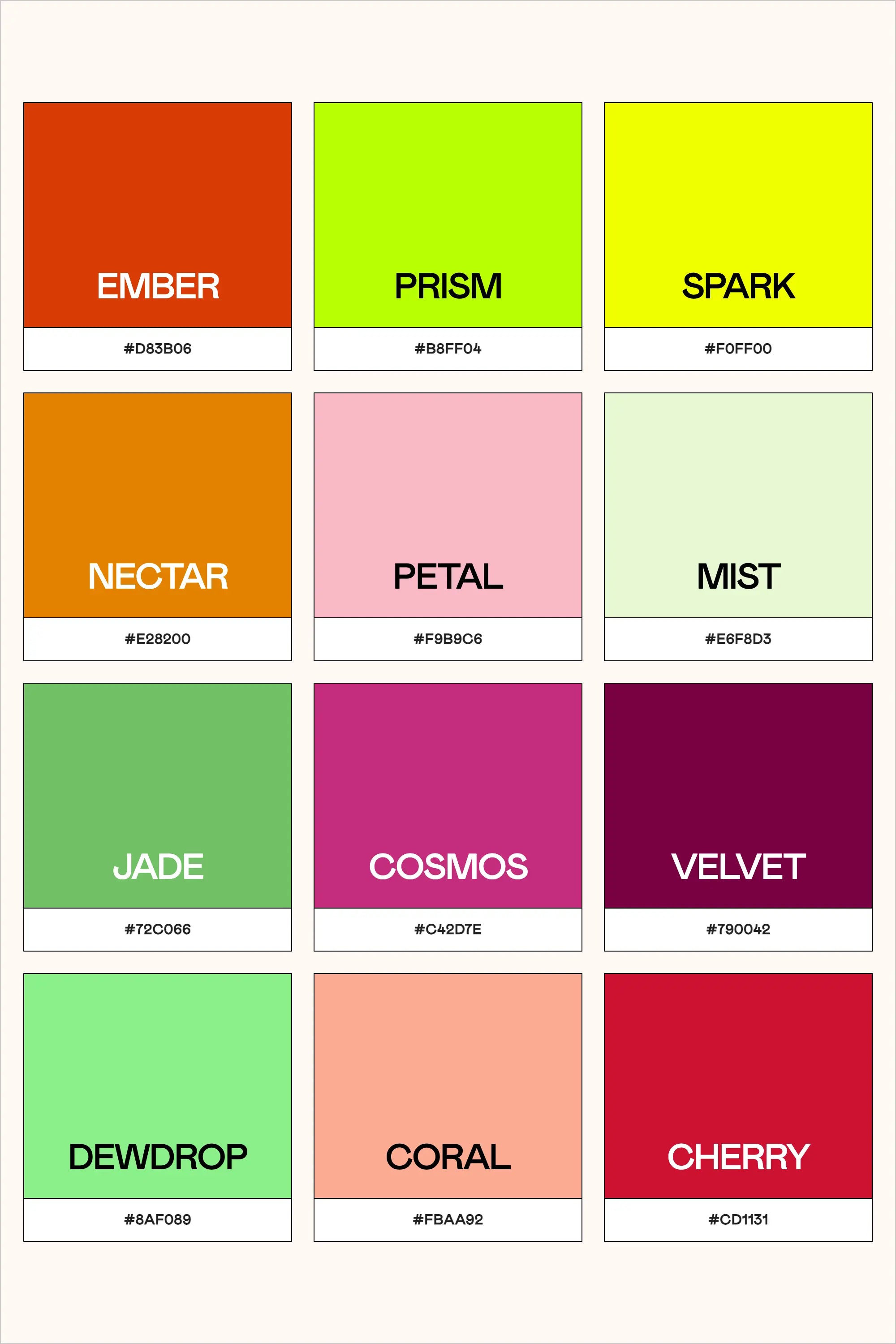
This twelve-color palette brings together warm and cool tones in a thoughtfully curated collection:
- Ember (#D83B06) - A deep, energetic orange-red that commands attention
- Prism (#B8FF04) - An electric lime that brings modern vibrancy
- Spark (#F0FF00) - A brilliant yellow that energizes designs
- Nectar (#E28200) - A rich amber that feels both natural and sophisticated
- Petal (#F9B9C6) - A soft pink that adds gentle contrast
- Mist (#E6F8D3) - A whisper-light sage green for subtle backgrounds
- Jade (#72C066) - A balanced green that suggests growth and stability
- Cosmos (#C42D7E) - A bold magenta that adds dramatic flair
- Velvet (#790042) - A deep burgundy that brings luxury and depth
- Dewdrop (#8AF089) - A fresh mint green for modern accents
- Coral (#FBAA92) - A warm, inviting peachy tone
- Cherry (#CD1131) - A bold red that demands attention
Color Psychology and Brand Applications
As any creative entrepreneur knows, understanding color psychology in design is crucial for effective brand color selection. This palette offers remarkable versatility for different brand personalities:
Tech and Innovation
The combination of Prism and Spark creates high-energy, forward-thinking designs perfect for startups and tech companies. When balanced with Mist or Petal, these bright tones become more approachable while maintaining their innovative edge.
Wellness and Sustainability
Jade, Dewdrop, and Mist form a natural, harmonious combination that speaks to environmental consciousness and wellbeing. These colors work beautifully for sustainable brands, wellness coaches, or organic products.
Luxury and Fashion
Velvet, Cosmos, and Cherry create a sophisticated trio that exudes elegance. For any independent designer working on luxury brand projects, these deeper tones communicate premium quality and refinement.
Accessibility and Inclusivity
As web accessibility standards become increasingly important, color contrast checker tools are essential in our design process. This palette was developed with WCAG color guidelines in mind. For example:
- Velvet (#790042) provides excellent contrast against light backgrounds
- Mist (#E6F8D3) works well as a background with darker text
- Ember (#D83B06) meets accessibility requirements when used with white
Practical Implementation Tips
For small business website design, consider these color matching techniques:
- Start with a Base: Choose one dominant color (like Jade or Ember) and build your scheme around it. This creates a strong foundation for your user-friendly color layouts.
- Create Hierarchy: Use bolder colors (Cherry, Cosmos, Spark) for calls-to-action and important elements, while softer tones (Mist, Petal) work well for supporting content.
- Ensure Readability: When designing for mobile-friendly color schemes, maintain strong contrast ratios. Tools like Adobe Color wheel tutorial can help you verify your combinations.
Professional Tools for Color Management
For fellow design enthusiasts looking to elevate their color workflow, The Color Palette Studio offers several powerful tools specifically designed for creating and testing color combinations:
- Color Palette Builder: This interactive tool helps you create semi-custom, ready-to-use color palettes following proven design formulas. With built-in accessibility features and over 35 billion possible combinations, it takes the guesswork out of palette creation while ensuring WCAG compliance.
- Color Palette Tester: Perfect for validating your color choices, this tool helps you check brand colors for usability, contrast, and harmony in just 60 seconds. It's especially valuable for ensuring your color combinations meet accessibility standards and provide strong visual contrast.
- Brand Visualizer: This comprehensive tool allows you to see how your colors will actually look in real-world applications, helping you visualize fonts, colors, logos, and images together in just a few minutes. It's an invaluable resource for previewing how your color palette will function across different design elements.
- Brand Guideline Builder: Once you've perfected your color palette, this tool helps you create professional brand guidelines that document your color usage rules, ensuring consistency across all applications. The mix-and-match template system makes it easy to create comprehensive guidelines in under an hour.
These tools work together seamlessly, taking you from initial color selection through testing, visualization, and final documentation. For any freelance web designer or small business designer looking to streamline their color workflow while maintaining professional standards, this suite of tools offers a complete solution for color palette development and implementation.
Building Your Design Portfolio
As you develop your graphic design basics and work toward design fundamentals mastery, experimenting with color palettes like this one can strengthen your portfolio. Document your color selection process and reasoning – potential clients appreciate understanding the strategic thinking behind your design choices.
Conclusion
Whether you're a seasoned visual brand specialist or just starting your journey in freelance design, understanding how to work with complex color palettes is crucial. This collection offers both versatility and accessibility, making it a valuable addition to your design toolkit.
Remember, successful design isn't just about choosing beautiful colors – it's about creating purposeful, accessible experiences that serve both your clients and their audiences.
What color combinations from this palette speak to you? How might you use them in your next project?
#ColorDesign #WebAccessibility #GraphicDesign #BrandingTips #DesignFundamentals