In an era where digital noise competes for attention, this carefully curated six-color palette speaks volumes through its restraint. Combining the depth of espresso with the lightness of alabaster, while grounded by professional grays and an organic sage, this palette embodies executive sophistication.
The Color Story
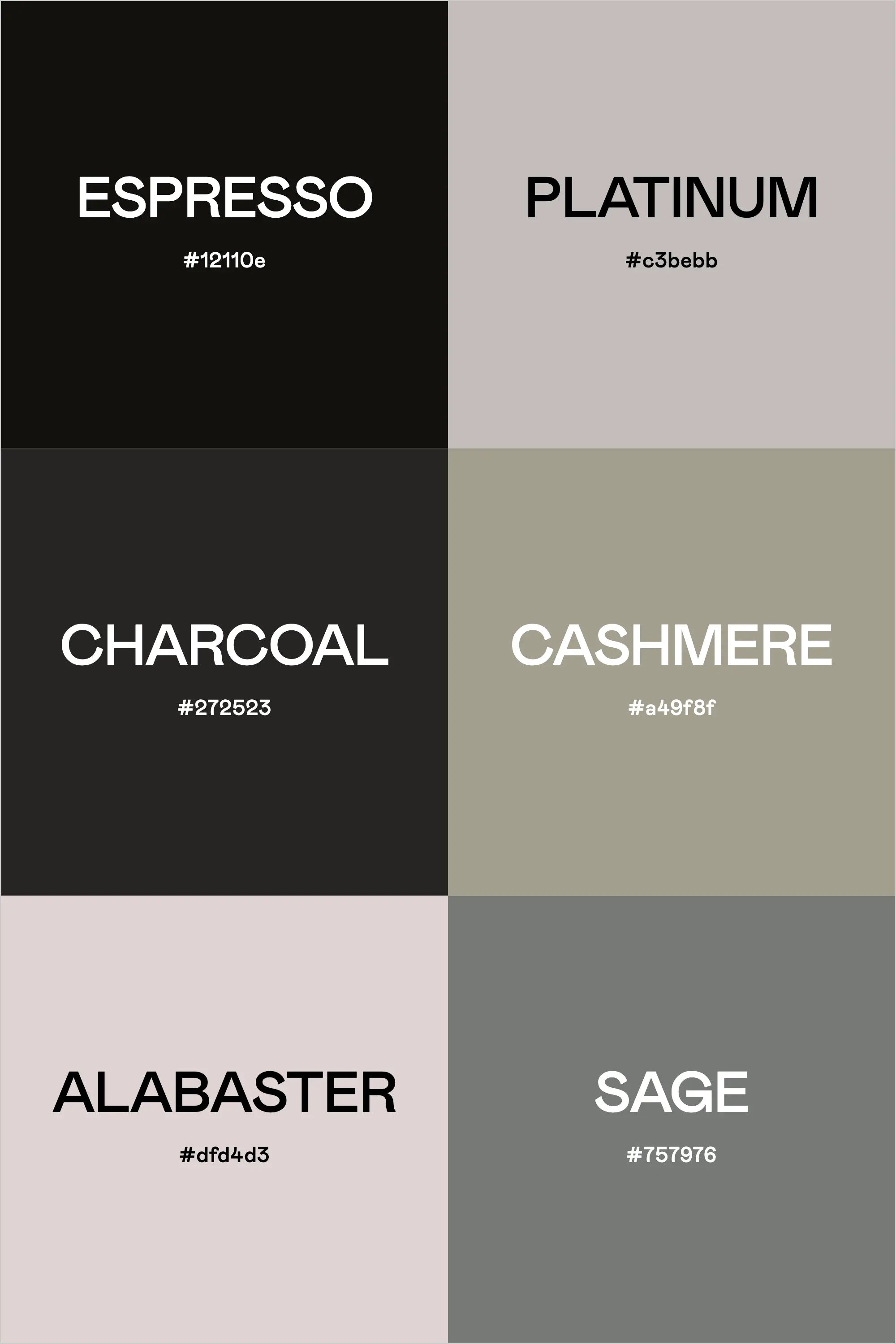
At first glance, this palette might appear simple, but its thoughtful composition reveals layers of sophistication. Espresso (#12110e) anchors the palette with a rich, deep tone that's softer than pure black, while Platinum (#c3bebb) provides a sophisticated metallic grey that bridges the palette's extremes. Charcoal (#272523) offers a professional depth that's perfect for primary text and foundational elements.
Moving into lighter territories, Cashmere (#a49f8f) introduces a warm, inviting grey that softens the palette's professional edge. Alabaster (#dfd4d3) brings an organic warmth to light backgrounds, while Sage (#757976) introduces a subtle natural element that grounds the entire collection.
Professional Applications
This palette excels in:
- Legal and Financial Services
- Architecture and Interior Design
- Executive Consulting
- Luxury Real Estate
- High-End Retail
- Professional Services
- Corporate Communications
Design Implementation
For maximum impact, consider these strategic applications:
1. Use Espresso for primary navigation and key typography, ensuring clear hierarchy without the harshness of pure black
2. Employ Platinum and Cashmere as sophisticated neutral backgrounds that won't overwhelm content
3. Reserve Alabaster for areas requiring visual breathing room, perfect for content sections and negative space
4. Integrate Sage strategically as an accent color to introduce organic elements without compromising professionalism
Digital Presence Strategy
When implementing this palette in digital environments, consider:
- Using Espresso and Charcoal for primary content to maintain readability
- Leveraging Platinum and Cashmere for secondary information and supporting elements
- Applying Alabaster for section breaks and content areas
- Incorporating Sage for interactive elements and subtle accents
Brand Voice Through Color
This palette communicates:
- Established authority
- Timeless sophistication
- Professional confidence
- Organic modernism
- Understated luxury
- Executive presence
Creating Your Professional Palette
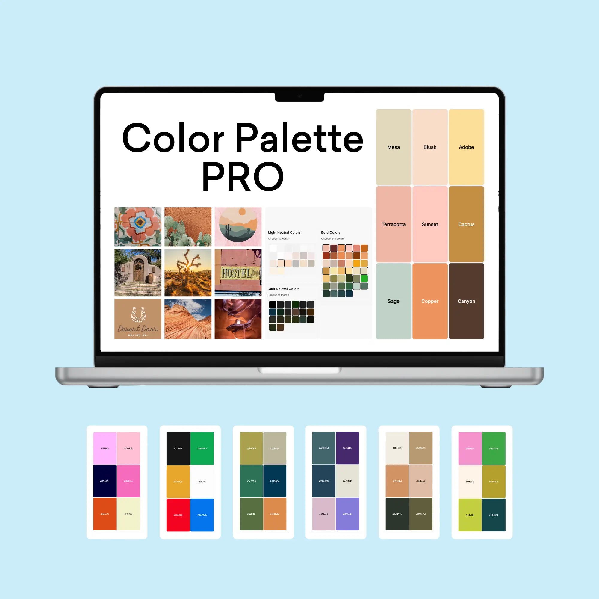
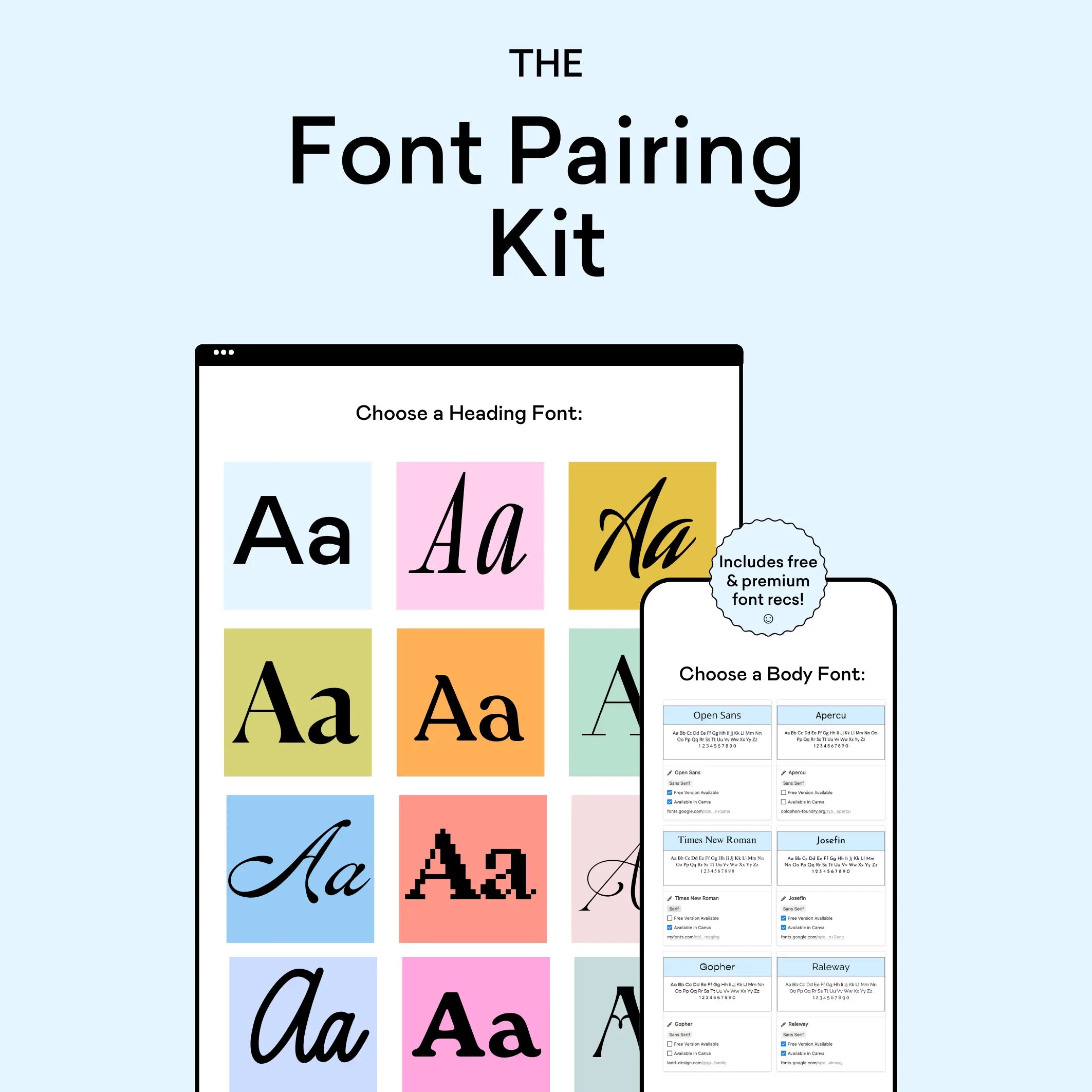
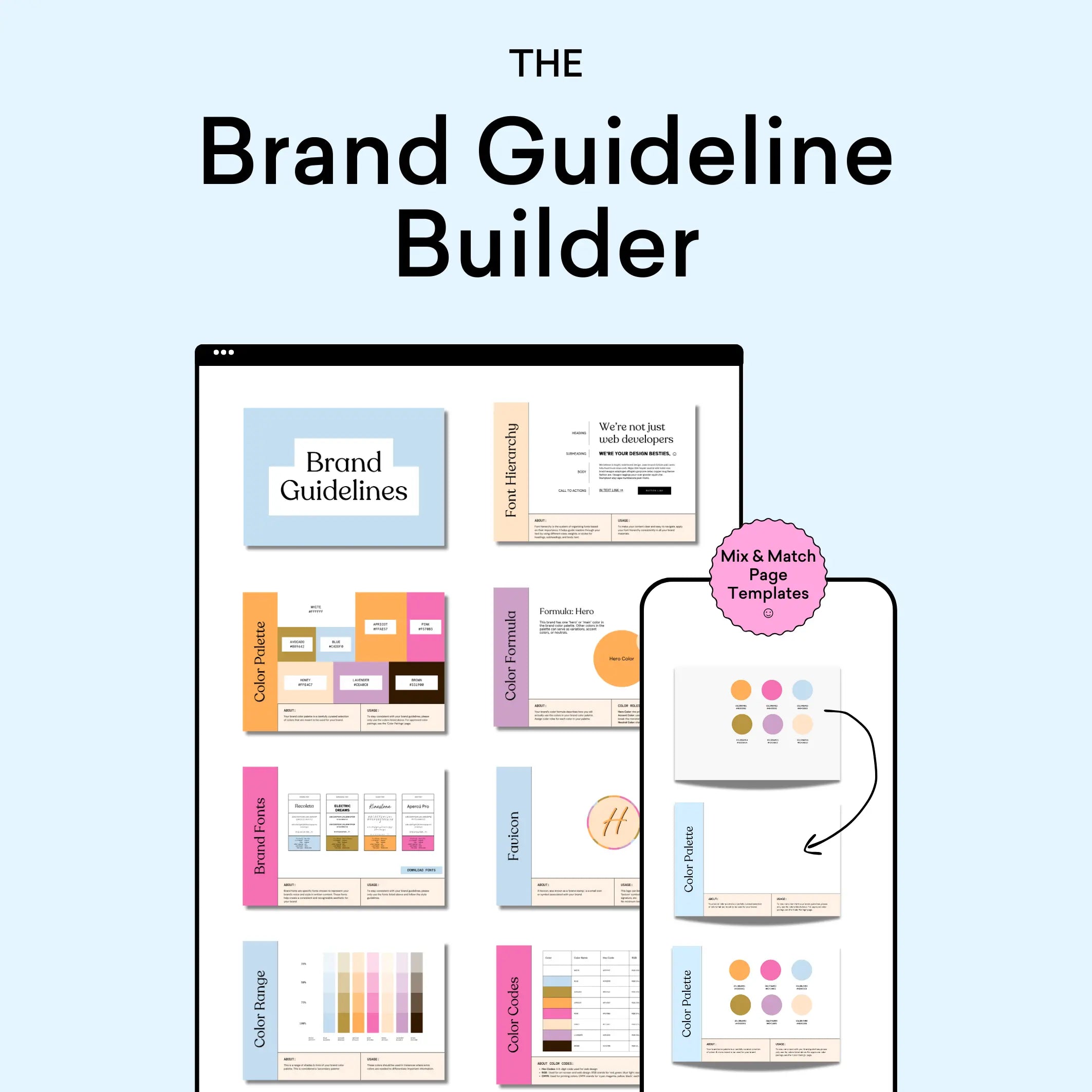
Looking to develop a similarly sophisticated color palette for your next project? The Color Palette Builder offers professional designers a streamlined approach to creating polished, cohesive color combinations that resonate with high-end clients.
Key features include:
- Professional-grade color formulas based on design principles
- Easy-to-use palette generation tools
- Multiple export options for client presentations
- Customizable testing environments
- Comprehensive style guide integration
Palette in Practice
This executive palette showcases how thoughtful restraint can create powerful brand impressions. Its grayscale foundation, complemented by subtle organic touches, provides a versatile framework for professional applications while maintaining a distinct personality.
Ready to elevate your design process with professional color tools? Explore the Color Palette Builder below and start creating sophisticated color combinations today.
Did you find this color analysis helpful? Share it with other designers crafting executive-level brands!

