In the realm of professional design, finding a palette that balances depth, versatility, and sophistication can be challenging. Today, we're diving into an expanded maritime-inspired collection that masterfully bridges the gap between professional authority and natural beauty.
The Palette Story
This carefully curated 12-color palette tells the story of coastal depths, from the lightest morning frost to the darkest oceanic trenches. Each color has been selected to work in harmony while offering enough contrast for accessible design applications.
Color Breakdown & Applications
Light Tones
- Glacier (#DDECF9): Morning light on calm waters
- Frost (#C8D9F2): Winter sky reflections
- Steel (#A6CAE1): Industrial waterfront elements
Mid-Range Blues
- Navy (#0F4F67): Deep harbor waters
- Depth (#092E42): Oceanic mysteries
- Harbor (#1E7087): Working waterfront
- Ocean (#4A8CA2): Coastal reflections
- Tide (#70A5C0): Changing waters
Neutrals
- Storm (#A1AAB8): Overcast skies
- Slate (#676369): Weathered dock wood
- Obsidian (#3C3033): Shadow depths
- Timber (#A28A77): Driftwood accents
Professional Applications
Digital Design
The palette offers exceptional versatility for digital applications:
-
Website Design
- Use Glacier/Frost for clean backgrounds
- Implement Navy/Depth for primary actions
- Apply Storm/Slate for secondary elements
- Use Timber for warm accents
-
App Development
- Ocean/Tide for progressive actions
- Obsidian for text elements
- Harbor for notification states
- Steel for hover states
Accessibility Considerations
This palette has been crafted with WCAG guidelines in mind:
- Strong contrast pairs:
- Depth on Glacier
- Navy on Frost
- Obsidian on Steel
Brand Identity Implementation
Primary Brand Elements
- Choose Navy or Depth for primary brand colors
- Use Glacier or Frost for light backgrounds
- Implement Harbor or Ocean for secondary brand elements
Supporting Elements
- Use Storm and Slate for neutral backgrounds
- Apply Timber for organic accent elements
- Utilize Obsidian for text-heavy sections
Technical Integration
For developers, here's a quick CSS implementation:
:root {
--color-glacier: #DDECF9; --color-frost: #C8D9F2;
--color-steel: #A6CAE1;
--color-navy: #0F4F67;
--color-depth: #092E42;
--color-harbor: #1E7087;
--color-ocean: #4A8CA2;
--color-tide: #70A5C0;
--color-storm: #A1AAB8;
--color-slate: #676369;
--color-obsidian: #3C3033;
--color-timber: #A28A77;
}Industry-Specific Applications
This palette particularly excels in:
-
Maritime Industries
- Shipping companies
- Naval architecture
- Ocean conservation
- Coastal development
-
Professional Services
- Law firms
- Financial institutions
- Environmental consulting
- Architecture firms
-
Luxury Markets
- Coastal real estate
- Marine tourism
- High-end hospitality
- Yacht services
Creating Harmonious Combinations
For maximum impact, consider these color combinations:
Professional Presentations
- Glacier background with Navy text
- Depth backgrounds with Steel accents
- Storm dividers with Obsidian content
Marketing Materials
- Ocean with Timber accents
- Frost with Harbor highlights
- Slate with Steel contrasts
Best Practices for Implementation
-
Maintain Hierarchy
- Use darker tones (Navy, Depth) for primary elements
- Apply mid-tones (Ocean, Harbor) for secondary content
- Implement light tones (Glacier, Frost) for backgrounds
-
Ensure Readability
- Pair light and dark colors for text
- Use mid-tones for interactive elements
- Apply neutrals for supporting content
Professional Tools for Color Management
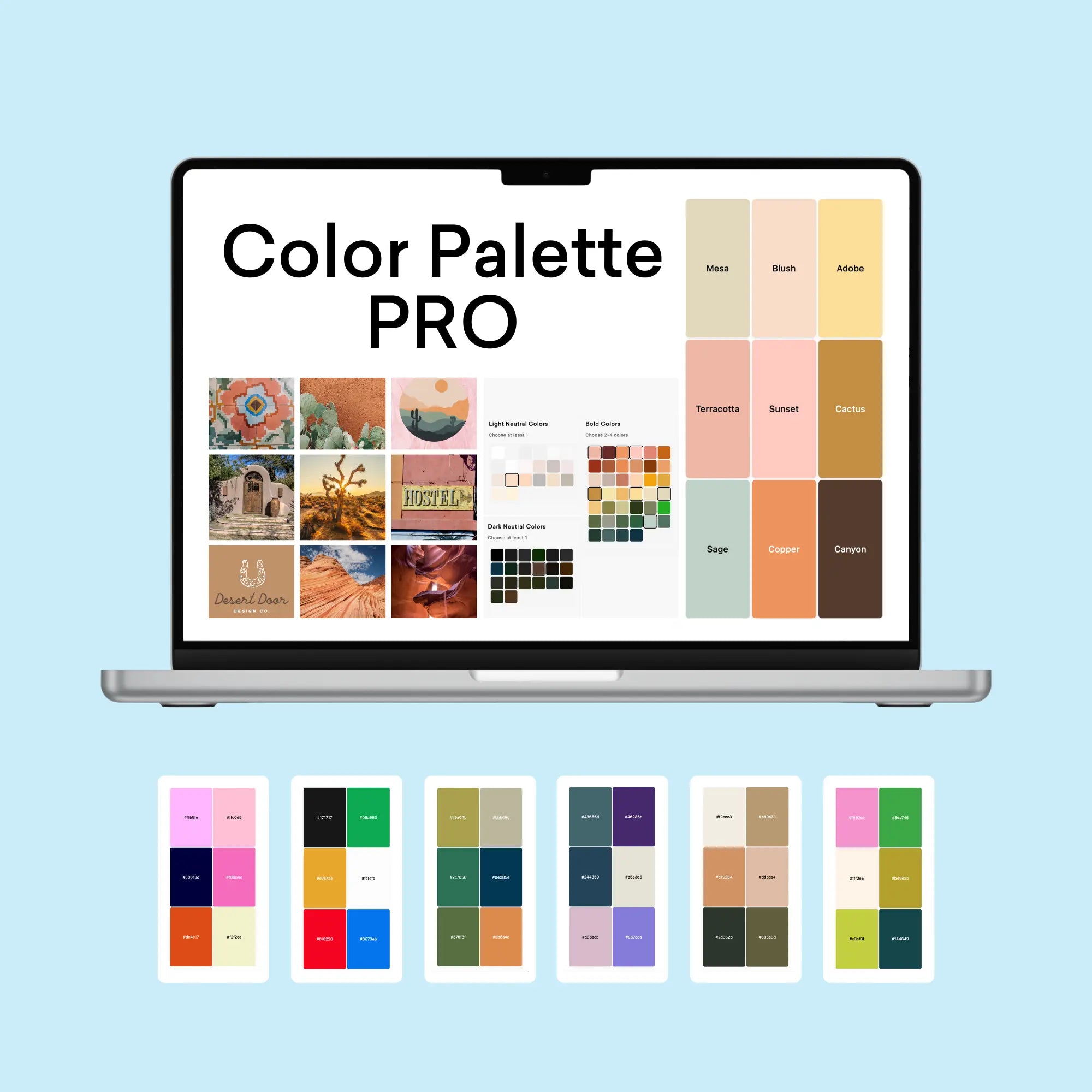
For fellow design enthusiasts looking to elevate their color workflow, The Color Palette Studio offers several powerful tools specifically designed for creating and testing color combinations:
- Color Palette Builder: This interactive tool helps you create semi-custom, ready-to-use color palettes following proven design formulas. With built-in accessibility features and over 35 billion possible combinations, it takes the guesswork out of palette creation while ensuring WCAG compliance.
- Color Palette Tester: Perfect for validating your color choices, this tool helps you check brand colors for usability, contrast, and harmony in just 60 seconds. It's especially valuable for ensuring your color combinations meet accessibility standards and provide strong visual contrast.
- Brand Visualizer: This comprehensive tool allows you to see how your colors will actually look in real-world applications, helping you visualize fonts, colors, logos, and images together in just a few minutes. It's an invaluable resource for previewing how your color palette will function across different design elements.
- Brand Guideline Builder: Once you've perfected your color palette, this tool helps you create professional brand guidelines that document your color usage rules, ensuring consistency across all applications. The mix-and-match template system makes it easy to create comprehensive guidelines in under an hour.
These tools work together seamlessly, taking you from initial color selection through testing, visualization, and final documentation. For any freelance web designer or small business designer looking to streamline their color workflow while maintaining professional standards, this suite of tools offers a complete solution for color palette development and implementation.
Conclusion: A Versatile Foundation
This expanded maritime palette offers tremendous versatility while maintaining professional sophistication. From digital applications to print materials, these colors work together to create compelling and accessible designs that resonate with audiences across industries.
The strength of this palette lies in its ability to convey both depth and professionalism while maintaining harmony across all applications. Whether you're developing a new brand identity or refreshing an existing design system, these colors provide a robust foundation for creating impactful visual experiences.