In today's corporate landscape, the challenge lies in striking the perfect balance between professionalism and innovation. This meticulously crafted palette, inspired by the soaring heights of modern architecture and the subtle gradients of the sky, delivers exactly that balance.
The Palette Story
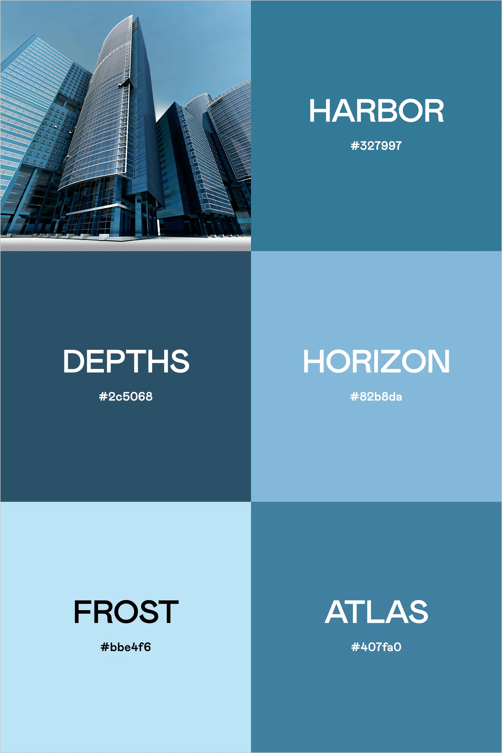
Drawn from the commanding presence of contemporary skyscrapers, this collection features six harmonious blue tones that create a sophisticated and dynamic color system:
Harbor (#32799f) anchors the palette with a confident medium blue that speaks to stability and trustworthiness. Like the steady waters of a commercial port, it provides a solid foundation for brand communications.
Depths (#2c5068) brings a deeper, more contemplative tone to the mix. This rich navy blue adds gravitas and sophistication, perfect for establishing authority in corporate communications.
Horizon (#82b8da) captures the optimistic blue of a clear midday sky. It offers a perfect transition point between deeper corporate tones and lighter, more approachable shades.
Frost (#bbe4f6) provides an airy, sophisticated light blue that creates breathing room within designs. It's essential for modern, clean layouts and digital interfaces.
Atlas (#407fa0) rounds out the palette with a balanced blue that bridges the gap between corporate authority and approachable professionalism.
Strategic Applications
This palette excels in corporate environments where innovation meets tradition:
- Digital Products and Interfaces
- Corporate Communications
- Financial Reports and Documentation
- Executive Presentations
- Professional Service Marketing
- Corporate Real Estate Materials
Implementation Strategy
To maximize the impact of this palette:
- Use Harbor for primary branding elements and key messaging
- Deploy Depths for areas requiring authority and trust
- Incorporate Horizon to create movement and energy
- Utilize Frost for negative space and digital backgrounds
- Apply Atlas for secondary elements and supporting graphics
Industry Focus
This palette is particularly effective for:
- Financial Services
- Corporate Real Estate
- Management Consulting
- Technology Companies
- Professional Services
- Corporate Law Firms
- Business Solutions Providers
Building Your Visual System
For Digital Applications:
- Use Frost as your primary background color
- Implement Harbor for main navigation and key buttons
- Apply Depths for important calls-to-action
- Utilize Horizon for hover states and interactive elements
- Reserve Atlas for secondary navigation and supporting elements
For Print Materials:
- Lead with Harbor for headers and primary information
- Use Depths for body text and important information
- Apply Horizon and Frost for supporting graphics and charts
- Incorporate Atlas for pullout quotes and secondary information
Design Elements That Complement
This palette works exceptionally well with:
- Modern geometric sans-serif typography
- Clean, minimal iconography
- Architectural photography
- White space
- Strong grid systems
- Glass and metal textures
The Broader Context
In today's business environment, this palette communicates several key messages:
- Progressive thinking through its variety of blue tones
- Stability through its deeper shades
- Innovation through its lighter, more contemporary blues
- Professionalism through its cohesive color story
Crafting Brand Color Palettes with Professional Tools
The process of creating professional color palettes benefits from specialized tools that ensure both aesthetic appeal and functional performance. Using our Color Palette Builder and complementary tools, designers can craft semi-custom color palettes that maintain perfect balance while meeting crucial web accessibility standards.
Strategic Color Development
The Color Palette Builder serves as your foundation for creating professional color palettes, offering built-in formulas that ensure harmony and accessibility. The tool guides you through a systematic process:
- Selection of design style that aligns with brand personality
- Built-in color recipes for foolproof combinations
- Automatic contrast checking for WCAG compliance
- High-contrast pairing identification for accessibility
- Color validation across different applications
Each palette created includes strategically selected colors for:
- Primary brand colors that establish core identity
- Secondary accent colors for visual interest
- Supporting neutral tones for balance
- Accessible combinations for digital applications
Visualization and Application
The Brand Visualizer brings your palette to life by showing how colors interact in real-world applications. This step helps identify any potential adjustments before implementation and demonstrates how your palette performs across various design elements:
- Website components and UI elements
- Marketing materials and collateral
- Social media assets
- Brand documentation
Documentation and Guidelines
Use the Brand Guideline Builder to document your color palette with professional precision. This tool helps create comprehensive style guides that include:
- Color codes in multiple formats (HEX, RGB, CMYK)
- Usage guidelines and hierarchy
- Approved color combinations
- Application examples and restrictions
By following this systematic approach with our professional tools, designers can create color palettes that are not only visually striking but also practical and accessible. The integration between tools ensures a smooth workflow from initial concept to final implementation, saving valuable time while maintaining professional standards.
Final Insights
What makes this palette particularly effective is its ability to speak the language of corporate professionalism while maintaining a fresh, contemporary edge. It provides enough variety for complex applications while maintaining a clear, cohesive identity that works across all touchpoints.
For designers and brand strategists, this palette offers the perfect foundation for creating sophisticated corporate identities that feel both established and forward-thinking. It's particularly well-suited for businesses looking to position themselves at the intersection of tradition and innovation, offering the gravitas of established business with the dynamism of modern enterprise.
Whether developing materials for C-suite presentations or creating dynamic digital interfaces, these colors provide the versatility and professionalism required for today's corporate environment while maintaining a distinctive and memorable presence.