Warm neutrals never go out of style, and this palette proves it! When you’re aiming to give your designs a comforting, down-to-earth feel, these colors—ranging from a creamy off-white to deep, rich brown—are a perfect fit. They offer a sense of calm and approachability that resonates across industries and audiences. Think of them as the ultimate building blocks for brand identities that want to evoke timelessness and reliability.
Whether you’re crafting a social media campaign or designing a full website, these warm neutrals create an easy-on-the-eyes foundation that pairs wonderfully with pops of accent colors or bold typography. Thanks to their balanced contrast, you can adhere to accessibility guidelines without sacrificing style. Take your pick from silky light tones for backgrounds or the darker cocoa hues for text—each color offers endless possibilities to keep your design fresh, modern, and inclusive.
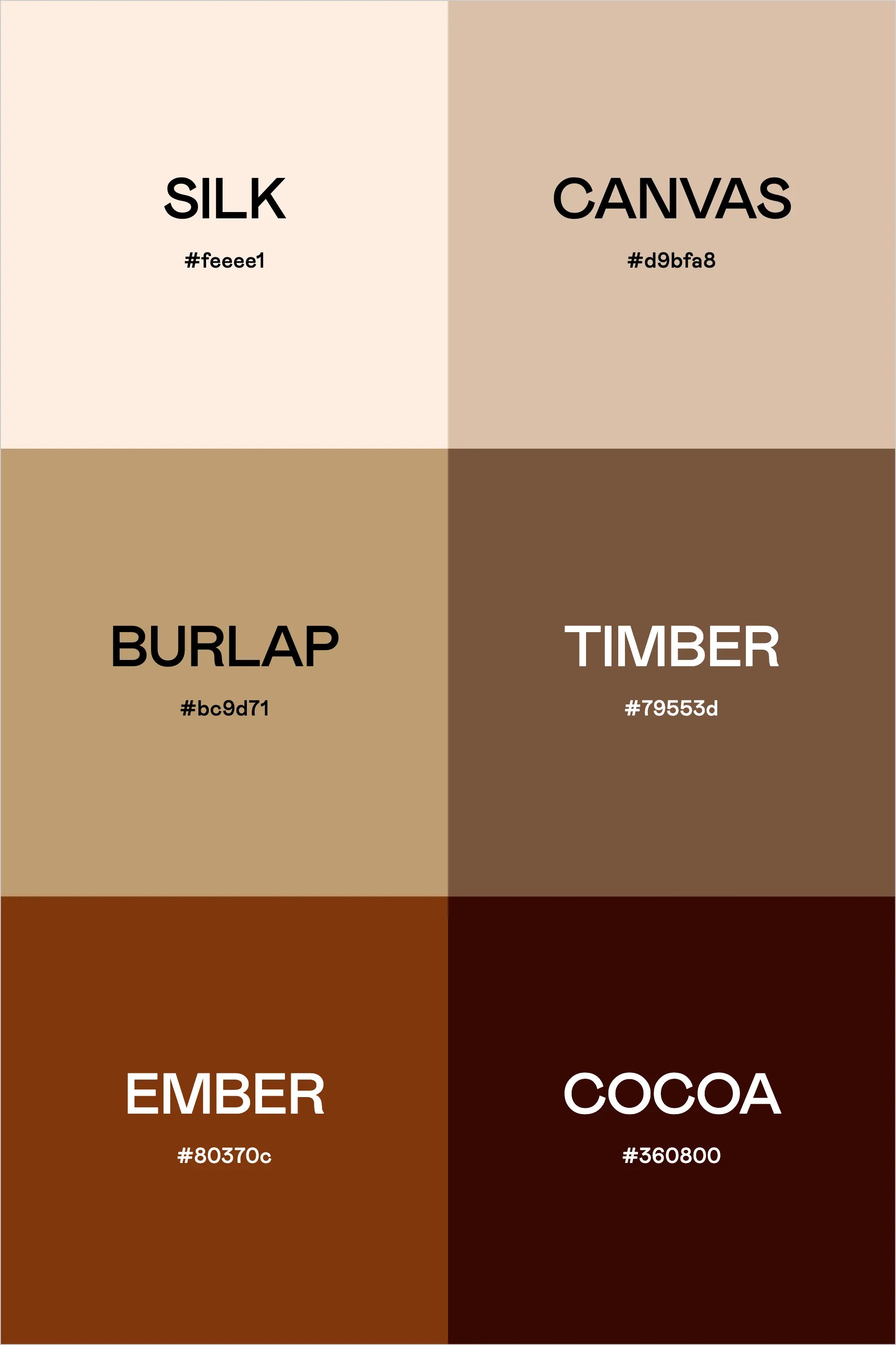
Color Names & Hex Codes:
- Silk – #feeee1
- Canvas – #d9bfa8
- Burlap – #bc9d71
- Timber – #79553d
- Ember – #80370c
- Cocoa – #360800