Color Palette: Tropical Postcard

Color Palette: Tropical Postcard

Samantha Remboldt

The Tropical Postcard color palette transports you to a sun-soaked paradise with its warm and vibrant tones. From the airy lightness of Seashell and Sunset to the bold richness of Brass, Terracotta, and Jungle, this palette is the perfect mix of tropical charm and grounded sophistication. Whether you're creating branding for a travel agency, a lifestyle brand, or a creative project inspired by nature, this palette brings an unforgettable tropical vibe to life.

With versatile tones that balance softness and boldness, Tropical Postcard works beautifully across both digital and print projects. Use it to infuse your designs with warmth, vibrancy, and a touch of adventure.
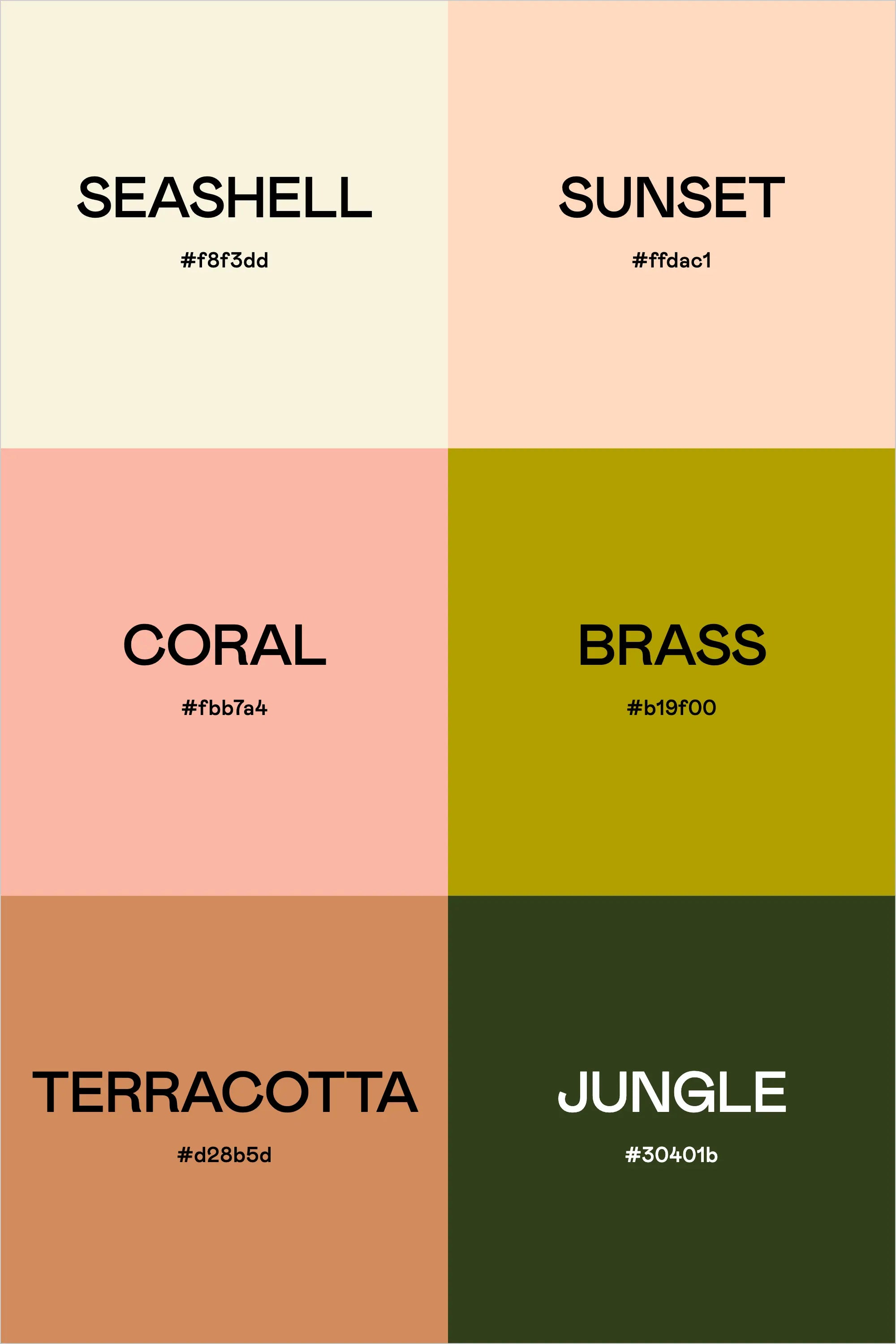
Color Breakdown:

  • Seashell: #f8f3dd
  • Sunset: #ffdac1
  • Coral: #fbb7a4
  • Brass: #b19f00
  • Terracotta: #d28b5d
  • Jungle: #30401b
Back to blog

★ ★ ★ ★ ★

Say hello to your new favorite color palette tool:

Color Palette PRO

Excellent 4.97 | Trusted by 1,000+ Designers

Create beautiful, brand-ready color palettes in 60 seconds.

Our all‐in‐one tool helps you select, test, and finalize your brand’s perfect palette—without the guesswork.

Get Color Palette PRO

Read the Reviews

"Wow, I love this! It's insanely useful!! From generating themed names to contrast compliance - this tool is so much fun to use and saved me a ton of time."

Customer Reviews

Based on 69 reviews
96%
(66)
3%
(2)
1%
(1)
0%
(0)
0%
(0)
J
Julia B.
SO helpful

This tool has been an amazing addition to my design process. I'm so glad I got it! its such a time saver and it lays everything out really well. I highly recommend it!

M
Megan D.
I'm Obsessed!

I've been a fan of their tools from the beginning, but I've got to say the new Color Palette Pro is the best yet! As a web designer this is the first place I go to take my clients' inspiration and create a palette that's uniquely them, but also meets contrast guidelines. It's so much fun to use I could spend hours just creating amazing palettes. There's so much here, I could go on and on, do yourself a favor and grab this tool!

K
Kelly D.
The Graphic Designer's Best Friend

WOW! This is the best tool and I love using it regularly for branding, graphic design, and web development projects. I highly recommend it to improve your creative process. Bonus: it's super fun to use, too!

I
Ingrid U.
Saves me SO much time and it's fun to use!

I love playing with color and going down the rabbit hole of color psychology and this is so helpful in letting me explore different combinations and good balanced palettes!!

K
Krista H.
new and improved color palette pro

I love the color palette pro! It is so easy to navigate and very intuitive, and it allows you to create a great palette in a few easy steps.