Color Palette: Sunset Salsa

Color Palette: Sunset Salsa

Samantha Remboldt

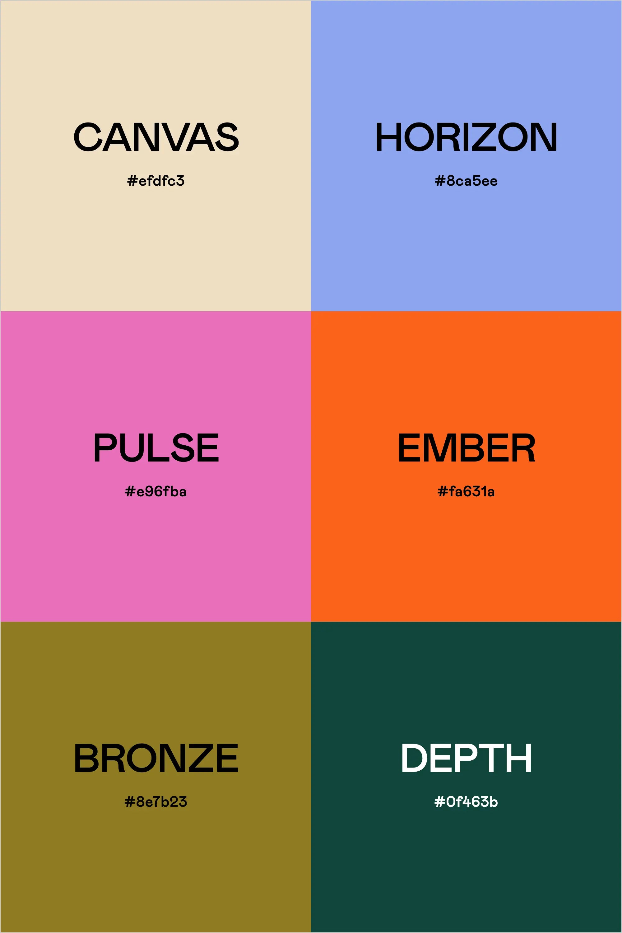
Meet Sunset Salsa—the ultimate mashup of vibrant orange, luscious lavender, warm gold, and grounding greens that feels both fresh and timeless. This palette instantly adds a burst of energy to your work while still maintaining a cool, modern edge—perfect for brands looking to stand out without going overboard. “Canvas” offers a subtle backdrop, “Pulse” brings a playful pop, “Ember” fuels the design with bold personality, “Horizon” adds just the right touch of playful fun, and “Bronze” plus “Depth” keep everything balanced and sophisticated.

To make the most of Sunset Salsa, pair the warm tones (Ember and Bronze) with the cool hues (Horizon and Depth) for contrast that sparks visual interest. Use Canvas as your foundation color for backgrounds or negative space—this helps your vivid accents shine. Whether you’re designing social media graphics, packaging, or a sleek new website, Sunset Salsa is all about mixing punchy saturation with refined calm.

Color Palette: 

  • Canvas: #efdfc3

  • Horizon: #8ca5ee

  • Pulse: #e96fba

  • Ember: #fa631a

  • Bronze: #8e7b23

Back to blog

★ ★ ★ ★ ★

Say hello to your new favorite color palette tool:

Color Palette PRO

Excellent 4.97 | Trusted by 1,000+ Designers

Create beautiful, brand-ready color palettes in 60 seconds.

Our all‐in‐one tool helps you select, test, and finalize your brand’s perfect palette—without the guesswork.

Get Color Palette PRO

Read the Reviews

"Wow, I love this! It's insanely useful!! From generating themed names to contrast compliance - this tool is so much fun to use and saved me a ton of time."

Customer Reviews

Based on 69 reviews
96%
(66)
3%
(2)
1%
(1)
0%
(0)
0%
(0)
J
Julia B.
SO helpful

This tool has been an amazing addition to my design process. I'm so glad I got it! its such a time saver and it lays everything out really well. I highly recommend it!

M
Megan D.
I'm Obsessed!

I've been a fan of their tools from the beginning, but I've got to say the new Color Palette Pro is the best yet! As a web designer this is the first place I go to take my clients' inspiration and create a palette that's uniquely them, but also meets contrast guidelines. It's so much fun to use I could spend hours just creating amazing palettes. There's so much here, I could go on and on, do yourself a favor and grab this tool!

K
Kelly D.
The Graphic Designer's Best Friend

WOW! This is the best tool and I love using it regularly for branding, graphic design, and web development projects. I highly recommend it to improve your creative process. Bonus: it's super fun to use, too!

I
Ingrid U.
Saves me SO much time and it's fun to use!

I love playing with color and going down the rabbit hole of color psychology and this is so helpful in letting me explore different combinations and good balanced palettes!!

K
Krista H.
new and improved color palette pro

I love the color palette pro! It is so easy to navigate and very intuitive, and it allows you to create a great palette in a few easy steps.