Color Palette: Studio Neutrals

Color Palette: Studio Neutrals

Samantha Remboldt

Timeless, warm, and effortlessly sophisticated, the Studio Neutrals color palette is designed for brands that embrace natural elegance. With a harmonious mix of soft ivories, earthy browns, and rich terracotta hues, this palette creates a sense of warmth and refinement. Whether you're working on brand identity, website design, or product packaging, these neutral tones provide a solid foundation that feels both inviting and professional.

Ivory and Sand bring a light, airy quality, perfect for backgrounds and minimalist aesthetics. Blush and Clay add a touch of warmth, making this palette versatile for organic and handmade brands. Deeper tones like Terracotta and Mocha ground the palette, adding richness and depth. Whether you’re crafting a sleek, modern brand or a cozy, artisanal feel, Studio Neutrals offers a balanced, earthy elegance that works across industries.
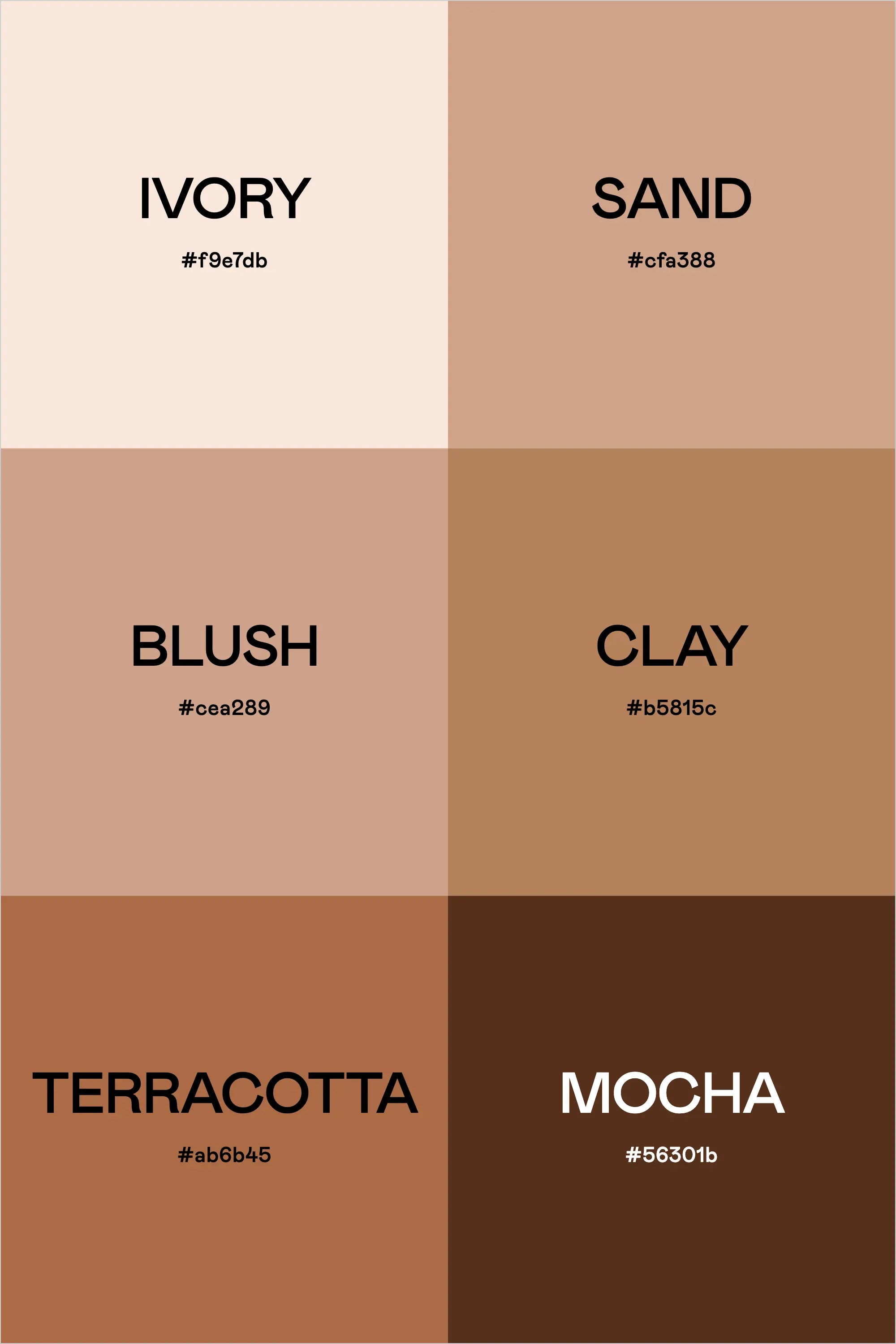
Colors & Hex Codes

  • Ivory – #f9e7db
  • Sand – #cfa388
  • Blush – #cea289
  • Clay – #b5815c
  • Terracotta – #ab6b45
  • Mocha – #56301b
Back to blog

★ ★ ★ ★ ★

Say hello to your new favorite color palette tool:

Color Palette PRO

Excellent 4.97 | Trusted by 1,000+ Designers

Create beautiful, brand-ready color palettes in 60 seconds.

Our all‐in‐one tool helps you select, test, and finalize your brand’s perfect palette—without the guesswork.

Get Color Palette PRO

Read the Reviews

"Wow, I love this! It's insanely useful!! From generating themed names to contrast compliance - this tool is so much fun to use and saved me a ton of time."

Customer Reviews

Based on 69 reviews
96%
(66)
3%
(2)
1%
(1)
0%
(0)
0%
(0)
J
Julia B.
SO helpful

This tool has been an amazing addition to my design process. I'm so glad I got it! its such a time saver and it lays everything out really well. I highly recommend it!

M
Megan D.
I'm Obsessed!

I've been a fan of their tools from the beginning, but I've got to say the new Color Palette Pro is the best yet! As a web designer this is the first place I go to take my clients' inspiration and create a palette that's uniquely them, but also meets contrast guidelines. It's so much fun to use I could spend hours just creating amazing palettes. There's so much here, I could go on and on, do yourself a favor and grab this tool!

K
Kelly D.
The Graphic Designer's Best Friend

WOW! This is the best tool and I love using it regularly for branding, graphic design, and web development projects. I highly recommend it to improve your creative process. Bonus: it's super fun to use, too!

I
Ingrid U.
Saves me SO much time and it's fun to use!

I love playing with color and going down the rabbit hole of color psychology and this is so helpful in letting me explore different combinations and good balanced palettes!!

K
Krista H.
new and improved color palette pro

I love the color palette pro! It is so easy to navigate and very intuitive, and it allows you to create a great palette in a few easy steps.