Delicate, soothing, and effortlessly elegant, the Soft Pastels color palette brings a calm yet sophisticated touch to your designs. This palette features a beautiful balance of gentle pinks, warm neutrals, and serene blues, perfect for brands that want to project a refined, approachable, and calming aesthetic. Whether you're designing for wellness brands, lifestyle blogs, or modern minimalist projects, Soft Pastels offers versatility with a subtle pop of color.
Blush and Rosette provide a soft, feminine base, while Honey and Coral add warmth and a touch of earthiness. Serenity introduces a cool, peaceful balance, complemented by the grounding, natural tone of Timber. Together, these shades create a harmonious palette that’s perfect for anything from packaging and branding to social media graphics and website design. If you’re looking for a palette that’s understated yet full of charm, Soft Pastels is a perfect choice.
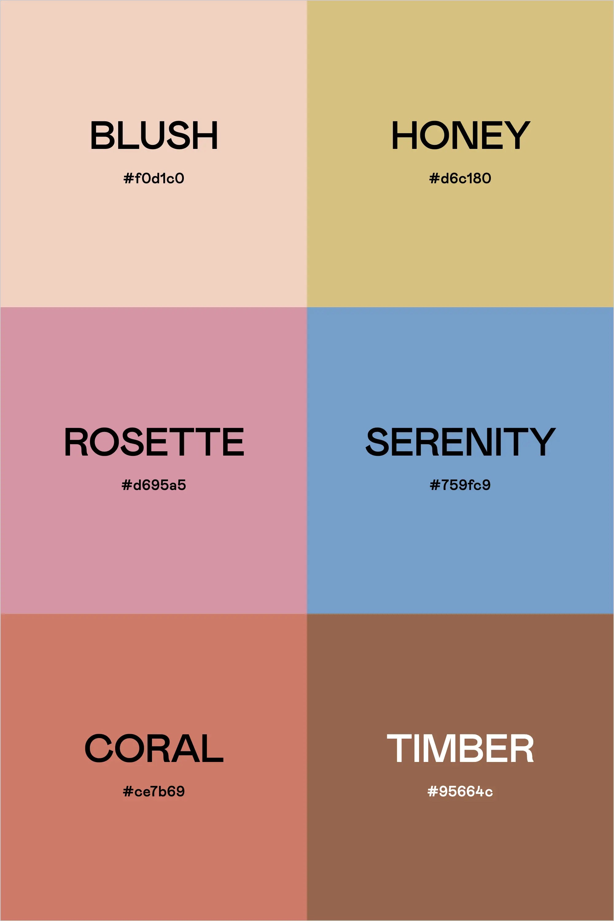
Colors & Hex Codes
- Blush – #f0d1c0
- Honey – #d6c180
- Rosette – #d695a5
- Serenity – #759fc9
- Coral – #ce7b69
- Timber – #95664c