This "Severance" palette is a cool, professional mix of blues, muted grays, and deep metallic tones, inspired by the sterile, corporate aesthetic of the Apple TV show Severance. It evokes a sense of order, detachment, and quiet control, making it perfect for modern branding, corporate identities, tech startups, and structured design projects. The mix of cold blues, industrial gold, and deep navy creates a balanced yet authoritative look.
How to Use This Palette:
-
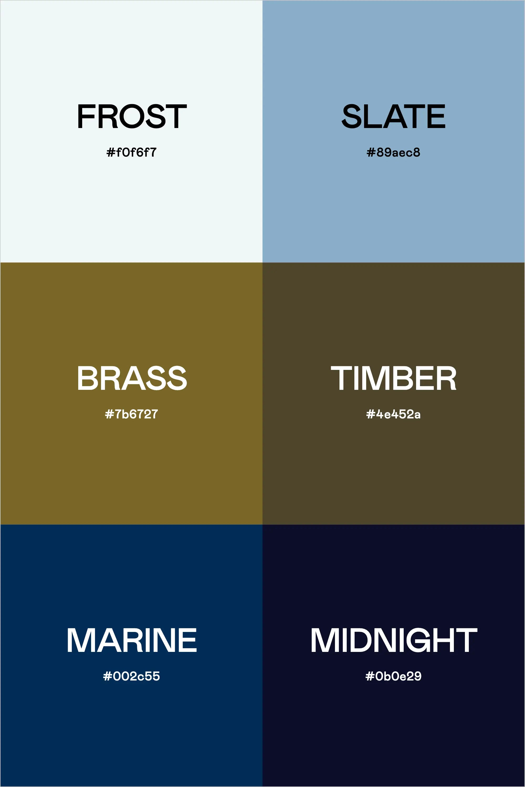
Frost (#f0f6f7) is a clean, sterile white-blue—perfect for backgrounds and negative space.
-
Slate (#89aec8) is a soft yet corporate blue, ideal for typography, branding, and UI elements.
-
Brass (#7b6727) adds warmth and contrast, giving the palette a controlled, industrial feel.
-
Timber (#4e452a) is a muted brown with an earthy depth, grounding the palette with neutrality.
-
Marine (#002c55) is a deep navy that provides contrast and structure—great for strong branding elements.
-
Midnight (#0b0e29) is the darkest shade, perfect for backgrounds, bold text, and high-contrast design work.
This palette feels structured, refined, and slightly ominous, making it ideal for corporate branding, futuristic design projects, and modern minimalist aesthetics.