Minimalist, calming, and effortlessly chic, the Scandinavian Neutrals color palette embodies the essence of Nordic design. With soft, muted tones and rich earthy shades, this palette is perfect for brands that embrace simplicity, elegance, and a touch of natural warmth. Whether you’re designing for interior brands, lifestyle products, or minimalist websites, Scandinavian Neutrals offers a versatile, timeless look.
Alabaster and Pebble create a light, airy foundation, ideal for clean, modern designs. Driftwood and Bark introduce warm, organic tones that bring depth without overpowering the minimalist aesthetic. Timber and Shadow add contrast and sophistication, grounding the palette with rich, earthy hues. This palette is ideal for creating serene, cohesive designs that feel both modern and inviting. If you're looking for a palette that radiates simplicity and elegance, Scandinavian Neutrals is your go-to.
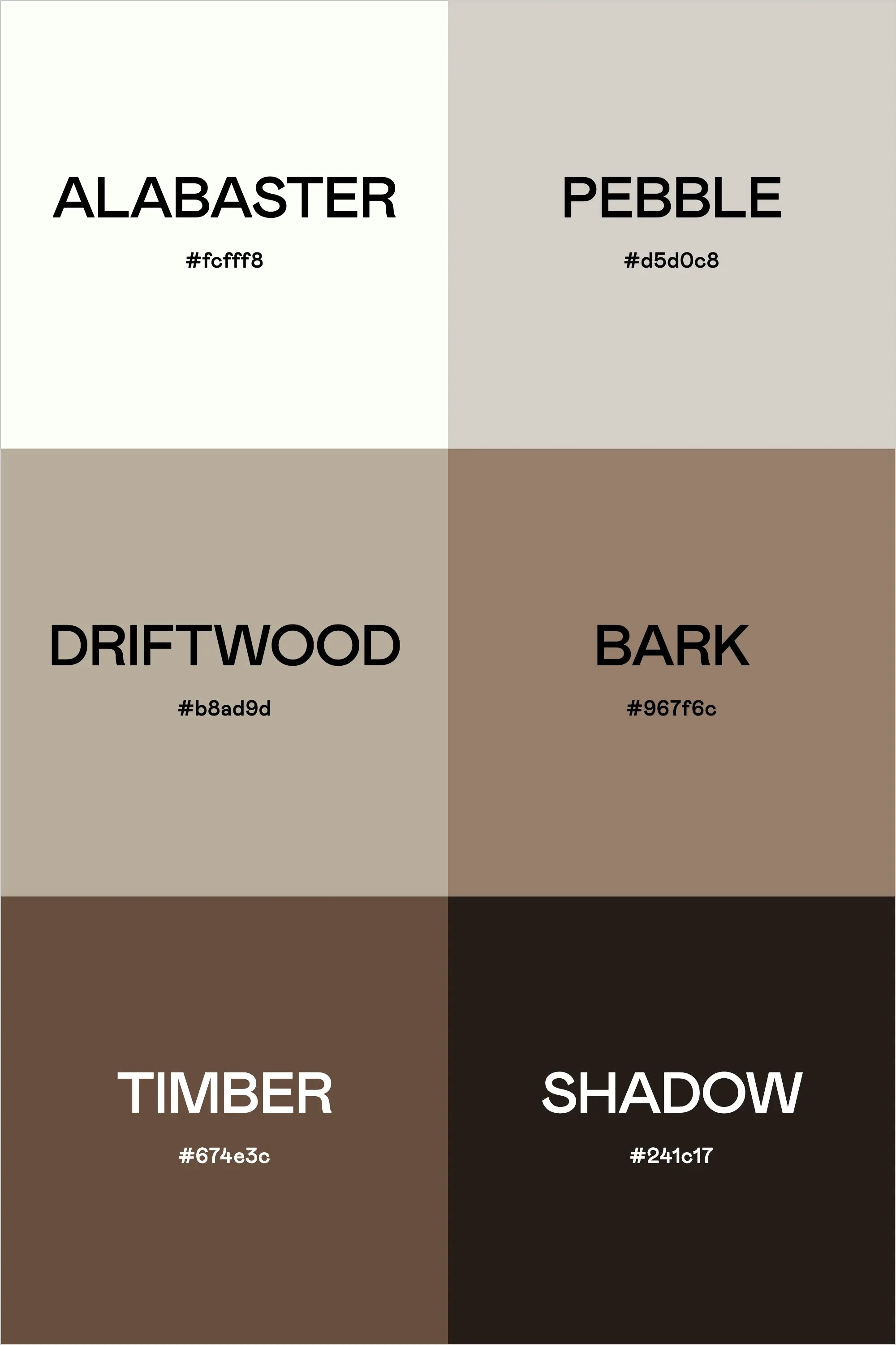
Colors & Hex Codes
- Alabaster – #fcfff8
- Pebble – #d5d0c8
- Driftwood – #b8ad9d
- Bark – #967f6c
- Timber – #674e3c
- Shadow – #241c17