Color Palette: Pastel Rainbow

Color Palette: Pastel Rainbow

Samantha Remboldt

This "Pastel Rainbow" palette is a bright and cheerful mix of soft blues, pinks, yellows, and greens, creating a playful yet balanced aesthetic. It’s perfect for brands that want to feel fun, inviting, and full of energy, making it ideal for kids' brands, creative businesses, lifestyle blogs, and colorful social media aesthetics.

How to Use This Palette:

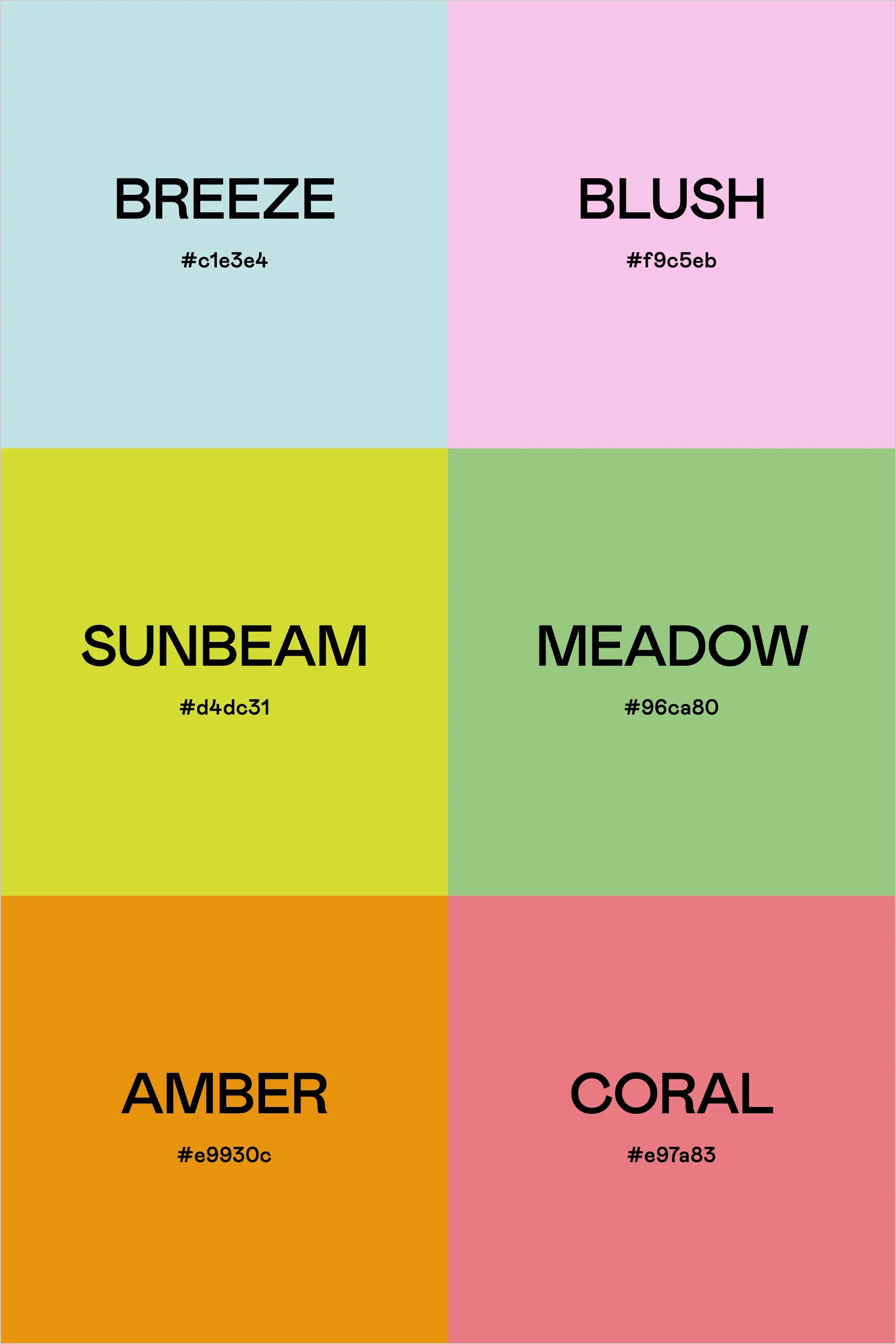
  • Breeze (#c1e3e4) is a light sky blue that adds a fresh and airy feel—great for backgrounds or soft accents.
  • Blush (#f9c5eb) brings a delicate pastel pink, perfect for adding warmth and sweetness to your designs.
  • Sunbeam (#d4dc31) is a punchy, citrusy yellow that brightens up any layout—great for buttons and highlight elements.
  • Meadow (#96ca80) adds a fresh, nature-inspired green, making the palette feel balanced and organic.
  • Amber (#e9930c) brings a bold golden-orange pop, ideal for creating contrast and drawing attention.
  • Coral (#e97a83) ties everything together with a warm, lively hue—perfect for branding, typography, or eye-catching design details.

This palette feels fresh, fun, and full of life, making it a great choice for brands looking for a modern, colorful, and energetic aesthetic.

Hex Codes:

  • Breeze: #c1e3e4
  • Blush: #f9c5eb
  • Sunbeam: #d4dc31
  • Meadow: #96ca80
  • Amber: #e9930c
  • Coral: #e97a83
Back to blog

★ ★ ★ ★ ★

Say hello to your new favorite color palette tool:

Color Palette PRO

Excellent 4.97 | Trusted by 1,000+ Designers

Create beautiful, brand-ready color palettes in 60 seconds.

Our all‐in‐one tool helps you select, test, and finalize your brand’s perfect palette—without the guesswork.

Get Color Palette PRO

Read the Reviews

"Wow, I love this! It's insanely useful!! From generating themed names to contrast compliance - this tool is so much fun to use and saved me a ton of time."

Customer Reviews

Based on 76 reviews
92%
(70)
7%
(5)
1%
(1)
0%
(0)
0%
(0)
J
Julia B.
SO helpful

This tool has been an amazing addition to my design process. I'm so glad I got it! its such a time saver and it lays everything out really well. I highly recommend it!

Hi Julia,

Thank you for this wonderful review! I'm SO happy to hear that this tool is saving you time.

-Sam

M
Megan D.
I'm Obsessed!

I've been a fan of their tools from the beginning, but I've got to say the new Color Palette Pro is the best yet! As a web designer this is the first place I go to take my clients' inspiration and create a palette that's uniquely them, but also meets contrast guidelines. It's so much fun to use I could spend hours just creating amazing palettes. There's so much here, I could go on and on, do yourself a favor and grab this tool!

Hi Megan,

I'm so grateful for your review- thank you! I love your comment about spending hours just playing with the tool- I felt the exact same way when we were working on this new update. I'm glad this makes creating color palettes feel FUN. Thank you!

-Sam

K
Kelly D.
The Graphic Designer's Best Friend

WOW! This is the best tool and I love using it regularly for branding, graphic design, and web development projects. I highly recommend it to improve your creative process. Bonus: it's super fun to use, too!

Hi Kelly,

Your review means so much to us- thank you so much. I LOVE to hear that you're having fun using it, that was our whole goal with this update.

-Sam

D
Dawn B.
Best tool ever

Love, love, love this tool!!!

R
Rhianna S.
Such a time saver!

This tool makes it so easy to add your colors, name them, check for color contrast, and then export the palette + approved color pairings in a cute little PDF. I used to do all of that manually and it was a major time-suck! Love this tool.