Color Palette: Moody Emerald

Color Palette: Moody Emerald

Samantha Remboldt

This "Moody Emerald" palette is a rich and refined mix of deep greens, warm neutrals, and soft earth tones, evoking the mystery and elegance of nature. With a balance of dark forest hues and soft, natural shades, this palette is perfect for luxury brands, wellness businesses, eco-friendly designs, and timeless branding aesthetics. Whether you're working on a modern minimalist look or a high-end brand identity, these colors bring a sense of depth and sophistication.

How to Use This Palette:

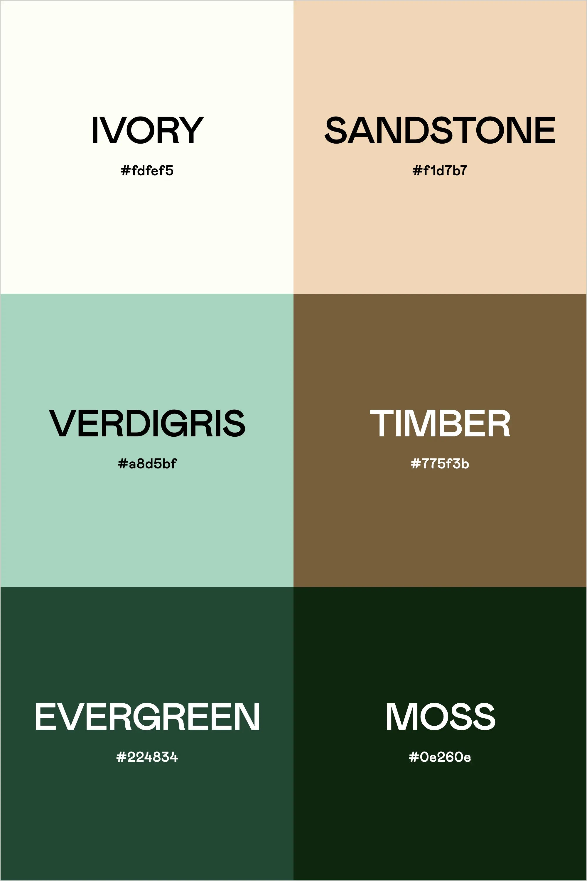
  • Ivory (#fdfeF5) is a soft, warm neutral—perfect for backgrounds and clean, minimal typography.
  • Sandstone (#f1d7b7) adds an earthy warmth, great for subtle branding elements or UI highlights.
  • Verdigris (#a8d5bf) is a muted green with a vintage feel—ideal for adding softness and contrast.
  • Timber (#775f3b) brings a natural, wood-inspired tone, grounding the palette beautifully.
  • Evergreen (#224834) is a deep, moody green that adds richness and elegance, perfect for bold design elements.
  • Moss (#0e260e) is the darkest, most dramatic shade, making it perfect for backgrounds, contrast, and a high-end look.

This palette feels luxurious, organic, and grounded, making it ideal for nature-inspired brands, high-end design projects, and businesses that want to exude sophistication and depth.

Hex Codes:

  • Ivory: #fdfeF5
  • Sandstone: #f1d7b7
  • Verdigris: #a8d5bf
  • Timber: #775f3b
  • Evergreen: #224834
  • Moss: #0e260e
Back to blog

★ ★ ★ ★ ★

Say hello to your new favorite color palette tool:

Color Palette PRO

Excellent 4.97 | Trusted by 1,000+ Designers

Create beautiful, brand-ready color palettes in 60 seconds.

Our all‐in‐one tool helps you select, test, and finalize your brand’s perfect palette—without the guesswork.

Get Color Palette PRO

Read the Reviews

"Wow, I love this! It's insanely useful!! From generating themed names to contrast compliance - this tool is so much fun to use and saved me a ton of time."

Customer Reviews

Based on 76 reviews
92%
(70)
7%
(5)
1%
(1)
0%
(0)
0%
(0)
J
Julia B.
SO helpful

This tool has been an amazing addition to my design process. I'm so glad I got it! its such a time saver and it lays everything out really well. I highly recommend it!

Hi Julia,

Thank you for this wonderful review! I'm SO happy to hear that this tool is saving you time.

-Sam

M
Megan D.
I'm Obsessed!

I've been a fan of their tools from the beginning, but I've got to say the new Color Palette Pro is the best yet! As a web designer this is the first place I go to take my clients' inspiration and create a palette that's uniquely them, but also meets contrast guidelines. It's so much fun to use I could spend hours just creating amazing palettes. There's so much here, I could go on and on, do yourself a favor and grab this tool!

Hi Megan,

I'm so grateful for your review- thank you! I love your comment about spending hours just playing with the tool- I felt the exact same way when we were working on this new update. I'm glad this makes creating color palettes feel FUN. Thank you!

-Sam

K
Kelly D.
The Graphic Designer's Best Friend

WOW! This is the best tool and I love using it regularly for branding, graphic design, and web development projects. I highly recommend it to improve your creative process. Bonus: it's super fun to use, too!

Hi Kelly,

Your review means so much to us- thank you so much. I LOVE to hear that you're having fun using it, that was our whole goal with this update.

-Sam

D
Dawn B.
Best tool ever

Love, love, love this tool!!!

R
Rhianna S.
Such a time saver!

This tool makes it so easy to add your colors, name them, check for color contrast, and then export the palette + approved color pairings in a cute little PDF. I used to do all of that manually and it was a major time-suck! Love this tool.