Color Palette: Luxe & Elegant

Color Palette: Luxe & Elegant

Samantha Remboldt

Luxe and Moody is your palette of choice when sophistication meets depth. This rich, atmospheric color combination is perfect for brands that want to convey elegance with a touch of mystery. Whether you're designing a high-end website, curating luxurious packaging, or creating moody social media graphics, these hues bring an undeniable sense of drama. The palette ranges from soft neutrals like Alabaster and Pewter to intense, grounding shades like Obsidian and Mahogany, making it versatile enough for both minimalist and bold designs.

For designers focused on balance, pair the light, airy Alabaster with the deep richness of Slate or Obsidian for high contrast and readability. Bronze and Mahogany add warmth and earthiness, perfect for accent elements or backgrounds that need a touch of opulence. Pewter offers a cool counterbalance, softening the palette while maintaining its luxe aesthetic. With Luxe and Moody, your designs will exude timeless elegance and a refined, modern edge.
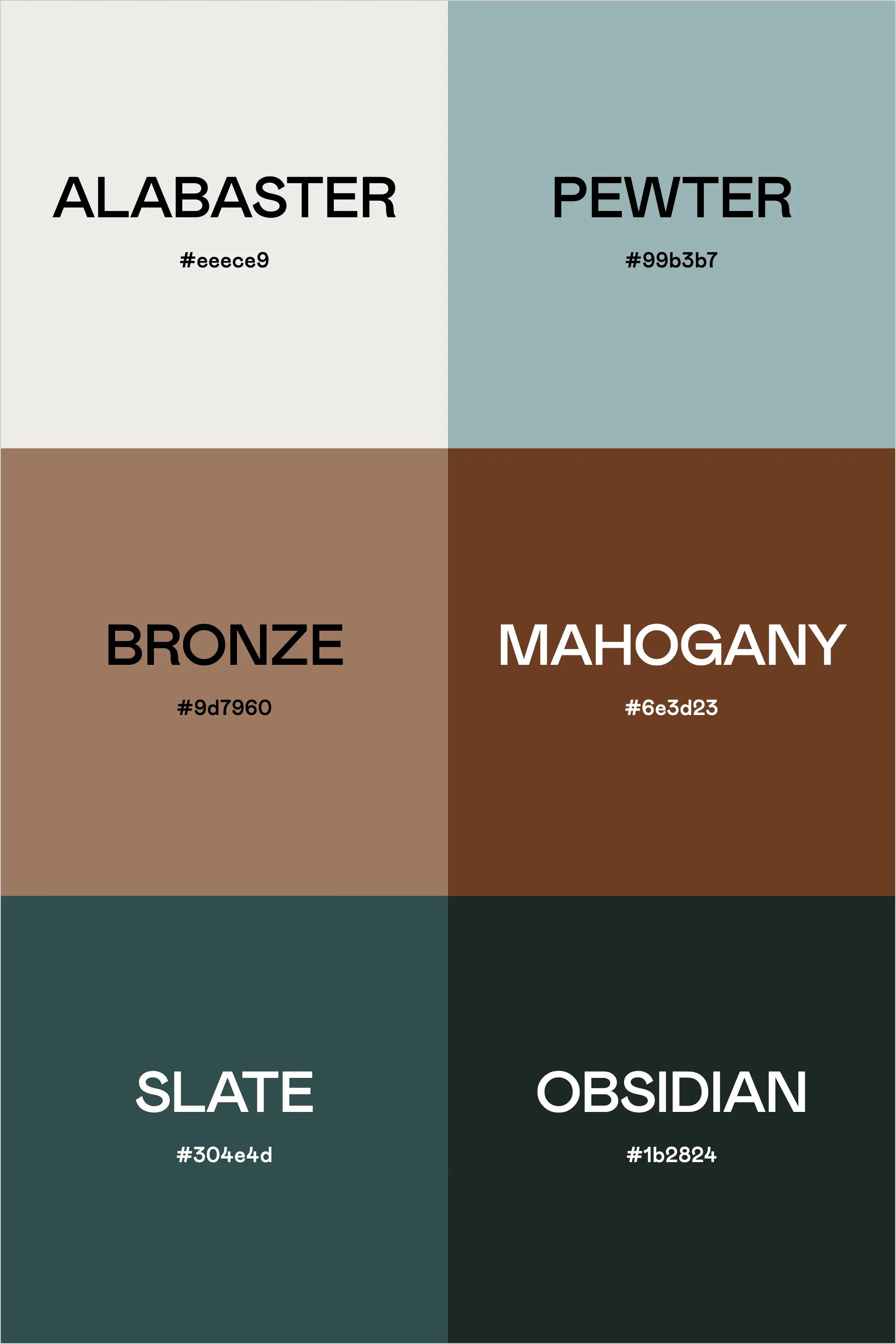
Colors & Hex Codes:

  • Alabaster – #eee9e9
  • Pewter – #99b3b7
  • Bronze – #9d7960
  • Mahogany – #6e3d23
  • Slate – #304e4d
  • Obsidian – #1b2824
Back to blog

★ ★ ★ ★ ★

Say hello to your new favorite color palette tool:

Color Palette PRO

Excellent 4.97 | Trusted by 1,000+ Designers

Create beautiful, brand-ready color palettes in 60 seconds.

Our all‐in‐one tool helps you select, test, and finalize your brand’s perfect palette—without the guesswork.

Get Color Palette PRO

Read the Reviews

"Wow, I love this! It's insanely useful!! From generating themed names to contrast compliance - this tool is so much fun to use and saved me a ton of time."

Customer Reviews

Based on 70 reviews
94%
(66)
4%
(3)
1%
(1)
0%
(0)
0%
(0)
J
Julia B.
SO helpful

This tool has been an amazing addition to my design process. I'm so glad I got it! its such a time saver and it lays everything out really well. I highly recommend it!

M
Megan D.
I'm Obsessed!

I've been a fan of their tools from the beginning, but I've got to say the new Color Palette Pro is the best yet! As a web designer this is the first place I go to take my clients' inspiration and create a palette that's uniquely them, but also meets contrast guidelines. It's so much fun to use I could spend hours just creating amazing palettes. There's so much here, I could go on and on, do yourself a favor and grab this tool!

K
Kelly D.
The Graphic Designer's Best Friend

WOW! This is the best tool and I love using it regularly for branding, graphic design, and web development projects. I highly recommend it to improve your creative process. Bonus: it's super fun to use, too!

I
Ingrid U.
Saves me SO much time and it's fun to use!

I love playing with color and going down the rabbit hole of color psychology and this is so helpful in letting me explore different combinations and good balanced palettes!!

K
Krista H.
new and improved color palette pro

I love the color palette pro! It is so easy to navigate and very intuitive, and it allows you to create a great palette in a few easy steps.