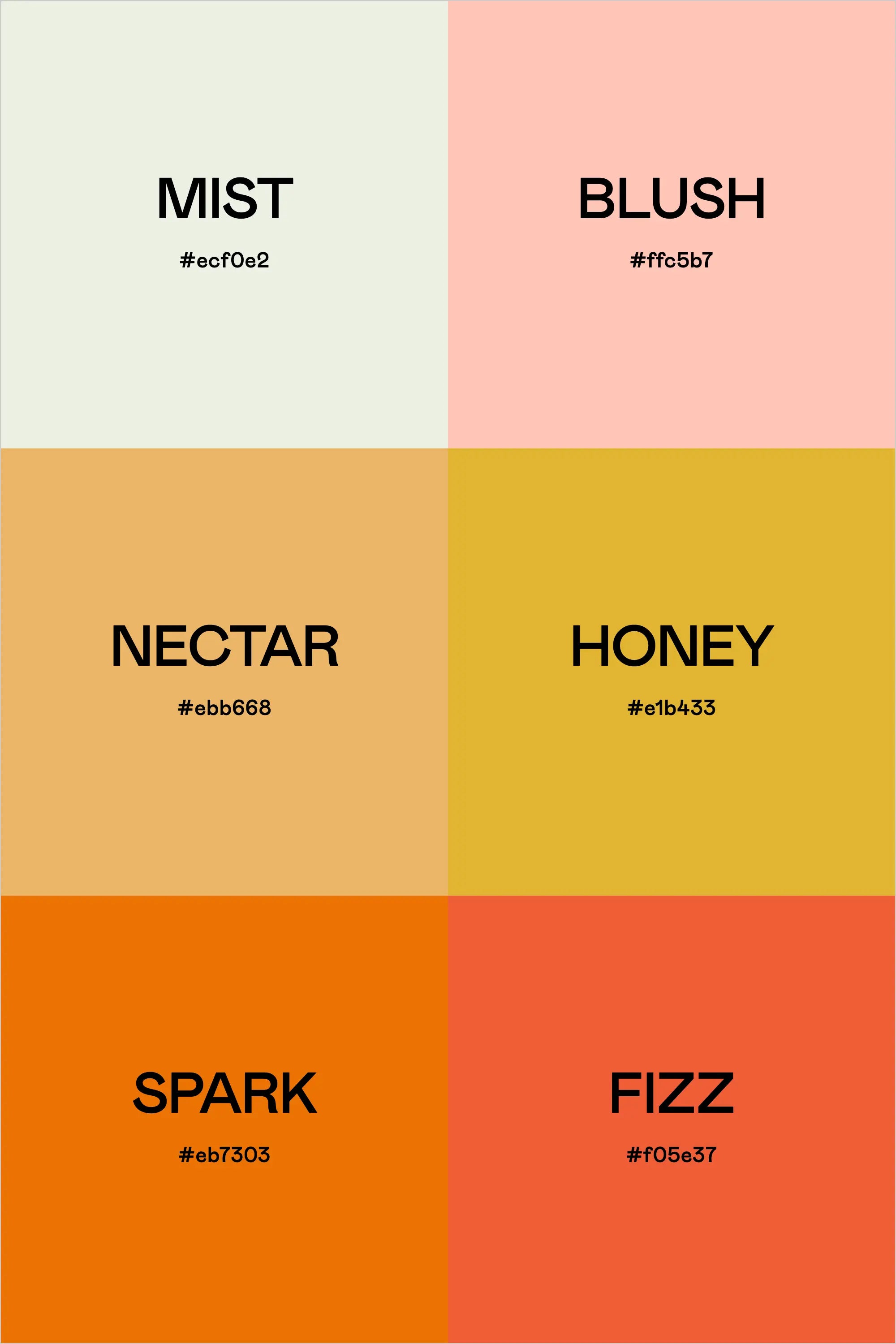
Fresh, juicy, and full of life, the "Fruit Punch" color palette is the perfect blend of soft pastels and bold, zesty hues. This combination of warm oranges, golden yellows, and soft pinks creates an inviting, energetic aesthetic that’s perfect for fun and approachable branding. Whether you're working on packaging, social media graphics, or a vibrant brand identity, this palette brings a sense of warmth and positivity to any design.
Mist and Blush provide a soft, airy foundation, while Nectar and Honey add a delicious warmth reminiscent of ripe fruit and golden sunlight. Spark and Fizz bring in the bold energy, giving this palette a playful and dynamic edge. For brands that want to radiate joy, excitement, and a fresh perspective, "Fruit Punch" is an irresistible choice. It’s perfect for lifestyle brands, food businesses, and anyone looking to infuse their designs with a cheerful, feel-good vibe.
Colors & Hex Codes
- Mist – #ecf0e2
- Blush – #ffc5b7
- Nectar – #ebb668
- Honey – #e1b433
- Spark – #eb7303
- Fizz – #f05e37