Rich, bold, and effortlessly refined, the Espresso Martini color palette captures the luxurious depth of coffee tones with a sophisticated, modern twist. Inspired by the creamy layers and deep espresso hues of the classic cocktail, this palette is perfect for brands that want to exude warmth, indulgence, and timeless elegance. Whether you’re working on a café brand, a high-end lifestyle aesthetic, or a cozy, earthy design, these shades provide a versatile and inviting foundation.
Foam and Crema bring a light, airy softness that pairs beautifully with the richness of Roast and Espresso. Grounds and Noir add the perfect amount of depth, creating strong contrast for a bold and grounded look. This palette is ideal for packaging, branding, and editorial design, offering a balance of warmth and strength that makes an impact. If your brand is all about sophistication and comfort, Espresso Martini is the perfect mix.
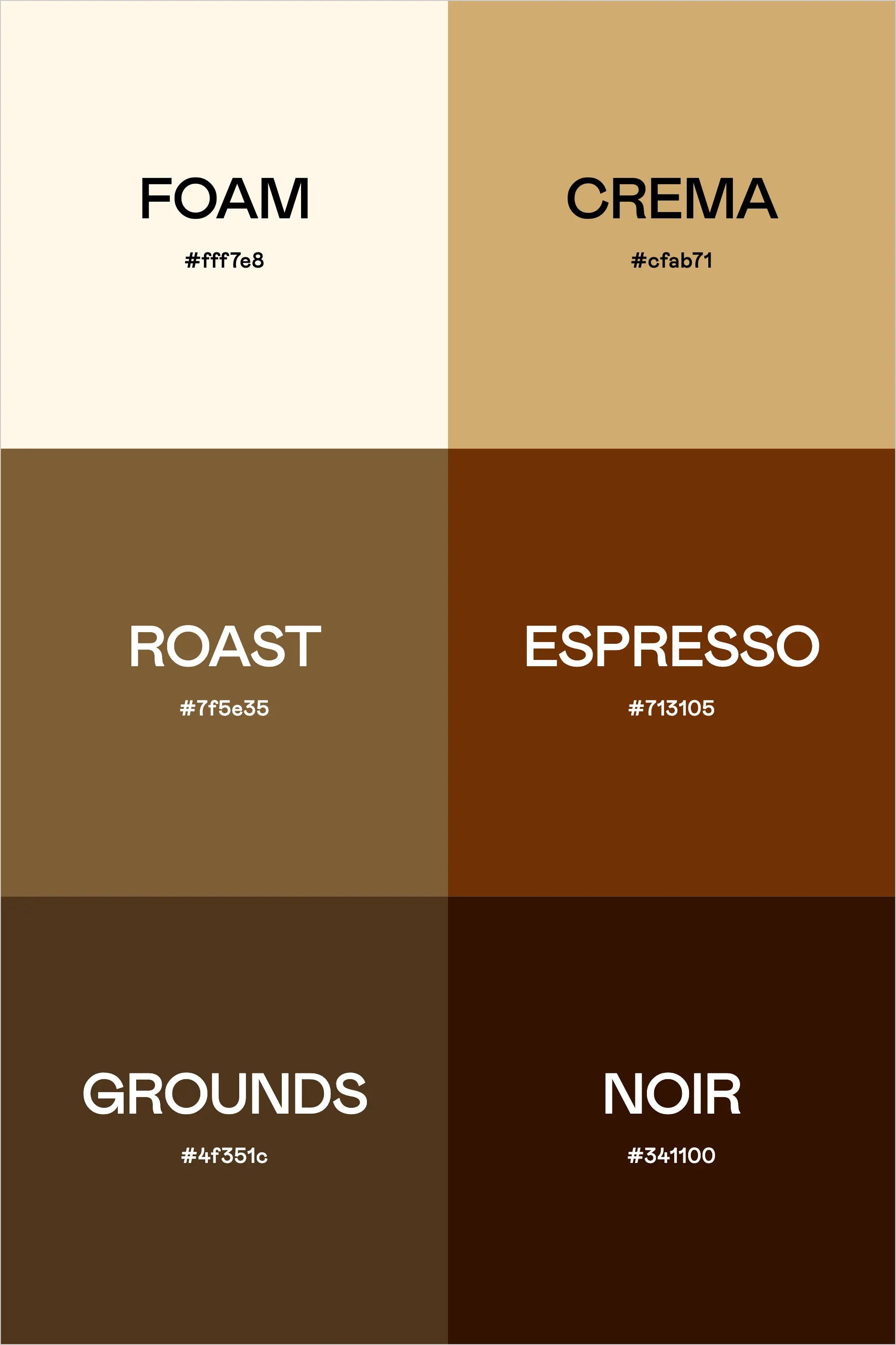
Colors & Hex Codes
- Foam – #fff7e8
- Crema – #cfab71
- Roast – #7f5e35
- Espresso – #713105
- Grounds – #4f351c
- Noir – #341100