Color Palette: Earthy Greens

Color Palette: Earthy Greens

Samantha Remboldt

Grounded, organic, and rich in natural tones, the "Earthy Greens" color palette is perfect for brands looking to convey a sense of stability, sustainability, and timeless beauty. This palette draws inspiration from deep forests, fresh foliage, and the warmth of natural wood, making it an excellent choice for eco-friendly businesses, outdoor brands, and wellness-focused designs. Whether you’re designing a brand identity, website, or product packaging, these colors bring a calming, nature-inspired aesthetic.

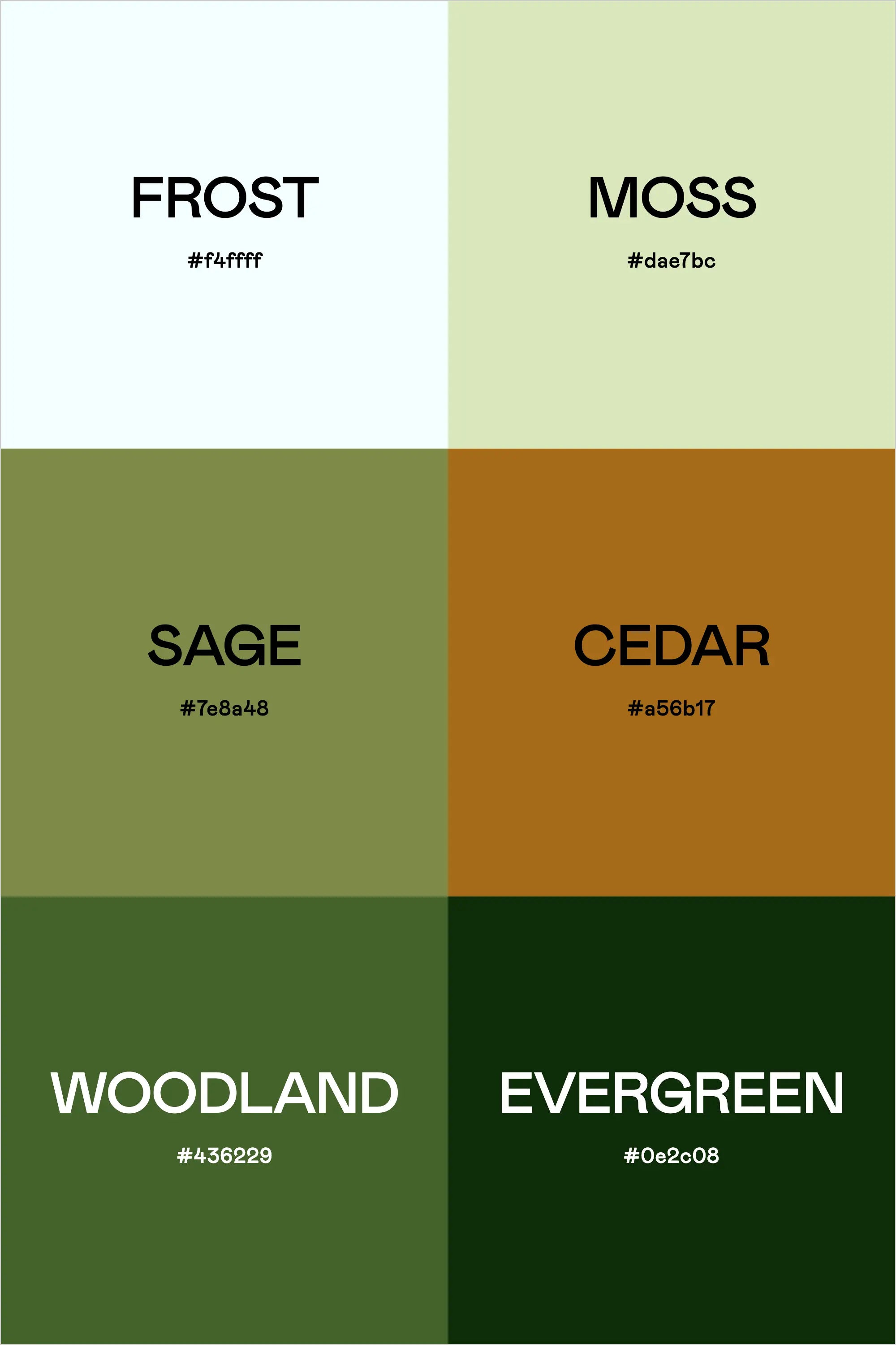
With soft, airy Frost and Moss setting the foundation, Sage and Cedar add warmth and an earthy richness. Woodland and Evergreen deepen the palette, offering contrast and depth that can be used to create striking visual impact. These shades work beautifully together in minimalist designs or layered for a rustic, organic feel. If you’re looking to capture the essence of nature in your work, "Earthy Greens" is the ideal palette for a fresh, down-to-earth look.

Colors & Hex Codes

  • Frost – #f4ffff
  • Moss – #dae7bc
  • Sage – #7e8a48
  • Cedar – #a56b17
  • Woodland – #436229
  • Evergreen – #0e2c08
Back to blog

★ ★ ★ ★ ★

Say hello to your new favorite color palette tool:

Color Palette PRO

Excellent 4.97 | Trusted by 1,000+ Designers

Create beautiful, brand-ready color palettes in 60 seconds.

Our all‐in‐one tool helps you select, test, and finalize your brand’s perfect palette—without the guesswork.

Get Color Palette PRO

Read the Reviews

"Wow, I love this! It's insanely useful!! From generating themed names to contrast compliance - this tool is so much fun to use and saved me a ton of time."

Customer Reviews

Based on 69 reviews
96%
(66)
3%
(2)
1%
(1)
0%
(0)
0%
(0)
J
Julia B.
SO helpful

This tool has been an amazing addition to my design process. I'm so glad I got it! its such a time saver and it lays everything out really well. I highly recommend it!

M
Megan D.
I'm Obsessed!

I've been a fan of their tools from the beginning, but I've got to say the new Color Palette Pro is the best yet! As a web designer this is the first place I go to take my clients' inspiration and create a palette that's uniquely them, but also meets contrast guidelines. It's so much fun to use I could spend hours just creating amazing palettes. There's so much here, I could go on and on, do yourself a favor and grab this tool!

K
Kelly D.
The Graphic Designer's Best Friend

WOW! This is the best tool and I love using it regularly for branding, graphic design, and web development projects. I highly recommend it to improve your creative process. Bonus: it's super fun to use, too!

I
Ingrid U.
Saves me SO much time and it's fun to use!

I love playing with color and going down the rabbit hole of color psychology and this is so helpful in letting me explore different combinations and good balanced palettes!!

K
Krista H.
new and improved color palette pro

I love the color palette pro! It is so easy to navigate and very intuitive, and it allows you to create a great palette in a few easy steps.