Color Palette: Cactus Flower

Color Palette: Cactus Flower

Samantha Remboldt


This "Cactus Flower" palette brings together the warmth of desert hues with the vibrancy of blooming flowers. It’s a mix of soft neutrals, warm earth tones, and bold pinks and reds, making it perfect for brands that want to feel organic, adventurous, and full of life. Whether you're working on boho branding, lifestyle blogs, fashion designs, or nature-inspired aesthetics, this palette offers the perfect mix of earthy warmth and floral vibrance.

How to Use This Palette:

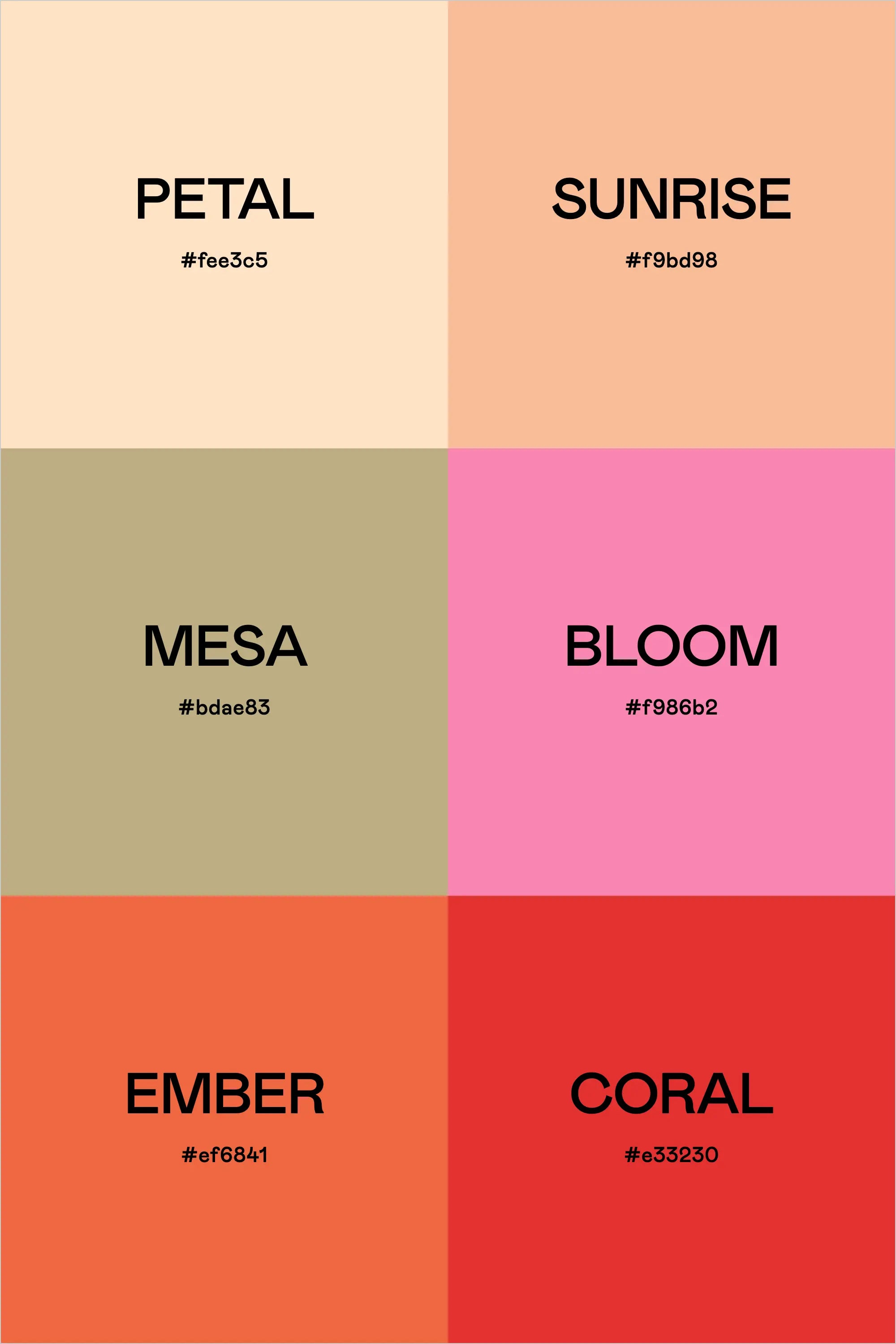
  • Petal (#fee3c5) is a soft, sandy neutral—ideal for backgrounds, typography, or light UI elements.
  • Sunrise (#f9bd98) adds a subtle warmth, perfect for highlights, buttons, or soft color blocks.
  • Mesa (#bdae83) grounds the palette with an earthy green-beige, making it great for balance and contrast.
  • Bloom (#f986b2) is the floral pop—use it for accents, call-to-action elements, or social media highlights.
  • Ember (#ef6841) and Coral (#e33230) bring the heat, adding bold contrast for text, branding, and high-impact visuals.

This palette captures the beauty of the desert landscape, with warm sun-kissed tones and bursts of floral color—perfect for brands that want a mix of earthy and energetic vibes.

Hex Codes:

  • Petal: #fee3c5
  • Sunrise: #f9bd98
  • Mesa: #bdae83
  • Bloom: #f986b2
  • Ember: #ef6841
  • Coral: #e33230
Back to blog

★ ★ ★ ★ ★

Say hello to your new favorite color palette tool:

Color Palette PRO

Excellent 4.97 | Trusted by 1,000+ Designers

Create beautiful, brand-ready color palettes in 60 seconds.

Our all‐in‐one tool helps you select, test, and finalize your brand’s perfect palette—without the guesswork.

Get Color Palette PRO

Read the Reviews

"Wow, I love this! It's insanely useful!! From generating themed names to contrast compliance - this tool is so much fun to use and saved me a ton of time."

Customer Reviews

Based on 70 reviews
94%
(66)
4%
(3)
1%
(1)
0%
(0)
0%
(0)
J
Julia B.
SO helpful

This tool has been an amazing addition to my design process. I'm so glad I got it! its such a time saver and it lays everything out really well. I highly recommend it!

M
Megan D.
I'm Obsessed!

I've been a fan of their tools from the beginning, but I've got to say the new Color Palette Pro is the best yet! As a web designer this is the first place I go to take my clients' inspiration and create a palette that's uniquely them, but also meets contrast guidelines. It's so much fun to use I could spend hours just creating amazing palettes. There's so much here, I could go on and on, do yourself a favor and grab this tool!

K
Kelly D.
The Graphic Designer's Best Friend

WOW! This is the best tool and I love using it regularly for branding, graphic design, and web development projects. I highly recommend it to improve your creative process. Bonus: it's super fun to use, too!

I
Ingrid U.
Saves me SO much time and it's fun to use!

I love playing with color and going down the rabbit hole of color psychology and this is so helpful in letting me explore different combinations and good balanced palettes!!

K
Krista H.
new and improved color palette pro

I love the color palette pro! It is so easy to navigate and very intuitive, and it allows you to create a great palette in a few easy steps.