Color Palette: Bright Warm Boho

Color Palette: Bright Warm Boho

Samantha Remboldt

If you love warm, vibrant hues that bring energy and joy, this "Bright Warm Boho" palette is perfect for you! It’s a mix of sunny yellows, spicy oranges, and a pop of playful pink, making it ideal for brands that want to feel fun, welcoming, and full of life. Whether you're designing for a boho-inspired brand, a playful social media aesthetic, or a bold fashion concept, these colors will grab attention and radiate warmth.

How to Use This Palette:

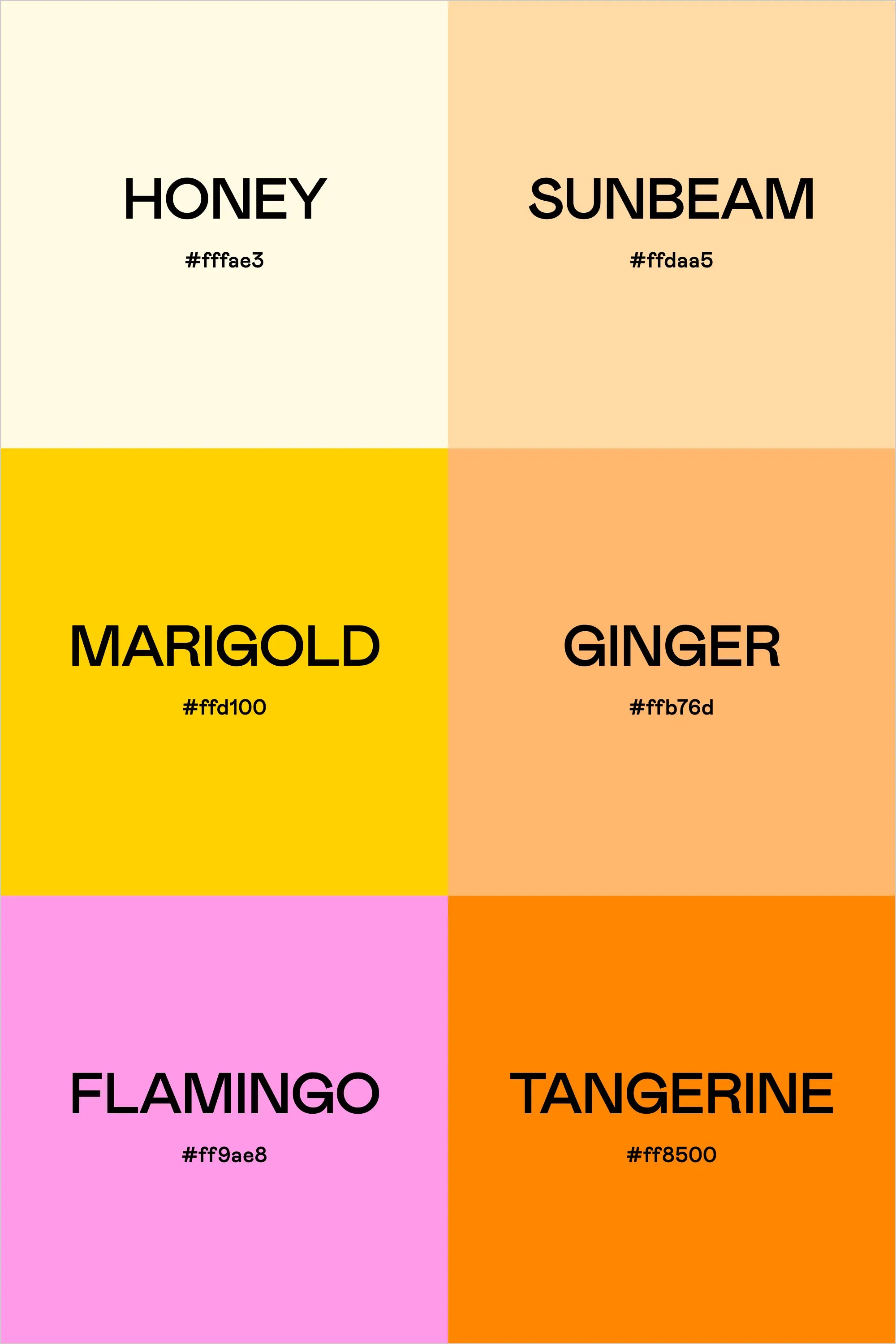
  • Honey (#fffae3) is a soft, creamy neutral—use it for backgrounds to let the brighter colors shine.
  • Sunbeam (#ffdaa5) and Ginger (#ffb76d) bring a warm glow, perfect for branding elements, buttons, or social media graphics.
  • Marigold (#ffd100) is a bold, golden yellow that adds a punchy highlight to any design.
  • Flamingo (#ff9ae8) introduces a playful contrast—use it for accents to make your brand feel lively and modern.
  • Tangerine (#ff8500) is the boldest, most attention-grabbing hue, great for call-to-action elements or statement designs.

This palette is fun, youthful, and effortlessly stylish—perfect for boho brands, summer campaigns, or any project that needs a bright, feel-good aesthetic.

Hex Codes:

  • Honey: #fffae3
  • Sunbeam: #ffdaa5
  • Marigold: #ffd100
  • Ginger: #ffb76d
  • Flamingo: #ff9ae8
  • Tangerine: #ff8500


Back to blog

★ ★ ★ ★ ★

Say hello to your new favorite color palette tool:

Color Palette PRO

Excellent 4.97 | Trusted by 1,000+ Designers

Create beautiful, brand-ready color palettes in 60 seconds.

Our all‐in‐one tool helps you select, test, and finalize your brand’s perfect palette—without the guesswork.

Get Color Palette PRO

Read the Reviews

"Wow, I love this! It's insanely useful!! From generating themed names to contrast compliance - this tool is so much fun to use and saved me a ton of time."

Customer Reviews

Based on 79 reviews
90%
(71)
9%
(7)
1%
(1)
0%
(0)
0%
(0)
J
Julia B.
SO helpful

This tool has been an amazing addition to my design process. I'm so glad I got it! its such a time saver and it lays everything out really well. I highly recommend it!

Hi Julia,

Thank you for this wonderful review! I'm SO happy to hear that this tool is saving you time.

-Sam

M
Megan D.
I'm Obsessed!

I've been a fan of their tools from the beginning, but I've got to say the new Color Palette Pro is the best yet! As a web designer this is the first place I go to take my clients' inspiration and create a palette that's uniquely them, but also meets contrast guidelines. It's so much fun to use I could spend hours just creating amazing palettes. There's so much here, I could go on and on, do yourself a favor and grab this tool!

Hi Megan,

I'm so grateful for your review- thank you! I love your comment about spending hours just playing with the tool- I felt the exact same way when we were working on this new update. I'm glad this makes creating color palettes feel FUN. Thank you!

-Sam

K
Kelly D.
The Graphic Designer's Best Friend

WOW! This is the best tool and I love using it regularly for branding, graphic design, and web development projects. I highly recommend it to improve your creative process. Bonus: it's super fun to use, too!

Hi Kelly,

Your review means so much to us- thank you so much. I LOVE to hear that you're having fun using it, that was our whole goal with this update.

-Sam

E
Emma B.
Fantastic tools, overflowing with value!

Wow! Such fabulous tools! Having watched from the sidelines for a long time, I'm so glad to have finally made the leap and purchased these tools. What a lot of time I've been wasting up until now. Oops! Oh and I love how they all integrate with each other to make processes even easier. Thanks so much Sam and Chris for all the love and effort you put into these. It shows!

D
Dawn B.
Best tool ever

Love, love, love this tool!!!