Color Palette: Bright Pastels

Color Palette: Bright Pastels

Samantha Remboldt

Looking for a color combo that feels warm, approachable, and a little adventurous? Meet “Bright Pastels.” Picture a friendly, sunny vibe—like sipping iced tea on a cozy porch in late spring. These tones hit that sweet spot between soft neutrals (like Linen and Blush) and playful pops of color (Honey and Horizon). Brands that want a laid-back but polished look—think boutique bakeries, eco-friendly shops, or lifestyle coaches—will vibe hard with this palette.

Feel free to mix and match for different moods. Terracotta and Clay bring an earthy foundation, while Linen and Honey add plenty of light for those crisp, airy designs. If you love a bold statement, try Horizon as your accent pop on social media graphics or logos. The best part? These shades can easily adapt to WCAG guidelines, so you can keep your designs inclusive and accessible without losing that breezy charm.
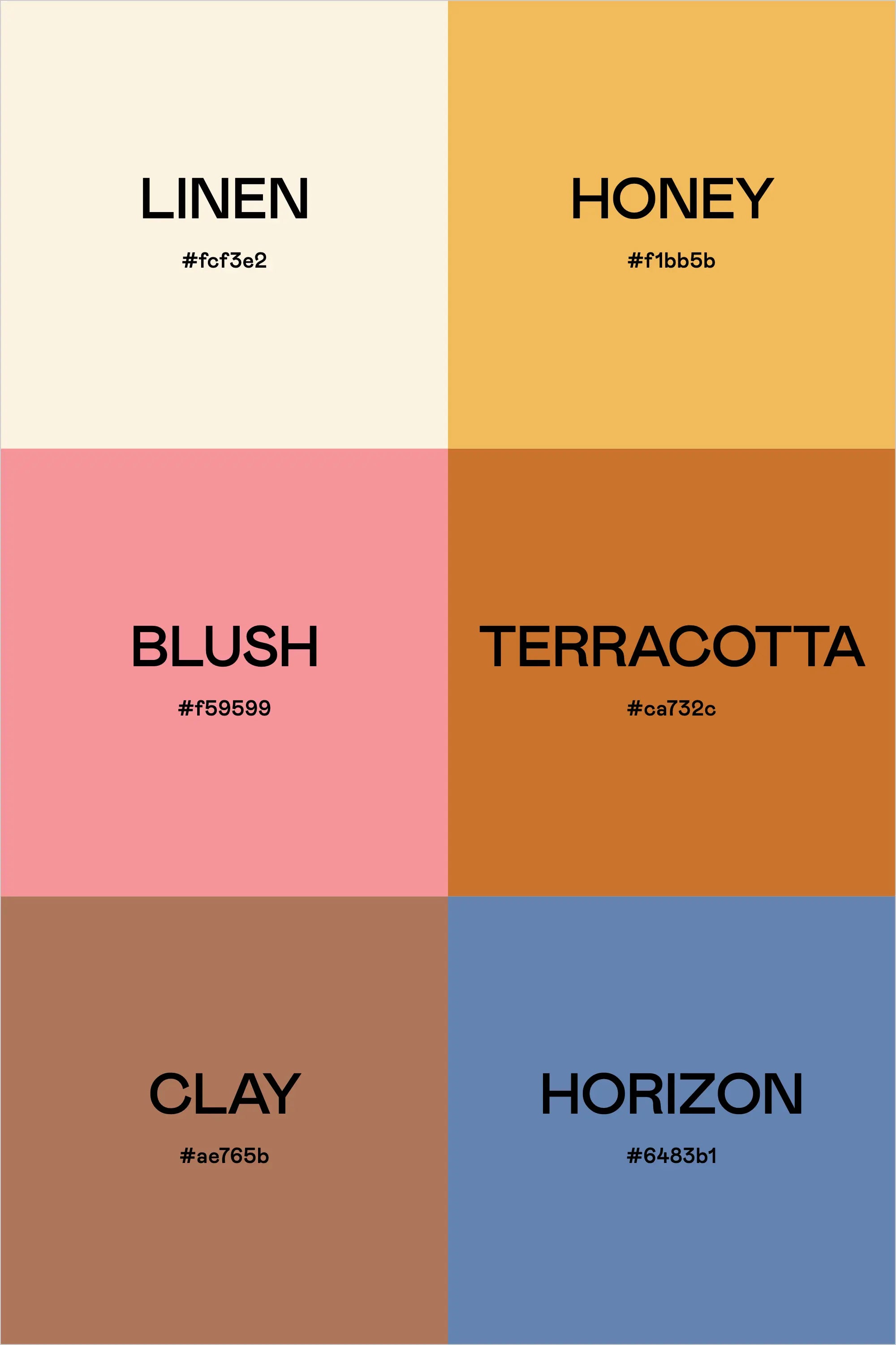
Color List: 

  • Linen – #fcf3e2
  • Honey – #f1bb5b
  • Blush – #f59599
  • Terracotta – #ca732c
  • Clay – #ae765b
  • Horizon – #6483b1
Back to blog

★ ★ ★ ★ ★

Say hello to your new favorite color palette tool:

Color Palette PRO

Excellent 4.97 | Trusted by 1,000+ Designers

Create beautiful, brand-ready color palettes in 60 seconds.

Our all‐in‐one tool helps you select, test, and finalize your brand’s perfect palette—without the guesswork.

Get Color Palette PRO

Read the Reviews

"Wow, I love this! It's insanely useful!! From generating themed names to contrast compliance - this tool is so much fun to use and saved me a ton of time."

Customer Reviews

Based on 69 reviews
96%
(66)
3%
(2)
1%
(1)
0%
(0)
0%
(0)
J
Julia B.
SO helpful

This tool has been an amazing addition to my design process. I'm so glad I got it! its such a time saver and it lays everything out really well. I highly recommend it!

M
Megan D.
I'm Obsessed!

I've been a fan of their tools from the beginning, but I've got to say the new Color Palette Pro is the best yet! As a web designer this is the first place I go to take my clients' inspiration and create a palette that's uniquely them, but also meets contrast guidelines. It's so much fun to use I could spend hours just creating amazing palettes. There's so much here, I could go on and on, do yourself a favor and grab this tool!

K
Kelly D.
The Graphic Designer's Best Friend

WOW! This is the best tool and I love using it regularly for branding, graphic design, and web development projects. I highly recommend it to improve your creative process. Bonus: it's super fun to use, too!

I
Ingrid U.
Saves me SO much time and it's fun to use!

I love playing with color and going down the rabbit hole of color psychology and this is so helpful in letting me explore different combinations and good balanced palettes!!

K
Krista H.
new and improved color palette pro

I love the color palette pro! It is so easy to navigate and very intuitive, and it allows you to create a great palette in a few easy steps.