Color Palette: Blue Hydrangea

Color Palette: Blue Hydrangea

Samantha Remboldt

This "Blue Hydrangea" palette is a calm and sophisticated blend of soft blues and purples, inspired by the delicate petals of hydrangea flowers. With a mix of airy pastels, muted blues, and deep twilight tones, this palette is perfect for elegant branding, wellness businesses, minimalist design, and calming aesthetics. Whether you're creating a serene website, branding a luxury product, or designing soothing social media graphics, these shades bring a sense of peace and refinement.

How to Use This Palette:

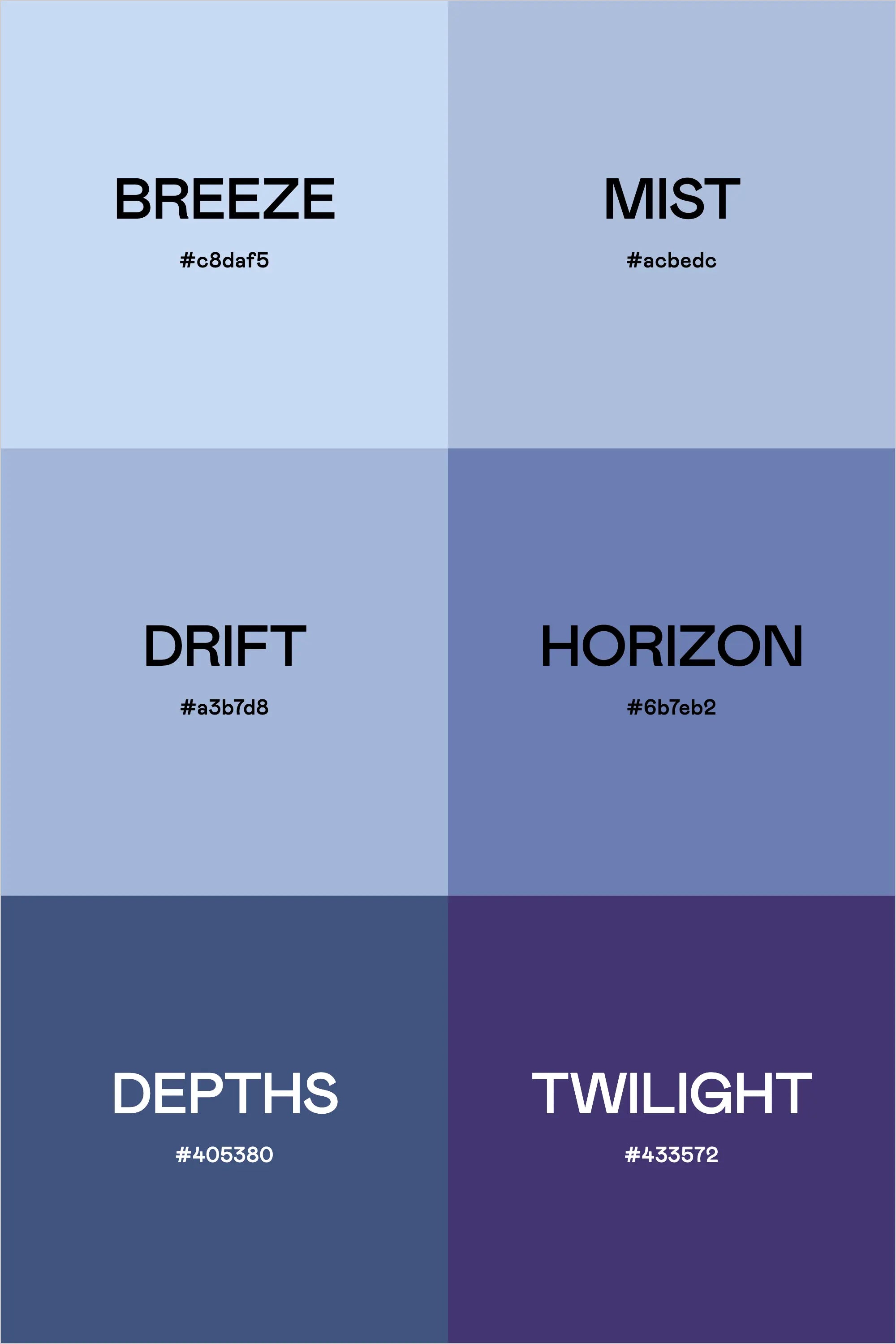
  • Breeze (#c8daf5) is a soft, sky-like blue that creates a light and airy feel—great for backgrounds.
  • Mist (#acbedc) adds a muted, misty blue, perfect for subtle branding elements and UI designs.
  • Drift (#a3b7d8) and Horizon (#6b7eb2) offer mid-tone blues, ideal for typography, buttons, or elegant accents.
  • Depths (#405380) deepens the palette with a rich navy blue, perfect for contrast and readability.
  • Twilight (#433572) adds a deep, sophisticated purple, grounding the palette with richness and depth.

This palette feels dreamy, romantic, and effortlessly elegant, making it ideal for luxury brands, beauty and wellness businesses, and serene, nature-inspired designs.

Hex Codes:

  • Breeze: #c8daf5
  • Mist: #acbedc
  • Drift: #a3b7d8
  • Horizon: #6b7eb2
  • Depths: #405380
  • Twilight: #433572
Back to blog

★ ★ ★ ★ ★

Say hello to your new favorite color palette tool:

Color Palette PRO

Excellent 4.97 | Trusted by 1,000+ Designers

Create beautiful, brand-ready color palettes in 60 seconds.

Our all‐in‐one tool helps you select, test, and finalize your brand’s perfect palette—without the guesswork.

Get Color Palette PRO

Read the Reviews

"Wow, I love this! It's insanely useful!! From generating themed names to contrast compliance - this tool is so much fun to use and saved me a ton of time."

Customer Reviews

Based on 70 reviews
94%
(66)
4%
(3)
1%
(1)
0%
(0)
0%
(0)
J
Julia B.
SO helpful

This tool has been an amazing addition to my design process. I'm so glad I got it! its such a time saver and it lays everything out really well. I highly recommend it!

M
Megan D.
I'm Obsessed!

I've been a fan of their tools from the beginning, but I've got to say the new Color Palette Pro is the best yet! As a web designer this is the first place I go to take my clients' inspiration and create a palette that's uniquely them, but also meets contrast guidelines. It's so much fun to use I could spend hours just creating amazing palettes. There's so much here, I could go on and on, do yourself a favor and grab this tool!

K
Kelly D.
The Graphic Designer's Best Friend

WOW! This is the best tool and I love using it regularly for branding, graphic design, and web development projects. I highly recommend it to improve your creative process. Bonus: it's super fun to use, too!

I
Ingrid U.
Saves me SO much time and it's fun to use!

I love playing with color and going down the rabbit hole of color psychology and this is so helpful in letting me explore different combinations and good balanced palettes!!

K
Krista H.
new and improved color palette pro

I love the color palette pro! It is so easy to navigate and very intuitive, and it allows you to create a great palette in a few easy steps.